
Are Hero Sections Necessary?
Hero sections are crucial if you are worried about conversion rates and have specific actions you want your users to take. If you have a run-of-the-mill 2008-style blog, it might be less necessary. But it is still helpful because it helps your readers navigate your site and highlight the most important parts of your site.
Hero Section Best Practices
When you are making a hero section, be sure to follow these best practice tips.
Be on-brand
When you’re picking out photos for your hero section, it’s essential to make sure they match your product or brand. Being selective is key if you want something that really shows off your creation. Because you are catering to a specific demographic or target audience, being off-brand with your hero image will turn visitors off. Imagine a women’s athletic clothing site using a hero section that includes a picture of a man lifting weights with dark and bold background colors. Not on-brand.
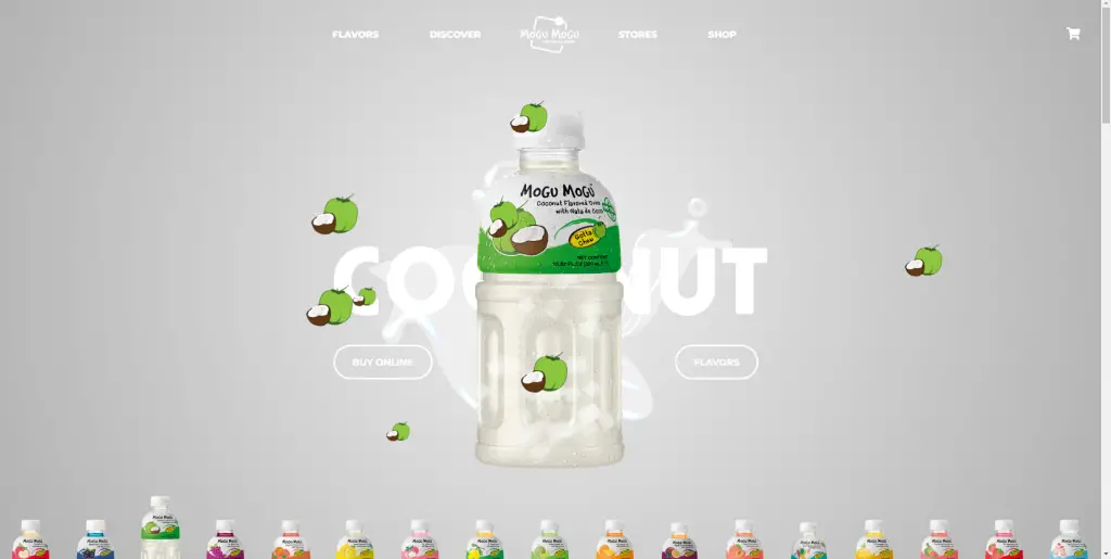
Make Sure The Hero Section Takes Up A Lot of Space
Your hero section should take up most of the initial screen real estate on both mobile and desktop. When a visitor visits your site, it should pop out and there should not be anything else on your site detracting from the hero section. The hero section for Gripe Water (seen below) pretty much takes up the whole screen. You have to scroll down to see the rest of the page.
Must Use High-Quality Visuals (With Enough Pixels)
The chosen images must be high-quality or will appear pixelated when the hero section needs to scale for higher (wider) screen resolutions. Ideally, you want an image that is 1920 pixels wide to account for wider screens. 
Emphasize Call To Action Buttons
A hero section should include a call-to-action (CTA) button for the visitor to take action. The button should stand in high contrast to the rest of your site. It shouldn’t blend in. The call-to-action button should jump out.
Check out the CTA in the hero section for Atlassian. They chose a color that is considerably high-converting—this orange is similar to the buy button of Amazon. But what’s more important is that the orange button stands in stark contrast to the rest of the site.
We wrote about how to easily find the ideal button color (and hex code) for your site based on its theme.

Consider Responsive Design
We live in a multi-device world. There’s no getting around it. Wordwide, mobile traffic actually beats desktop traffic in terms of usage. In most niches, traffic to your site will be mostly mobile. So it’s important to not only think about how your site will look on desktop, but also mobile. When we build sites, we build on desktop. So we often forget to check how it looks on mobile.
Most platforms you build sites on will automatically make your design mobile-responsive. But what’s even better is WordPress page builders will allow you to easily make different versions of your site for different devices types.
5 Examples Of Great Hero Sections
Surfrider Foundation
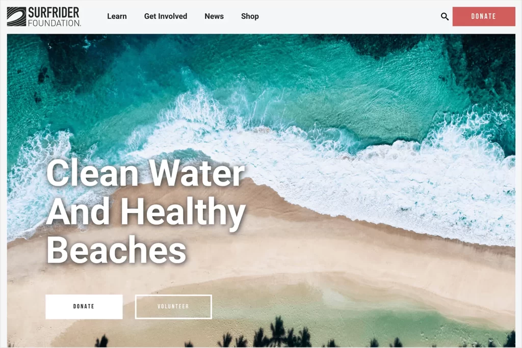
A full-width hero image and header text are displayed on each of the four slides as the carousel automatically advances through them. Without having to click anywhere, the combination of large photographs, legible language, and basic slide effects concentrates your attention on the foundation’s most crucial and up-to-date information. Using the left and right arrows on the carousel’s sides, you can browse the content at your own pace as well.
No Barriers
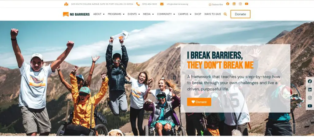
The headlines make excellent use of the font. In the end, the improper font can compromise crucial content and the message you want to convey, so be sure to understand why you are selecting a particular font. When selecting graphics for your hero section, your main considerations should be your audience and how to appeal to them. This is your opportunity to let the prospect know how important your product is to them, therefore you should approach it as an invitation.
Ditto
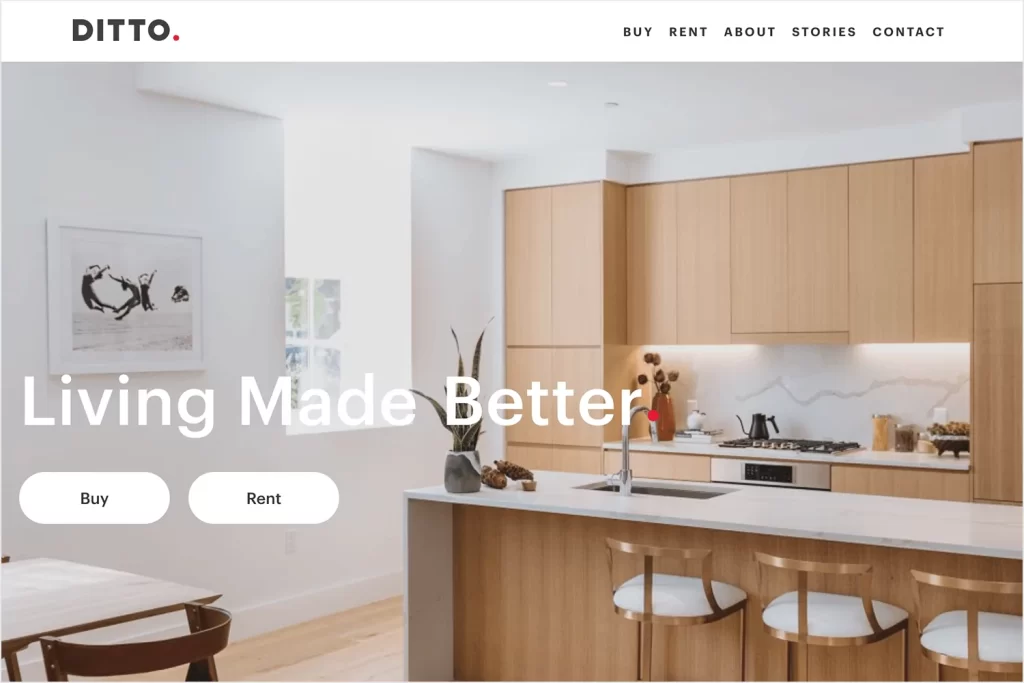
Ditto Residential, a real estate development company, uses a sequence of full-width video clips in their hero area in the sample below. The video snippets depict scenes from home and workplace life, including some extremely content residents, and the heading reads “Building places that inspire.” In this case, video serves as a means of product demonstration, enabling visitors to envision what it may be like to live or work in these kinds of homes.
Hiring Artists Website Design

This website platform makes it simple for clients and artists to connect, and they may work together to further enhance the beauty of the planet. A hero image on its main page encourages users to look for a talented artist for a design or marketing job. This is a brand-new website that features a striking hero image, an organized layout, and a big title. also CTA.
One Year No Beer
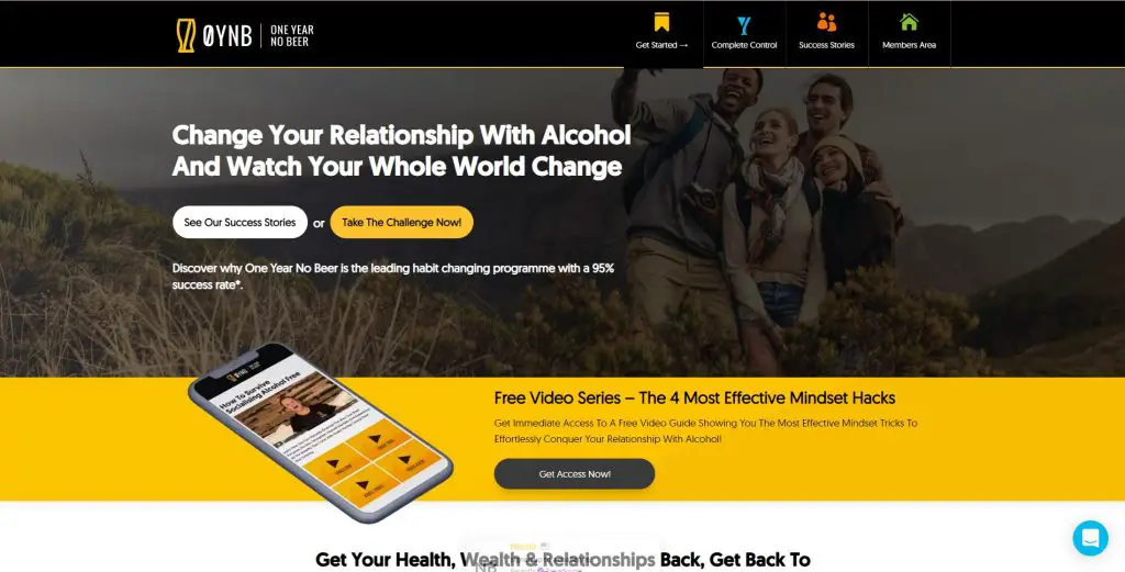
A well-organized and spotless navigation bar. Each icon’s different color helps categorize your site and makes it simple to reach the content. Links and dropdown menus can be too many. Maintain order. Simple is best. It will significantly increase your prospects’ level of interest. describing the triumphs. Utilizing social proof will always help your company build authority and trust. It has a significant impact on how potential buyers view your product since hearing real testimonials and real transformations from other individuals.
How To Create A Hero Section In Elementor (Tutorial)
If your image already has your preferred text embedded on it, you can skip Part 2.
Part 1: Creating the Hero Section layout
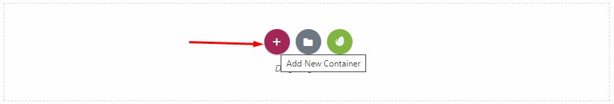
Step 1: Add a new Container by clicking the + sign in the page.
Step 2: Select a layout. As an example, I’ll choose 1 section.
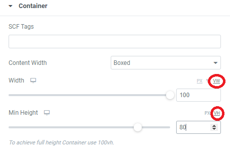
Step 3: Set the relative width and length of the hero section.
In the Container property, click the container and adjust the width and length of your hero section using vw and vh. In the example below, we set vw to 100 and vh to 80.
VH stands for viewport height and VW stands for viewport width. It is basically the height and width of the section in comparison to the viewable area of your site. 80 VH means that your layout will take up 80% of the length of the screen and 100 VW means that your hero section spans all the way across the text area of your site.
Step 4: Align the items to center. Under Advanced Tab, adjust the padding according to your needs.
Part 2: Adding the Hero Section Image
Step 1: Add Image Widget, drag and drop the image widget in the container.
Choose the image you want to use. The image should already be prepared and optimized.
Step 2: Adjust and style the image parameters.
Under Advanced Tab, use the Width feature to size the image.
Under the Style Tab, you may add additional options, such as box shadow, etc.
Part 3: Adding Text Overlays
If you already have the text you want in your image, you can skip this step. But this step is for adding a text overlay onto your image. In Elementor 3.8, there is a super easy way now to add text overlays.
Step 1: Drag the Text Editor widget below or above the image. This will be the text overlaid onto your hero image.
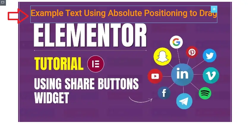
Step 2: In the Advanced tab of the Text Editor widget, set the Position to Absolute.
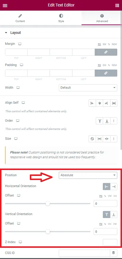
Step 3: Move the text around using your mouse cursor. Super easy!
You can pretty much do this with anything, any widget in Elementor (icon list, button, etc).
Part 4: Adding a Call-To-Action Button
So adding a call-to-action button would be pretty much the same steps as part 3. You add the Button widget to the same container as your hero section image, set the position to absolute, and then move it around with your cursor.
Don’t forget to add a link. Also, change the design of your button to get the highest conversion rate.
Part 5: Checking The Layout On Mobile and Tablet
Check Responsive Views by clicking on the Responsive Mode icon located at the bottom of the editor panel.
Check the tablet and mobile views.
Make minor adjustments (while in responsive mode) to the size and placement of your section to best fit your mobile/tablet design.
How To Add A Button Overlay On Hero Section In Elementor
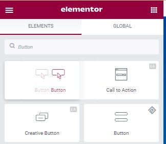
Step 1: Drag and drop a button anywhere in the same container as the Hero section. This is important that they are in the same container. You will see why in Step 5.
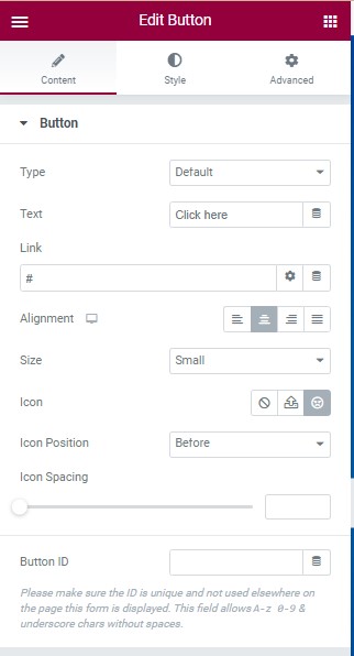
Step 2: At the left sidebar, you can see the button’s option to customize
Step 3: Under Content Tab, you can see a button option. You can select button type, customize button name and Link enter the URL of the page you want to link with. For the Size, you can also adjust and add an icon to your button.
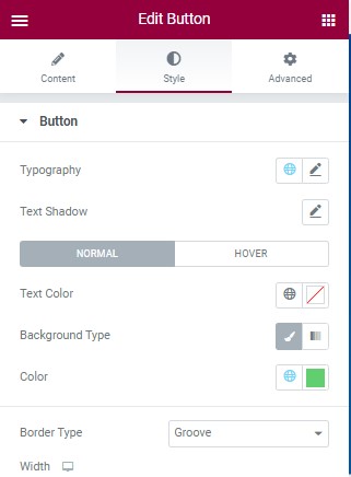
Step 4: Under Style Tab, you can edit the typography, text shadow. Normal and Hover. Text color Background Type and the color of the button.
Step 5: Set button to Absolute positioning in the Advanced Tab. Once the positioning is set to Absolute, now you can drag the button anywhere in the Hero section as long as it is in the same container.
