
Introduction
Elementor is a user-friendly tool that helps you build websites without needing technical skills. It’s like a virtual toolbox for creating web pages.
One of the handy tools in Elementor is the Testimonial Widget. This widget lets you easily display customer feedback on your website. Instead of just showing text, it arranges testimonials in a sliding carousel, making them more engaging.
In this tutorial, we’ll walk you through the simple steps to use the Testimonial Widget in Elementor. Whether you’re new to building websites or have some experience, this tool makes showcasing testimonials a breeze. It’s a great way to build trust with your audience. Let’s get started!
Understanding Testimonial Carousels
Testimonial carousels serve as dynamic displays of positive feedback from clients or users. They add a human touch to your website, instilling confidence in visitors and potential customers. With the ability to showcase multiple testimonials in a rotating manner, these carousels capture attention and convey social proof effectively.
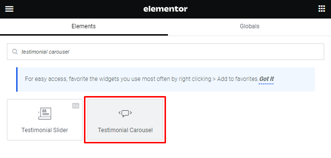
Accessing the Testimonial Carousel Widget
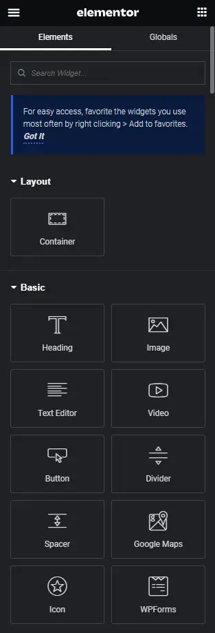
- Open Elementor: Launch the Elementor editor and select the section or column where you want to add the Testimonial Carousel.
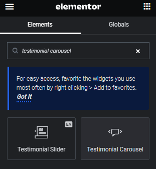
- Add Widget: Click on the box symbol to add a new widget and search for ‘Testimonial Carousel’. Click on it to insert it into your layout.
Configuring the Content Tab – Slides
The first step is to navigate to the Content Tab and select ‘Slides.’ This is where you manage the items that will appear in your testimonial carousel.
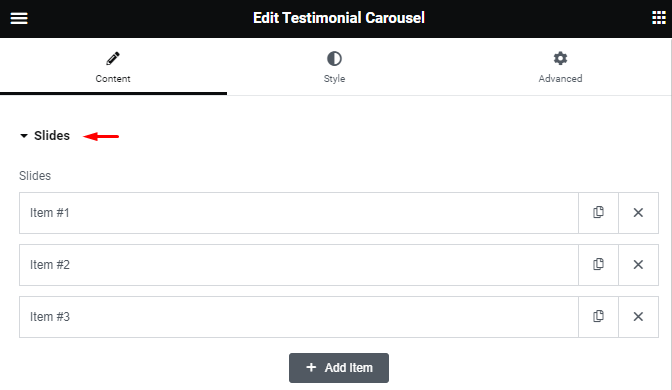
Content: Enter the text of the testimonial. This should be a concise and compelling endorsement of your product or service.
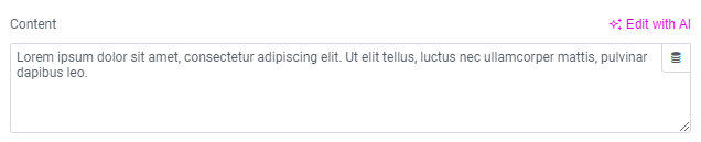
Image: Choose one from your media library or click upload. This image should ideally be of the customer who provided the testimonial.

Name: Enter the customer’s name.
Title: Enter the customer’s title or affiliation.
Slide Design Settings
Next, let’s delve into the design options for your testimonial carousel.
Skin: Select a pre-designed skin, either ‘Default’ or ‘Bubble.’ The choice of skin will affect the overall appearance of the widget.

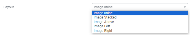
Layout: Choose from various layout options, including ‘Image Inline,’ ‘Image Stacked,’ ‘Image Above,’ ‘Image Left,’ or ‘Image Right.’
Alignment: Align the testimonial to the left, center, or right of the carousel.

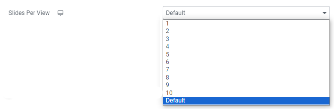
Slides Per View: Determine the number of slides to display at once, from 1 to 10.
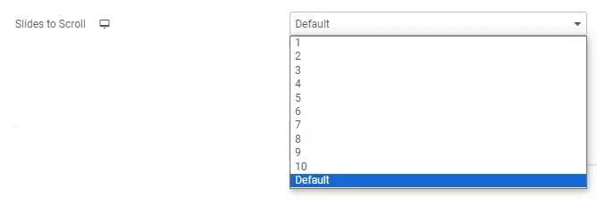
Slides To Scroll: Decide how many slides should move per swipe, from 1 to 10.
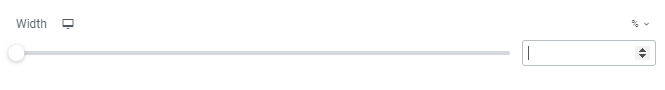
Width: Set the width of the widget to fit your website’s design.
Additional Options
Here, you have more choices to fine-tune your testimonial carousel.
Arrows: Choose whether to show or hide navigation arrows.

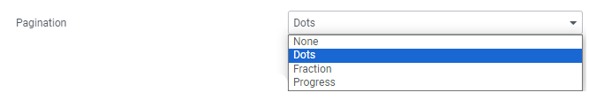
Pagination: Select the style of carousel pagination, including ‘None,’ ‘Dots,’ ‘Fraction,’ or ‘Progress.’
Transition Duration: Set the time interval between slide transitions in milliseconds.
Autoplay: Activate autoplay to make the carousel slide automatically.
Autoplay Speed: Adjust the speed at which the carousel transitions between slides, in milliseconds.
Infinite Loop: Enable this option to have the carousel slide continuously.
Pause on Interaction: Select ‘YES’ to pause autoplay when a user hovers over the carousel or clicks on it.
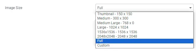
Image Size: Choose image size from thumbnail to full image or set custom size.
Lazy Load: Toggle this option to enable lazy loading of images for improved performance.
Styling with the Style Tab – Styling Slides
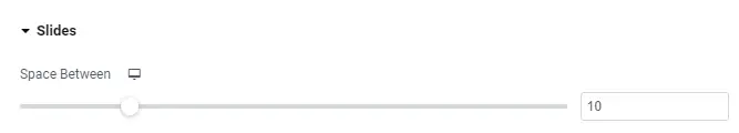
Space Between: Control the space between the slides to achieve the desired layout.
Background Color: Select a background color.
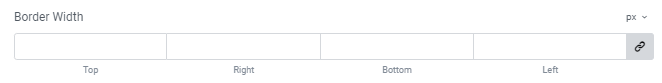
Border Width: Choose how thick the border around each slide should be.
Border Radius: Adjust the border radius to control the roundness of slide corners.

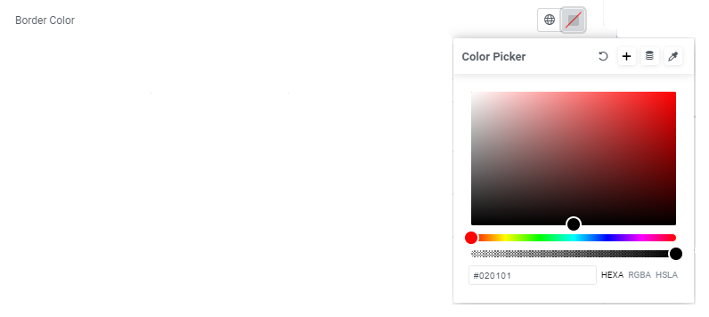
Border Color: Pick a color for the slide borders.
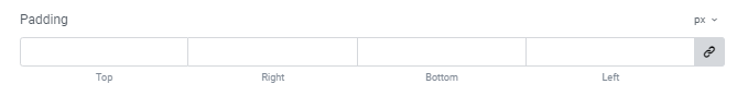
Padding: Set the padding within the border of each slide to ensure the right spacing.
Styling Content
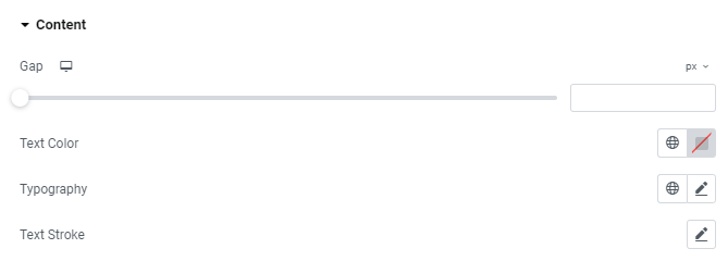
Gap: Manage the space between the image and the testimonial text for an aesthetically pleasing design.
Text Color: Select the color of the testimonial text.
Typography: Customize typography options for the testimonial text.
Styling Name
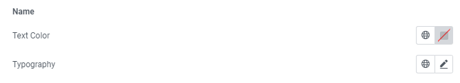
Text Color: Choose the color for the customer’s name.
Typography: Modify the typography options for the name.
Styling Title
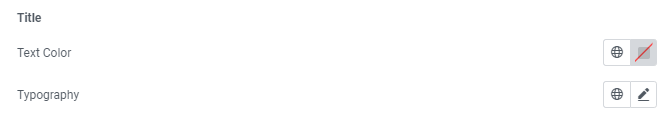
Text Color: Set the color for the customer’s title or affiliation.
Typography: Adjust the typography options for the title.
Styling Image
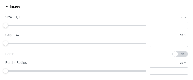
Size: Change the image size as per your design requirements.
Gap: If ‘Image Inline’ is selected, control the space between the image and the name and title.
Border: Enable or disable a border around the image.
Border Color: If a border is enabled, choose the color for the border.
Border Width: Set the thickness of the border around the image.
Border Radius: Adjust the border radius for corner roundness, even if the border is disabled.
Navigation Styling
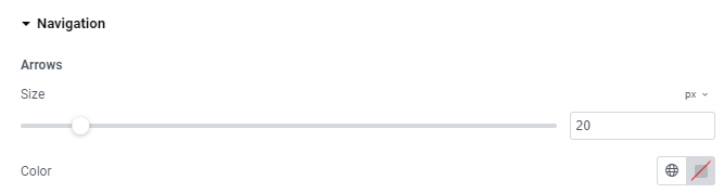
Arrows
Size: Customize the size of the navigation arrows.
Color: Select the color of the navigation arrows.
Pagination
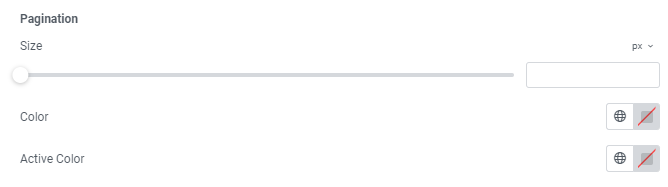
Size: Adjust the size of the pagination dots or indicators.
Color: Choose the color of the pagination dots.
Bubble Skin Styling (Bubble Skin only)
Background Color: Choose the background color of the bubble.
Padding: Set the padding within the bubble for spacing.
Border Radius: Adjust the border radius for corner roundness, even if the border is not enabled.
Border: Enable a border around the bubble.
Border Color: If the border is enabled, choose the border color.
Border Width: Set the thickness of the border around the bubble.
Customize your testimonial carousel widget to align with your brand’s aesthetic and watch as it enhances the trustworthiness of your website.
Best Practices for Testimonial Carousels in Elementor
Testimonial carousels are a powerful way to showcase positive feedback and build trust with your audience. When using Elementor, a popular WordPress page builder, it’s important to follow some best practices to ensure your testimonials have maximum impact. Here’s a step-by-step guide on how to create an effective testimonial carousel:
Access the Elementor Editor
Navigate to the page or post where you want to add the testimonial carousel.
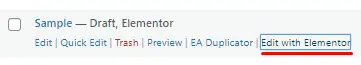
Click on “Edit with Elementor” to open the Elementor editor.
Add a New Section
In the Elementor editor, click the Elements icon to add a new section.
Choose a structure that best suits your design. A two-column or three-column layout often works well for testimonial carousels.
Add a Testimonial Widget
Click on the section you just created to select it.
Search for “Testimonial” or “Testimonial Carousel” in the widget search bar.
Drag the widget into the section and drop it there.
Customize the Testimonial Carousel
Click on the testimonial carousel widget to access its settings in the left sidebar.
Add testimonials one by one, providing the name, position, company (if applicable), and the actual testimonial message.
Upload a photo of the person giving the testimonial for a more personal touch.
Adjust the style settings, such as typography, colors, and spacing, to match your website’s overall design.
Configure Carousel Settings: Scroll down in the widget settings to find the “Carousel” or “Slider” settings.
Set the carousel to automatically rotate or allow manual navigation, depending on your preference.
Adjust the speed and animation settings to create a smooth user experience.
Optimize for Mobile Devices: Click on the mobile device icon at the bottom of the Elementor editor to switch to mobile view.
Make sure the testimonial carousel looks good and functions well on smaller screens. Adjust font sizes and spacing if needed.
Preview and Save: Click the “Preview” button to see how the testimonial carousel looks on your website.
Click the “Save” button to keep your changes if you’re satisfied with the outcome.
Publish the Page: Once you’ve saved your changes, click the “Publish” button to make the updated page live on your website.
View the published page to ensure the testimonial carousel displays correctly.
By following these best practices, you can create an effective testimonial carousel in Elementor that helps build trust with your audience and showcases the positive experiences of your customers or clients.
Conclusion
A testimonial carousel widget is a powerful tool to boost your website’s credibility and engage your visitors. By following the steps outlined in this guide, you can create a compelling and visually appealing carousel that showcases the positive experiences of your customers.


