
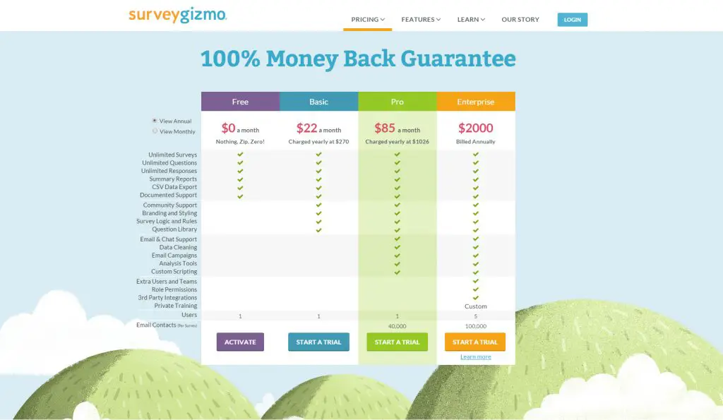
Pricing Table Design Best Practices
Like anything else, there are some DOs and DONTs when designing pricing tables. Here are a few of them.
DOs:
– Use icons or images.
– Use text labels to differentiate the features of each column.
– Make sure your button is easy to see and stands out from the rest of the table.
-Make your table easily scannable.
-Highlight the recommended product/plan.
– Include a clear call-to-action on your button.
-Make the button high-contrast so the text is clear.
-Place the most important features first.
-Make it mobile-friendly.
DON’Ts:
– overcrowd your table with text. Highlight 5-10 prominent features.
– use the same color for all of your column headers.
-Write full sentences
OPTIONAL:
-Include what is not included in the lower-tiered plans.
Research Into What Converts Well In a Pricing Table
Research from CXL, one of the biggest marketing agencies in the world, showed that highlighting your recommended plan boosts conversion rates, by a lot. But I think a lot of people know that. But how about how you arrange the prices of your product or service? Does that matter in terms of conversion rate?
Arranging The Prices of your Table
That same research also showed that aligning your most expensive plan first will also increase the conversion rate of your recommended plan. This is counterintuitive as we see pricing tables go from the least expensive being on the left and the most expensive being on the right.
Here is what their two tables looked like.
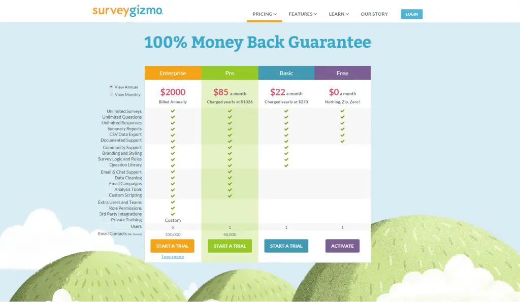
When they arranged the price conventionally, from cheapest to most expensive, the conversion rate for their recommended plan was 20%. When they arranged the table from most expensive to cheapest, the conversion rate on their recommended plan was 32%.
Here is a summary of the results of their research into the pricing table design.
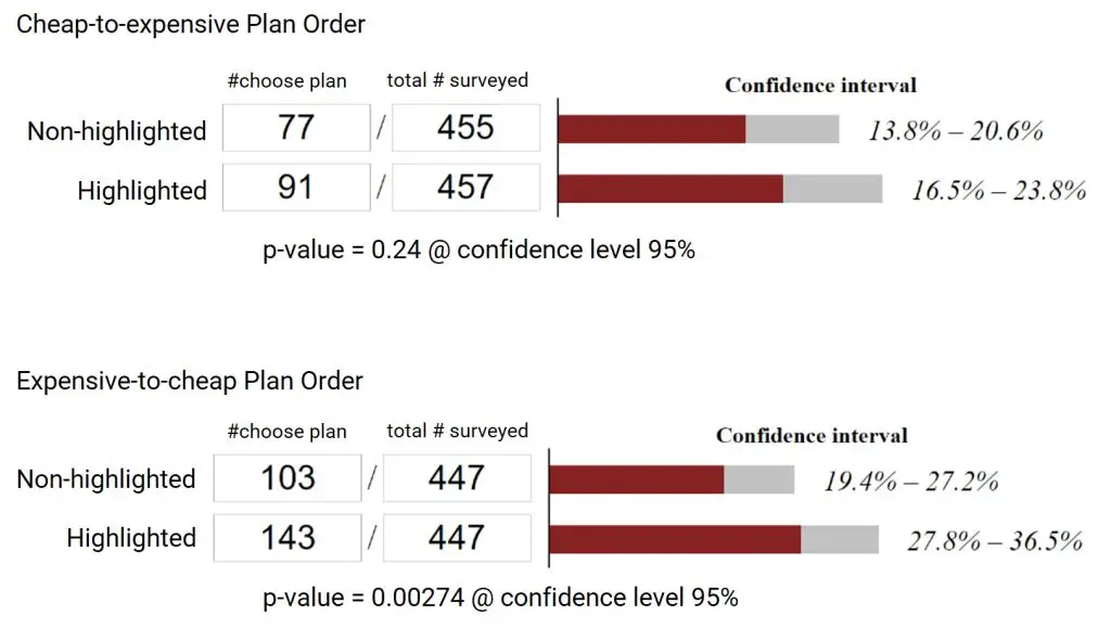
Highlighting increased conversion by 3% when arranging the price table from cheap to expensive. But when the price table is arranged from expensive to cheap, highlighting increased conversion by a whopping 9%.
What is the Ideal Button Color for Your Price Table? Hex Codes Included
When it comes to colors for your button, things get a little more nuanced. Certain colors have been shown to be more effective than others when it comes to getting people to take action. For example, red is often used to highlight special deals or sales. Blue is seen as a calming color and can help put people at ease. And, yellow is often used to grab attention and create a sense of urgency. But certain colors convert better for certain demographics than others—blue is the favorite color of men while purple is the favorite color of women. Younger demographics have different color preferences than older folks.
In addition, different colors bring about different types of feelings and thus influence purchase decisions differently. ConvertKit published an article showing 8 different buy button colors and what each conveys. They also showed examples of high-converting ones.
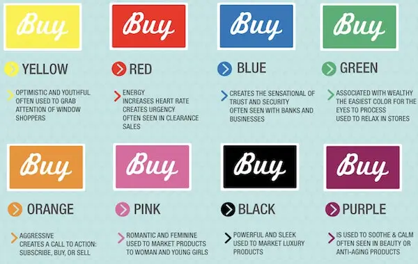
Although red has long been the marketer’s favorite for call-to-action buttons, customers have adjusted to red being the button of choice for marketers. And so red shouldn’t be the default choice for your pricing table button. What is much more important is that the button stands in high contrast to the rest of the content on the page, so that it stands out. In addition, the design colors should match the overall theme of your site, says CXL.
Again, if you aren’t sure what color to use for your price table button, just stick to the 8 above:
- Yellow (#FFFF00)
- Red (#FF0000)
- Blue (#0000FF)
- Green (#00FF00)
- Orange (#FFA500)
- Pink (#FFC0CB)
- Black (#000000)
- Purple (#A020F0)
Or if you want to be really safe, just stick to the five initial ones. But remember, the button should contrast well with the rest of the table and go well with your site.
Ways to Highlight Your Recommended Service In a Price Table
As we mentioned earlier that the best practice is to highlight a recommended product or service. So there are three ways to do this.
- The first way is to change the background color.
- The second way is to create a border around it.
- The third way is to put a ribbon on it.
Or you can do all three. We will show you how to do all three in the tutorial below.
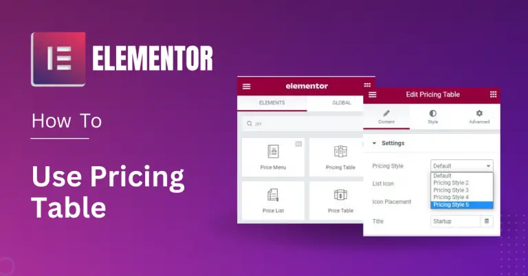
How to Create a Pricing Table with Elementor (Step-by-Step)
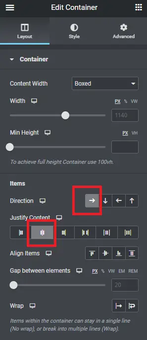
Step 1 – For Elementor version 3.7 or before, drag the Inner Section element into the page and click plus sign to add columns.
For Elementor version 3.8 onwards, drag the Container element onto the page and click the right arrow at Directions, and set it as Center for Justify Content.
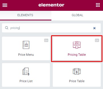
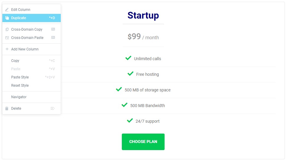
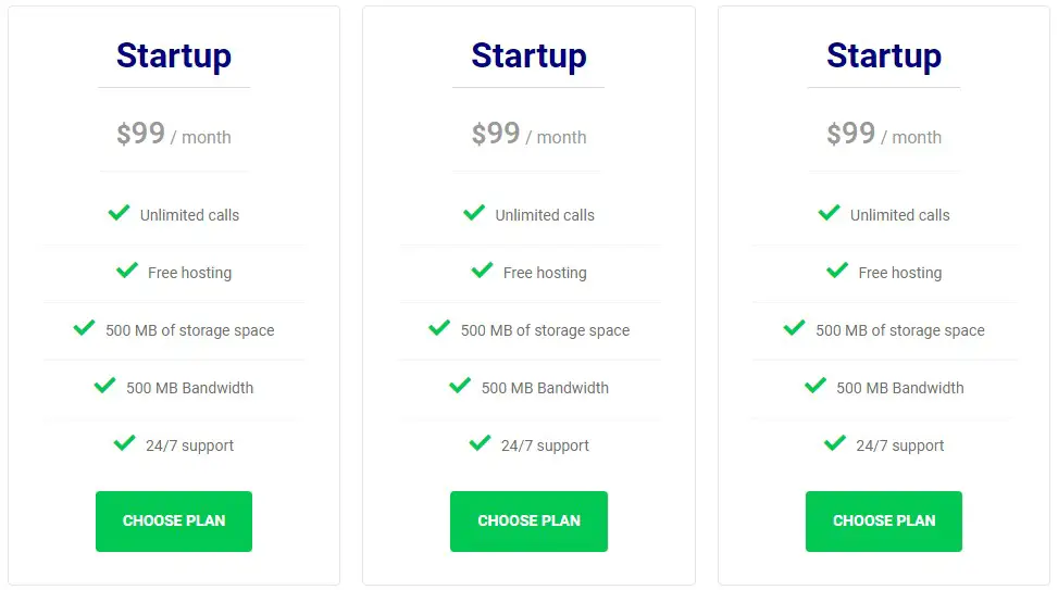
Step 2: Find the pricing table widget and drag it to the section. Then duplicate to make multiple.
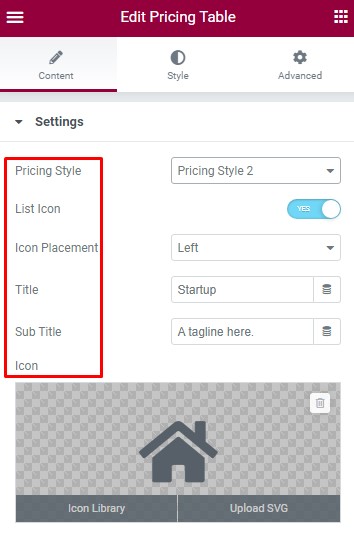
Step 3 – Customize the pricing table using the left sidebar.
Settings
In Settings, choose the pricing style you want. And add the title, subtitle, and icon.
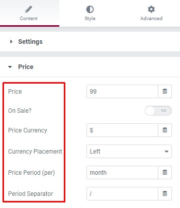
Price
Customize the options for the price, it includes:
- Price (amount)
- On Sale? (Yes or No)
- Price Currency
- Currency Placement
- Price Period (per)
- Period Separator
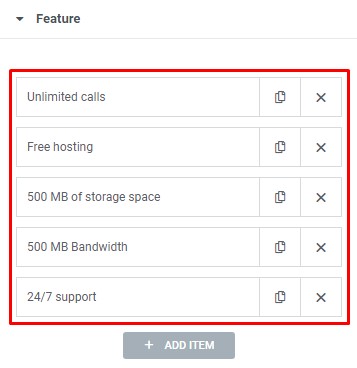
Feature
This is the section where you can add different features to the pricing packages you offer.
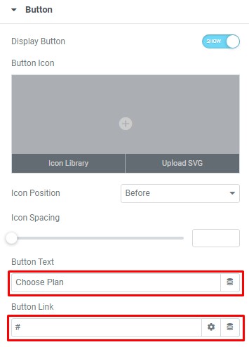
Button
Add your title button and then enter the URL for the item’s link.
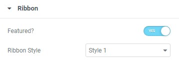
Ribbon
It will help you display discounts or offers related to their plan you can also put it on the left or on the right corner. A ribbon is also a great way to highlight the recommended product or plan.
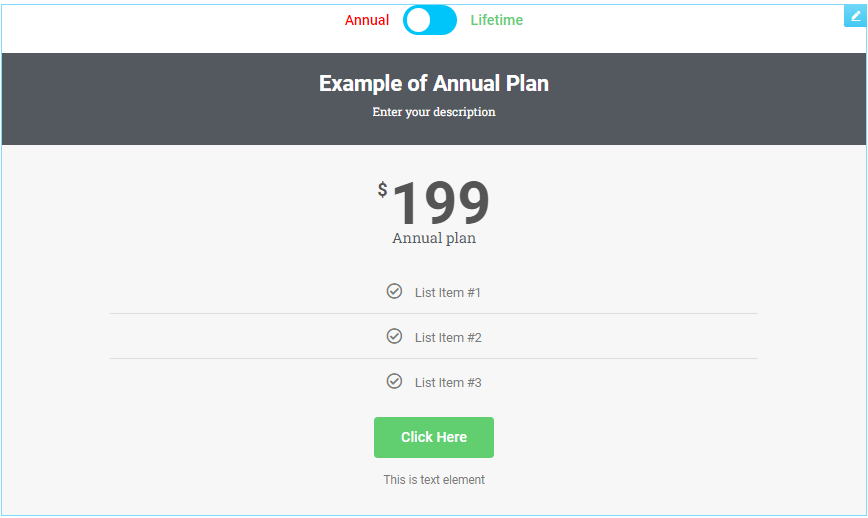
Make Your Pricing Table Toggle (Toggle Between Annual/Monthly Payments)
In order to toggle between two different types of plans, you will need a third-party add-on. There are several add-ons available that will let you toggle between plans. In this tutorial, we will be using the Essential Addons toggle element. If you do not have that, you will need to install that plugin first before you are able to do the steps below.
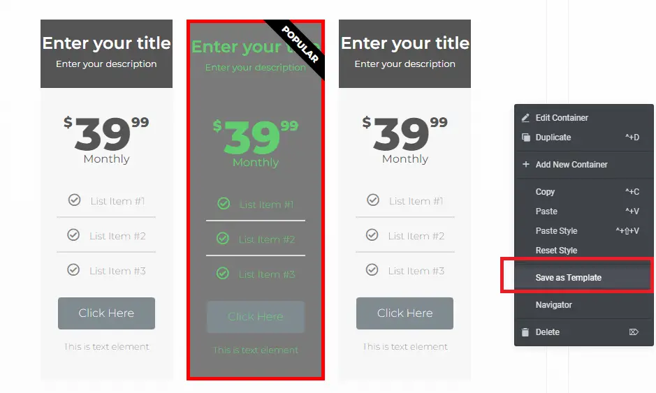
Step 1: First you will need to save the two different pricing tables.
For instance, if you want to toggle between monthly and annual plans, then you need to create two separate tables for each.
Step 2: Save the two different tables as separate templates.
One template for the yearly plan and one for the monthly plan.
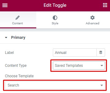
Step 3: Drag the toggle element onto the page.
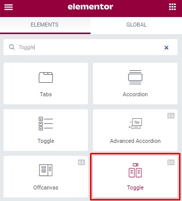
Then, in the dropdown for each, select “Saved Template” and insert the template for each plan in their respective fields.
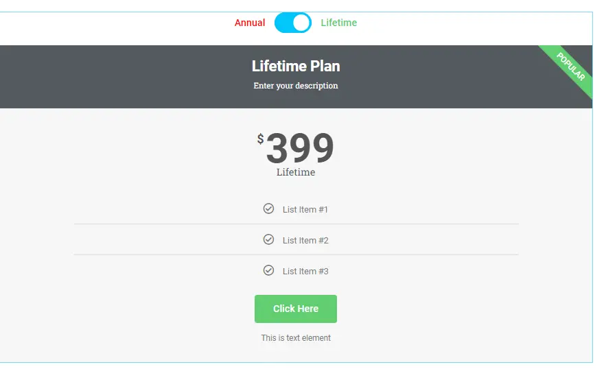
And the finished product would look something like this. For the sake of brevity, only one plan is included in each toggle.
Making The Recommended Plan/Service Stand Out In Your Elementor Price Table
To insert a ribbon, click on the recommended price column and go down to the bottom of the “Content” tab. Choose your ribbon style.
To change the background color and/or put borders around your recommended product or service, click on the column you want to modify and go to the “Advanced” tab. From there you can go down to the “Background” or “Border” section.
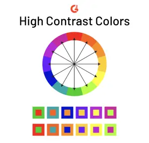
Do remember the rule to have high contrast so that the text and button is easily visible. High contrast pairs are: white and black, yellow and black, yellow and purple, green and purple, yellow and blue, etc. But of course those aren’t the only high contrast pairs. High contrast pairs are pairs that are on the opposite ends of the color wheel. The color wheel is presented for your convenience below. Image courtesy of G2.
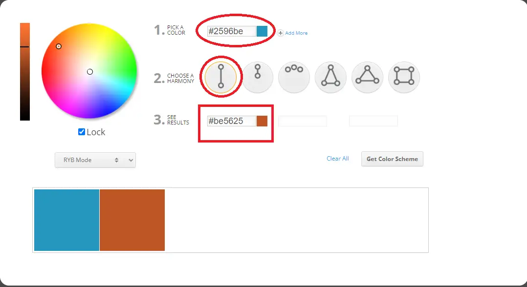
Find the Ideal Button Color for Your Price Table
We talked about the importance of choosing the right button color. And what the “right” color is will largely depend on the dominant colors of your site. But there is a way to easily choose the right button color for your price table or any call-to-action. Here are the steps.
Step 1: Go to imagecolorpicker.com and click the “User Your Image” button.
Step 2: Click on the Website Url tab and enter in your the url address of the page you want to place the button.
It will take a screenshot of that page and give you your site’s main colors. Copy this hex code
Step 3: Go to https://www.sessions.edu/color-calculator/ and paste the hex code you copy from Step 2.
Pick Complementary as the Harmony.
Once you do that, the calculator should spit out the hex code for your ideal button color for your site.