
Introduction
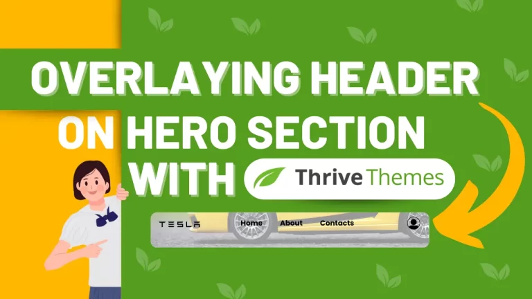
Overlaying a menu on top of the hero section can dramatically enhance your website’s visual appeal and improve user experience. Inspired by Tesla’s seamless design, we’ll guide you through this simple process using Thrive Themes’ intuitive interface and Page Builder.
Thrive Themes Page Builder makes the entire process quick and efficient, allowing you to create professional-quality designs with ease.
Understanding Overlay Menus
Definition of Overlay Menus
Overlay menus, often known as fullscreen menus, cover the entire screen when activated. They offer a sleek and modern way to present navigation options without cluttering the main interface.

Benefits of Using Overlay Menus
Enhanced User Experience: Simplifies navigation by centralizing menu options.
Modern Aesthetics: Provides a clean, contemporary look.
Space Efficiency: Frees up screen space for content.
Focus: Draws attention to the navigation menu, reducing distractions.
Steps to Overlay Menu on Top of Hero Section
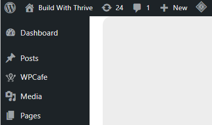
Step 1: Navigating to Your Dashboard
First things first, head over to your Thrive Themes dashboard. This is your control center where all the magic happens. Here’s how you do it:
Navigate to the Thrive Dashboard.
Step 2: Opening the Page for Editing
One of the great features of Thrive Themes is that you can edit the header directly on the page without needing to access a separate template. This makes the process quicker and more straightforward. Here’s what you need to do:
Go to the page you want to edit.
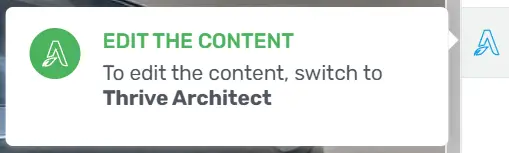
Click “Edit with Thrive Architect”.
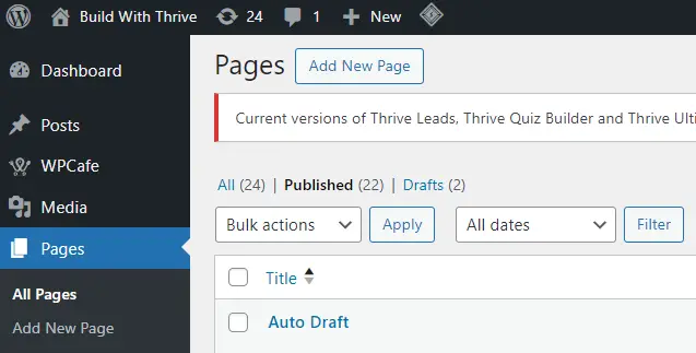
You should now see your page ready for editing.
Step 3: Editing the Pre-Made Hero Section
Now, let’s focus on the Hero Section. Typically, you’ll have a pre-made section ready to go. Here’s how you access it:
Open the pre-made Hero Section (Sample).
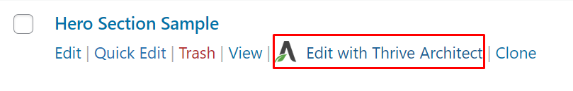
Click on “Edit with Thrive Architect”.
Step 4: Understanding the Current Layout
Before making any changes, take a moment to understand the current layout. You’ll notice that the header has a white background and is separate from the Hero Section container. Our goal is to overlay the header on top of the Hero Section seamlessly.

Step 5: Overlaying the Header
To begin editing the header, we need to switch to the Thrive Theme Builder. Follow these steps:
Go to Thrive Theme Builder.
Click on the logo on the right side.

Step 6: Setting the Z-Index for the Header
The z-index is a crucial concept in web design that determines the stack order of elements. Here’s how you set it for the header:
Go to Layout & Position.
Click on ‘Advanced’.
Set the z-index to 99999.
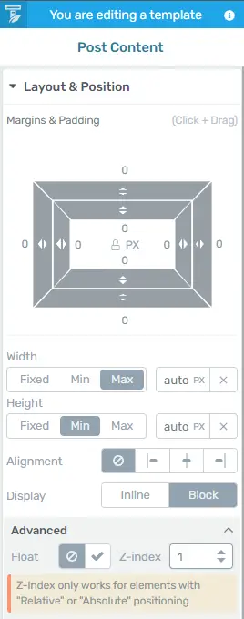
This ensures the header stays on top of everything else.
Step 7: Positioning the Header Absolutely
Absolute positioning will allow the header to float over the hero section. Here’s how you do it:
In the Layout & Position settings, select ‘Position’.
Choose ‘Absolute’.
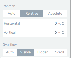
Now, the header should overlay on top of the Hero Section.
Step 8: Adjusting the Hero Section
To make sure everything looks perfect, we need to adjust the Hero Section slightly. Follow these steps:
Click on the Architect logo on the right side.
Go to Layout and Position.
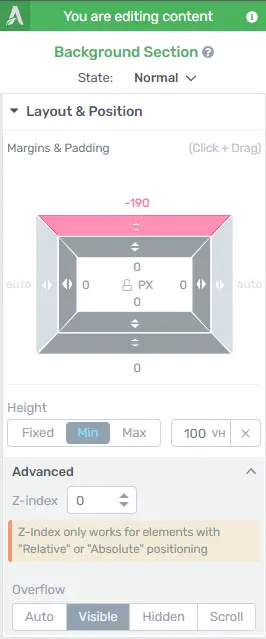
Adjust the margin to ensure proper alignment.
Step 9: Ensuring Responsiveness
A crucial part of web design is making sure your site looks great on all devices. Here’s how to check and adjust for responsiveness:
Preview your page in mobile, tablet, and desktop views.

Make any necessary adjustments to margins, padding, and positioning.
Step 10: Final Adjustments and Review
Before wrapping up, review all the changes you’ve made. Ensure that the header and hero section are perfectly aligned and that the overall design looks seamless.
Benefits of Overlaying the Header
Overlaying the header offers several benefits:
Enhanced Visual Appeal: It creates a modern and clean look.
Improved User Experience: Users can navigate your site more easily.
Common Issues and Troubleshooting
You might encounter a few issues along the way. Here are some common problems and how to fix them:
Header Not Overlaying Correctly: Check the z-index and position settings.
Responsive Design Issues: Ensure margins and paddings are adjusted for different devices.
Conclusion
Overlaying a menu on top of the hero section is a simple yet powerful way to enhance your website’s design and user experience. By following these steps, you can achieve a professional, seamless look similar to what you see on high-end sites like Tesla’s.


