

Introduction
Thrive Architect is a powerful and user-friendly page builder for WordPress that allows you to create stunning web pages with ease. Among its many elements, the Columns Element is a versatile tool that enables you to organize content into multiple columns, enhancing the visual appeal and functionality of your website. In this tutorial, we’ll dive into the ins and outs of using the Columns Element in Thrive Architect to create visually appealing and well-structured web pages.
Understanding the Columns Element
The Columns Element is a fundamental building block that allows you to structure your content in a grid-based layout. It provides a flexible framework, breaking away from traditional single-column designs. This dynamic element opens up a world of possibilities for creating engaging and responsive web pages.
Adding the Columns Element
- Access Thrive Architect: To begin, open your WordPress dashboard and navigate to the page or post where you want to add columns using Thrive Architect.
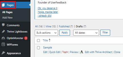
- Open the Page Editor: Once you’re on the desired page or post, click on the “Edit with Thrive Architect” button to launch the Thrive Architect editor.
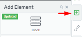
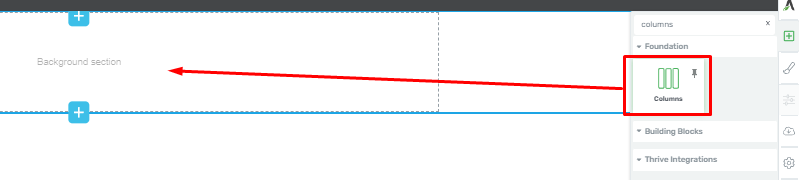
- Find the Plus Symbol: Look for the plus symbol located in the left sidebar of the Thrive Architect editor. This is where you’ll access various elements to add to your page.
- Search for Columns Element: In the elements library, either scroll down or use the search bar to find the “Columns” element.
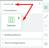
- Drag and Drop: After locating the Columns Element, simply drag and drop it onto your page where you want the columns to appear.
Configuring the Columns Element
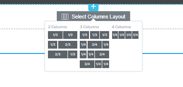
Once you’ve added the Columns Element to your page, a window will appear, allowing you to customize it to suit your needs.
Setting the Number and Proportions of Columns
- Choose the Number of Columns: You can select the number of columns you want in your layout. This can vary from two to as many as you need.
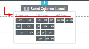
- Adjust Column Proportions: You can also determine the proportions of each column by selecting the appropriate options that best fit your design vision.
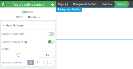
Customizing Column Options
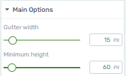
- Gutter Width and Minimum Height: Easily adjust the “Gutter Width” and “Minimum Height” of your columns by sliding the provided sliders or entering specific values in the corresponding boxes. These options can help you fine-tune the spacing and size of your columns.
- Vertical Position: Modify the vertical position of your columns to control how they align on your page.

Styling Your Columns
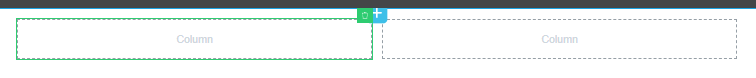
- Reverse Column Order: Activate this option to switch the positions of the columns, creating a dynamic layout effect.

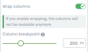
- Column Breakpoint: This feature becomes active when you toggle the “Wrap Columns” switch button. The “Column Breakpoint” sets the width at which columns will stack vertically on smaller screens. Adjust this breakpoint by sliding the provided slider.
- Reset Column Layout: If you wish to change the layout of your columns after initially selecting the number of columns, you can click the “Reset Column Layout” button. This allows you to choose from various column variations based on your selected number.

- Single Column Customization: For further customization, you can select and modify individual columns from the left sidebar.
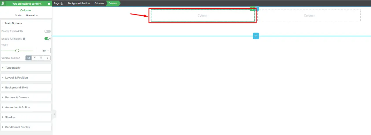
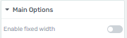
- Enabling Fixed Width: Use the “Enable Fixed Width” option to specify column widths in pixels, providing precise control over your layout. Drag the slider to adjust the width as needed.
- Inserting Elements: Thrive Architect allows you to insert various elements into your columns, not just text. You can add buttons, images, and more to create engaging content.
Creating Responsive Column Layouts in Thrive Architect
Thrive Architect is a powerful WordPress plugin that allows you to design and customize your website’s layout easily. Creating responsive column layouts is essential for ensuring your website looks great on various devices. Follow these steps to achieve this using Thrive Architect:
Accessing Thrive Architect
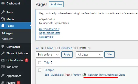
Navigate to the page or post where you want to create the responsive column layout.
Click on the “Edit with Thrive Architect” button.
Adding a New Section
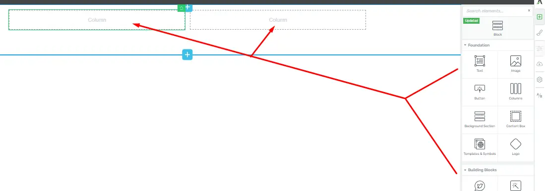
Once inside Thrive Architect, locate the (+) icon for adding elements.
Click on the (+) icon and select “Section” from the menu.
Choosing the Column Layout
Within the new section, click on the “Column Layout” element.
A menu will appear allowing you to select the desired column layout. Choose the one that fits your design.
Adjusting Column Widths
Click on the individual columns within the section.
A sidebar menu will appear. Locate and adjust the “Column Width” option to your preference. You can do this for each column to achieve the desired proportions.
Adding Content to Columns
Click inside each column to add content.
You can insert elements like text, images, buttons, or any other content that you want to display.
Previewing and Adjusting Responsiveness
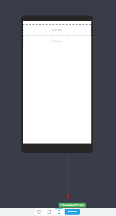
Click on the (Preview) button to see how your layout looks on different devices.
If adjustments are needed, switch back to edit mode and make the necessary changes to ensure responsiveness.
Save Work
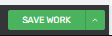
Once you’re satisfied with the layout, click the “Save Work” button in the upper right corner.
Check Responsiveness on Different Devices
Open your website on various devices (desktop, tablet, and mobile) to ensure that the column layout adjusts appropriately.
Enhancing User Experience: Best Practices for Using Columns in Thrive Architect
Understand the Purpose of Columns
Determine Your Layout Goals
Before diving into column design, identify the purpose of the columns on your webpage. Are you looking to showcase product features, create a pricing table, or present a gallery of images? Understanding your goals is crucial for designing effective columns.
Match Content to Column Structure
Once you’ve established your goals, ensure that your content aligns with the chosen column structure. For instance, use a two-column layout for a side-by-side comparison or a three-column layout for showcasing different products.
Create Engaging and Responsive Columns
Choose the Right Number of Columns
It’s essential to select the appropriate number of columns. Two columns are great for comparisons, while three or more can be used for content variations. Experiment and choose the one that best suits your content.
Column Width and Spacing
Properly manage column width and spacing. Ensure that columns are not too narrow, which may lead to cramped content, or too wide, which could be visually overwhelming. Maintain consistent spacing between columns for a polished look.
Use Background Colors and Borders
Add background colors to your columns to make them visually distinct. Consider using borders to separate columns and create a clear visual hierarchy.
Content Placement and Alignment
Prioritize Content Hierarchy
Decide which content elements should take precedence within each column. For example, in a product comparison table, the product name, price, and key features should be the most prominent.
Text and Image Alignment
Ensure that text and images are properly aligned within the columns. Use the alignment options in Thrive Architect to maintain a consistent and professional appearance.
Optimize for Mobile Devices
Responsive Design
Test your column layout on various devices to ensure it adapts seamlessly. Responsive design is crucial for providing an excellent user experience, regardless of the screen size.
Hide Unnecessary Columns
In some cases, you might need to hide specific columns on mobile devices to improve readability. Thrive Architect provides options for column visibility based on device type.
Conclusion
Enhancing user experience through effective column usage in Thrive Architect can significantly impact the success of your website. By understanding the purpose of columns, creating engaging and responsive designs, carefully placing content, and optimizing for mobile, you can create a visually appealing and user-friendly website.


