
Introduction
In the world of web design, creating a visually appealing and well-structured layout is crucial. Elementor, the popular page builder plugin for WordPress, offers a range of widgets to help you achieve just that. One such widget is the Divider widget, which serves to add a visual line, effectively dividing different sections or widgets on your web page. In this step-by-step tutorial, we will walk you through the process of adding a Divider widget in Elementor.
Getting Started with Divider Widget
Step 1: Locate and Add the Divider Widget
To get started with creating a Divider widget in Elementor, follow these simple steps:
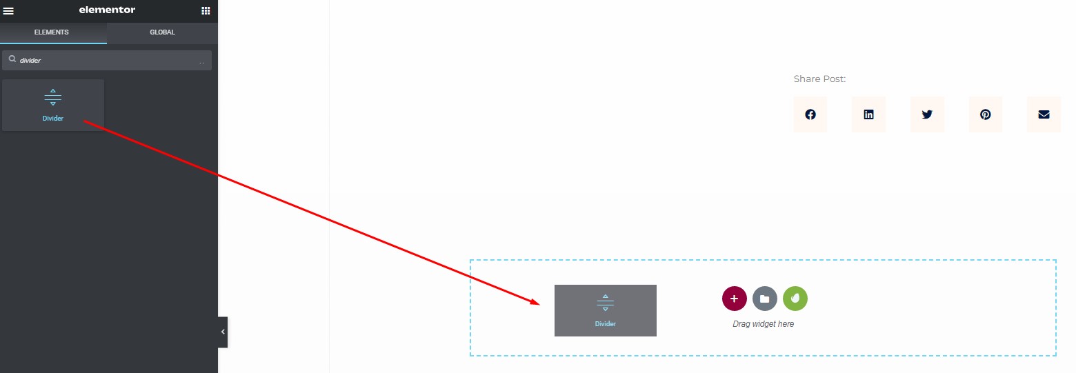
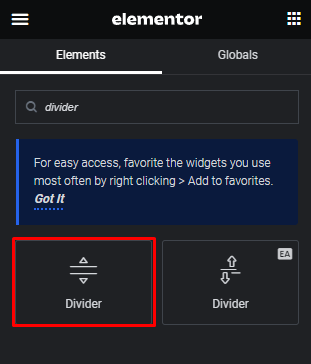
- Open your Elementor editor and access the left-hand menu bar.
- Search for the “Divider” widget.
- Once you’ve found it, drag and drop the Divider widget into your desired section on the page.
Step 2: Configuring the Elementor Divider
After adding the Divider widget, it’s time to configure its settings. Here’s how:
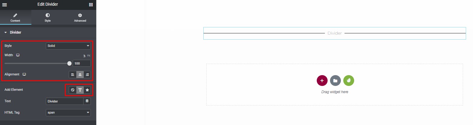
Click on the Divider widget you’ve just added to select it.
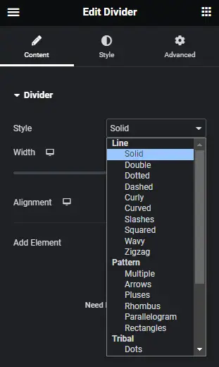
Navigate to the “Content” tab to access various customization options.
You’ll have the following settings to work with:
- Styles: Choose from a variety of classic and patterned styles for your divider, including options like solid lines, curly, wavy patterns, tribal designs, arrows, pluses, and more.
- Width: Adjust the width of the divider by setting it as a percentage, ranging from 0% to 100%.
- Alignment: Select whether you want the divider to align with the left, middle, or right of the page.
- Content: Choose between “Text,” “None,” or “Icon.” If you opt for “Text” or “Icon,” you can upload or select an icon from the icon library.
Step 3: Customizing Elementor Divider Styles
To give your Divider widget a unique look, you can customize the styles for both the divider and text. Here’s how to do it:
Customizing the Divider
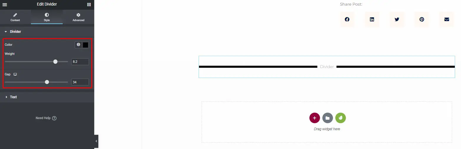
Scroll down to the “Divider” section under the “Style” tab.
Customize the following aspects of the divider:
- Color: Set the color of the divider to match your website’s color scheme.
- Weight: Adjust the thickness of the divider line.
- Gap: Define the gap between the divider and surrounding elements.
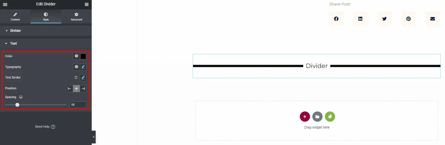
Customizing the Text
Navigate to the “Text” section under the “Style” tab.
Modify the text’s appearance using the following options:
- Color: Choose a color that complements your design.
- Typography: Adjust the font, size, and style of the text.
- Text Stroke: Add a text stroke effect to make the text stand out.
- Position: Control the position of the text relative to the divider.
- Spacing: Set the spacing between the text and the divider to achieve the desired visual effect.
By following these simple steps, you can create a Divider widget in Elementor that perfectly suits your website’s design and layout.
How to Add an Icon to the Divider in Elementor?
Elementor is a powerful and popular page builder for WordPress that empowers website creators to design stunning, responsive, and engaging websites with ease. One of the ways to enhance your web pages’ visual appeal and user experience is by adding icons to dividers in Elementor. In this comprehensive guide, we’ll walk you through the step-by-step process of adding icons to dividers in Elementor, allowing you to create visually stunning web pages that stand out from the competition.
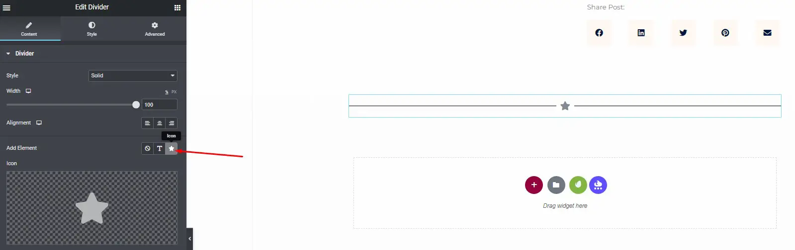
Step 1: Select the Icon
To get started with adding an icon to a divider in Elementor, follow these simple steps:
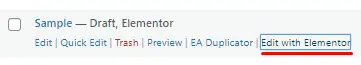
- Open Elementor: Log in to your WordPress dashboard and access the page you want to edit. Then, click on the “Edit with Elementor” button to open the Elementor editor.
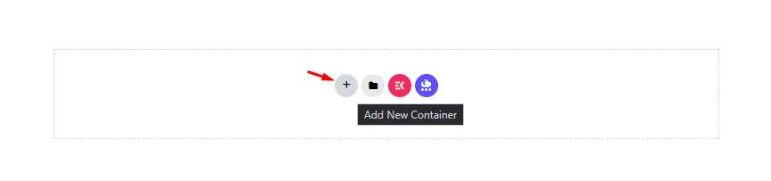
- Add Divider Widget: In the Elementor editor, locate the section where you want to add the divider with an icon. Click on the “+” icon to add a new section or widget, and search for the “Divider” widget. Add it to your page.
- Choose the Icon: Within the Divider widget settings, you’ll find an option to select an icon. Click on this option and choose the icon that best suits your content or design.
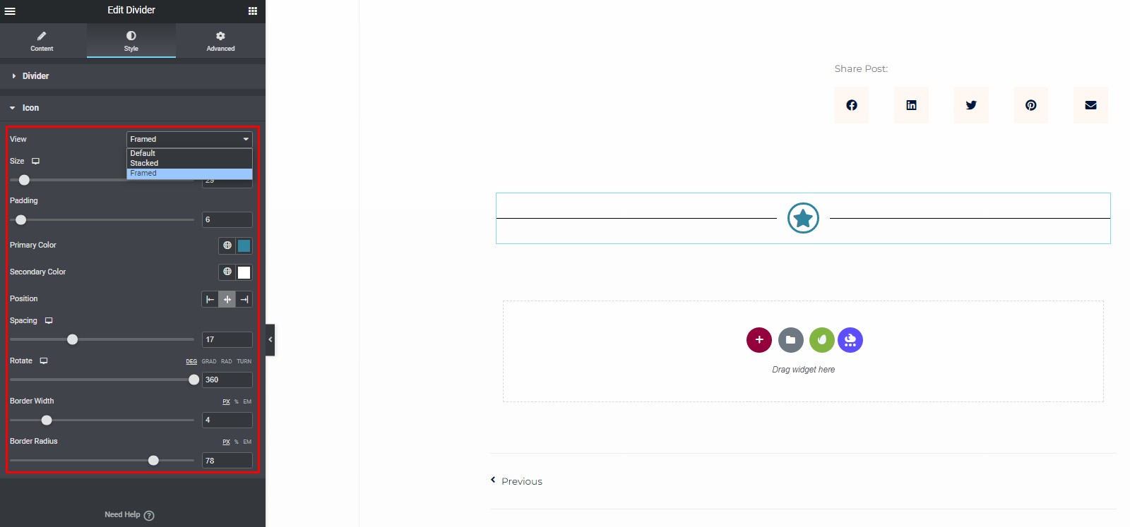
Step 2: Customize Icon Style
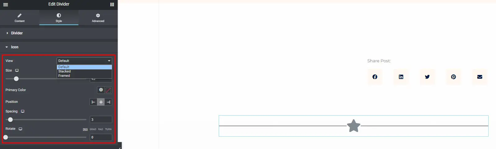
Elementor offers three different views for the icon within the Divider widget: default, stacked, and framed. Each view has its own unique customization options. Let’s explore each view in detail.
Default View
In the default view, you can customize the icon as follows:
- Set Icon Size: Adjust the size of the icon to fit your design.
- Select Icon Color: Choose the color of the icon that complements your website’s color scheme.
- Icon Position: Decide whether the icon should appear to the left, center, or right of the divider line.
- Icon Spacing: Slide the spacing control to add space between the icon and the divider line (ranging from 1 to 50).
- Icon Rotation: Adjust the icon’s rotation by sliding the control from 0 to 360 degrees.
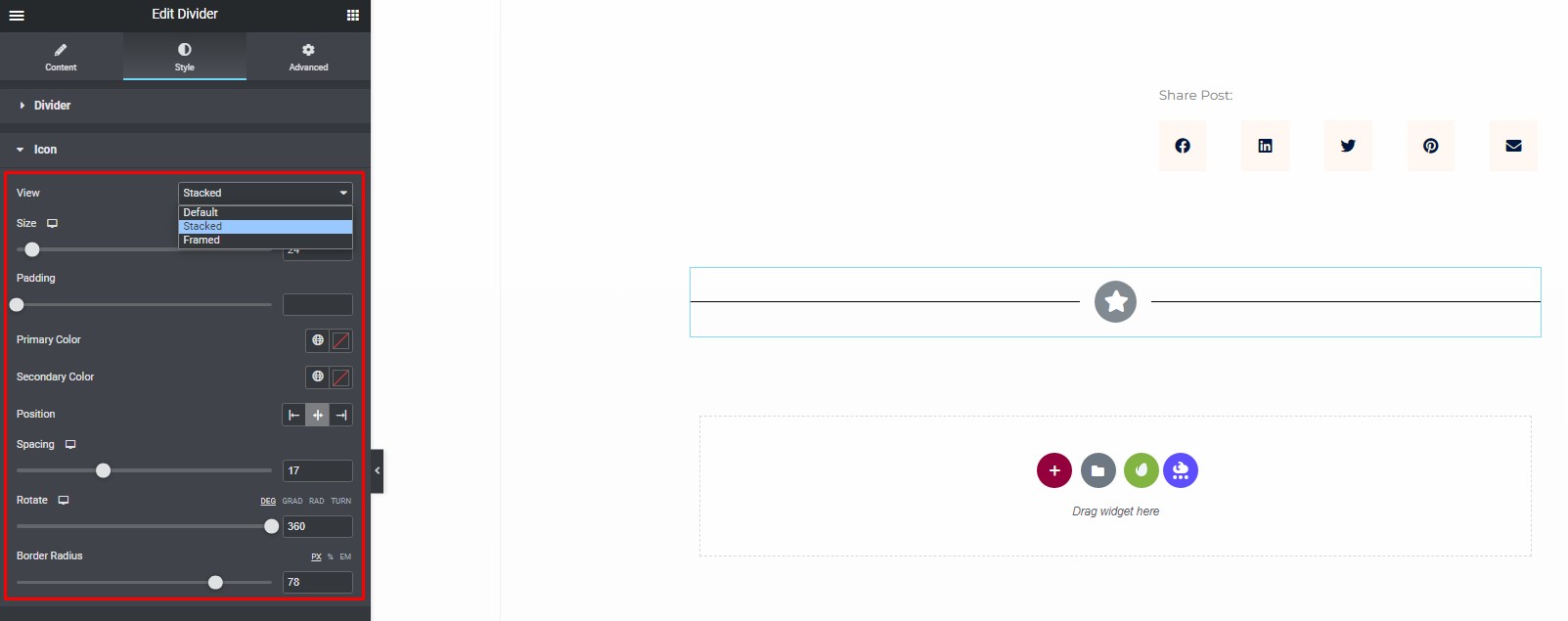
Stacked View
If you prefer the stacked view, you can customize the icon as follows:
- Icon Size: Determine the size of the icon in relation to your design.
- Border Padding: Set the padding around the icon for a precise look.
- Stack Background Color: Choose a background color for the stacked icon.
- Icon Color: Pick a color for the icon that complements your design.
- Icon Position: Decide whether the icon should be placed to the left, center, or right of the divider.
- Spacing: Adjust the spacing between the icon and the divider line (ranging from 1 to 50).
- Rotation: Rotate the icon by sliding the control from 0 to 360 degrees.
- Border Radius: Set the background’s border-radius to achieve rounded corners or a circular stack.
Framed View
In the framed view, you can customize the icon as follows:
- Icon Size: Set the size of the icon according to your design.
- Padding: Adjust the padding around the icon for a specific look.
- Frame Border Color: Choose the color for the frame border that complements your design.
- Icon Color: Pick a color for the icon itself.
- Icon Position: Decide whether the icon should be to the left, center, or right of the divider.
- Spacing: Control the space between the icon and the divider line (ranging from 1 to 50).
- Rotation: Rotate the icon by sliding the control from 0 to 360 degrees.
- Border Width and Radius: Customize the border width and border radius for the icon to achieve your desired look.
Final Steps
After you’ve finished customizing your icon within the Divider widget, it’s important to save your changes. To do this:
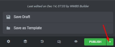
Save Your Work: In the Elementor editor, click the “Save” or “Save Draft” button at the bottom of the page to ensure your changes are saved.
By following these steps, you can add icons to dividers in Elementor, making your website’s design more visually appealing and engaging for your visitors. With these dynamic design options, your website will truly stand out from the crowd.
Enhancing Website Design with Elementor Dividers
Elementor is a popular tool for improving the appearance of your WordPress website. Elementor Dividers can be used to create stylish separations on your site. This step-by-step guide will show you how to effectively use Elementor Dividers.
Step 1: Create or Edit a Page
- In your WordPress dashboard, go to “Pages.”
- Choose whether to create a new page or edit an existing one.
Step 2: Start Using Elementor
While creating or editing a page, locate and click “Edit with Elementor.”
Step 3: Make a Section
- Click “+ Add Section” to establish a new segment of your page.
- Configure the section’s layout, such as selecting between one column or two columns.
Step 4: Personalize the Section
- Click on the section to highlight it.
- In the sidebar, customize the section’s appearance, background, and other attributes.
Step 5: Add Content
Utilize drag-and-drop functionality to insert widgets containing text, images, buttons, or other content into the section.
Step 6: Add an Elementor Divider
- Click the “+” icon to introduce a new element.
- Search for “Divider.”
- Drag and drop the “Divider” widget into your section.
Step 7: Customize the Divider
- Click on the Divider element to select it.
- In the sidebar, modify the Divider’s appearance, including its type (line, wave, zigzag), color, width, and height.
- Position the Divider above or below other components within the section.
Step 8: Save Your Changes
Click “Update” to save your progress within Elementor.
Step 9: Preview and Publish
- Click “Preview” to view your page with the Elementor Divider.
- If it appears as desired, click “Publish” to make it live on your website.
Step 10: Add Dividers to Other Sections (If Needed)
If you require dividers in other parts of your page, repeat the previous steps.
Step 11: Check Out Your Improved Website
Visit your website to observe how Elementor Dividers have enhanced its appearance.
By following these straightforward steps, you can effectively enhance the visual appeal of your website using Elementor Dividers. Experiment with various divider styles and settings to achieve the desired look for your site.


