
Introduction
Thrive Architect is a feature-rich WordPress page builder plugin designed for intuitive and efficient website building. With its drag-and-drop functionality, users can effortlessly create stunning web pages without the need for coding skills. One powerful tool for achieving this customization is the Button Element. In this comprehensive tutorial, we will walk you through the process of how to add and customize button elements in Thrive Architect. Follow the step-by-step instructions below to effectively utilize this feature and tailor it to your preferences.
Understanding Button Elements
Buttons are more than mere click triggers; they are the gateways to interaction. Whether it’s directing users to another page, submitting a form, or making a purchase, buttons are the silent conductors of online actions. Understanding the different types of buttons and their role in web design is the first step towards effective customization.
Adding the Button Element
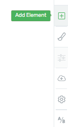
To begin, add the Button element to your page by following the standard process for adding any Thrive Architect element. Navigate to the right sidebar and click on the plus sign (+).
Locate the Button Element
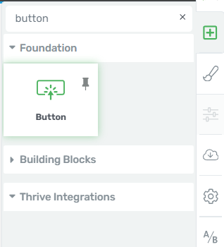
In the Element menu, either scroll down or use the search bar to locate the “Button” element.
Drag and Drop
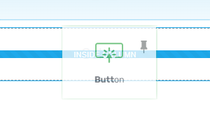
Once you’ve found the Button element, drag and drop it to your desired location on the page.
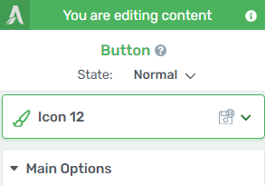
Access Element Options
After adding the Button element, its options will appear in the left sidebar. You can now proceed to customize the Button using the “Style Options,” “Main Options,” and other general options.
Add and Customize Button
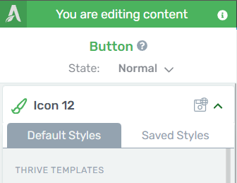
Template Button
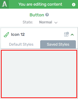
In the left sidebar, locate the “Template Button” section and click on the “Template Button” field to open a pop-up.
Choosing a Template
Within the pop-up, you will find two tabs, “Default Styles” and “Saved Styles.” Under “Default Styles,” select from pre-built button styles. If you are not using a Smart Landing Page, you’ll see “Thrive Templates.” If you are using a Smart Landing Page, you’ll also have access to the “Template Styles” section.
Applying a Style
Scroll through the styles in the “Default Styles” tab, select your preferred style, and click “Apply.”
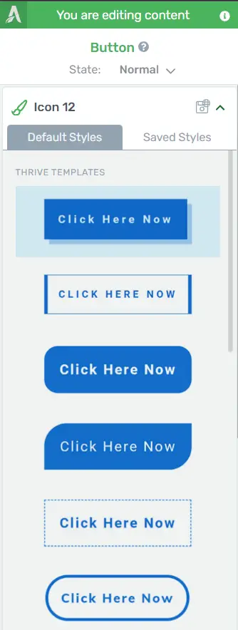
For “Saved Styles,” choose a style and click “Apply.” You can change the button’s style at any time using the “Style Options” section.
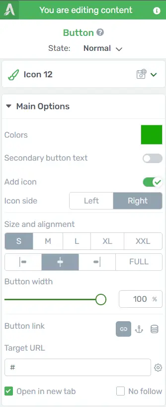
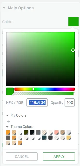
Main Options
Colors: In the “Main Options” section, locate the “Colors” option. To change the button’s color, click on the color box next to “Master Color” and use the color picker or enter a HEX/RGB code. You can also select colors from “My Colors” and “Theme Colors.” Don’t forget to click “Apply” to save your changes.
Secondary Button Text: Activate this option by clicking the switch next to it. It adds a second text element beneath the existing one.

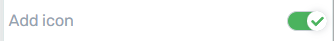
Add Icon: Activate the “Add Icon” option and choose the icon’s placement (Left/Right). Customize the icon’s type, size, and color by clicking on it.
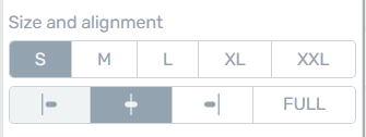
Size and Alignment: Select a button size (S/M/L/XL/XXL) and alignment (Align Left/Align Center/Align Right/Full Width).
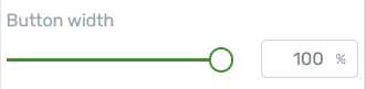
Button Width: Adjust the button’s width by dragging the slider or entering a value manually.
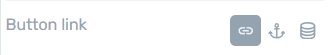
Button Link: Set a link for the button by configuring the “Static Link,” “Jumplink,” or “Dynamic Link” options.
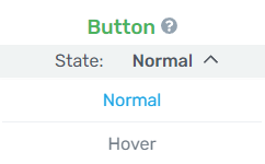
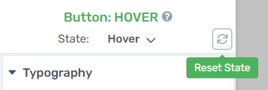
Hover State: Button Hover Effect
Use the “Hover State” option to determine how the button changes when a user hovers over it. Click “Normal” and choose “Hover” to configure the hover state.
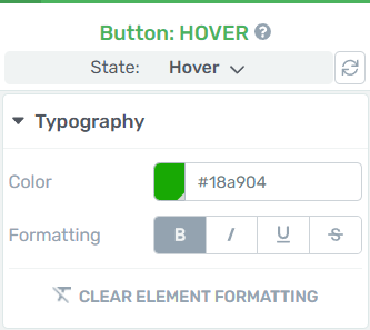
Customize Hover State
In the hover state, change aspects like the background color, font, borders, and shadows. Modify these settings in the left sidebar under “Hover.”
Reset Hover State
If you’re not satisfied with the hover state customization, use the “Reset State” option to revert to the normal state.
Further Customization
Edit Text: To edit the text inside the button, click on it. Customize the text using the options in the left sidebar.
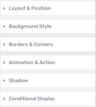
General Options: Explore additional options in the “General Options” section, such as “Borders & Corners,” “Layout & Position,” and more to fine-tune your button.
By following these step-by-step instructions and utilizing the various customization options, you can effectively use and style the Button element in Thrive Architect to suit your design needs.
Enhancing User Experience: Advanced Button Customization in Thrive Architect
Thrive Architect provides advanced customization options for buttons, allowing you to create a more engaging and visually appealing user experience on your website. This step-by-step guide will walk you through the process of enhancing button customization using Thrive Architect.
Step 1: Accessing Thrive Architect Editor
Navigate to the page or post where you want to customize a button.
To open the Thrive Architect editor, click the “Edit with Thrive Architect” button.
Step 2: Selecting the Button Element
Within the Thrive Architect editor, locate the button element you want to customize.
Click on the button to select it.
Step 3: Opening the Button Settings
With the button selected, look for the “Button” tab in the left sidebar.
Click on the “Button” tab to open the button settings panel.
Step 4: Customizing Button Text and Style
In the button settings panel, you can customize the button text by editing the “Text” field.
Explore the “Style” section to modify the button’s appearance, including colors, borders, and shadows.
Step 5: Adding Hover Effects
Navigate to the “Hover” tab within the button settings panel.
Enable the “Hover” option to add special effects when users hover over the button.
Customize the hover effects, such as color changes or animations, to enhance user interactivity.
Step 6: Adjusting Size and Alignment
Explore the “Size & Alignment” tab to adjust the button’s size, alignment, and spacing.
Use the provided options to control the width, height, and position of the button.
Step 7: Incorporating Iconography
To add an icon to your button, go to the “Icon” tab within the button settings panel.
Choose an icon from the available library and customize its size, color, and position.
Step 8: Advanced Customization with Custom CSS
For users familiar with CSS, navigate to the “Advanced” tab.
Enter custom CSS code to implement more intricate design changes beyond the standard settings.
Step 9: Preview and Save
After making your desired customizations, click the “Preview” button to see how the button looks in action.
If you’re satisfied, click “Save” to apply the changes to your page or post.
Conclusion
By following these steps, you can take advantage of Thrive Architect’s advanced button customization features to create visually stunning and user-friendly buttons on your WordPress website. Experiment with different options to find the perfect combination that enhances the overall user experience.


