

Introduction
In the realm of website design, crafting a transparent header menu can significantly enhance the aesthetic appeal and user experience of your WordPress site. With the Bricks Builder Page Builder, this process becomes remarkably straightforward, allowing you to achieve a sleek and modern design effortlessly. Bricks Builder empowers you to create stunning web pages with its intuitive drag-and-drop interface, making it the perfect tool for implementing innovative design elements like transparent header menus. Let’s delve into the step-by-step process of creating a transparent header menu using Bricks Builder and elevate the visual allure of your website.
Understanding Bricks Builder
What is Bricks Builder?
Bricks Builder is a versatile website building tool known for its intuitive interface and robust features. It empowers users to create professional-looking websites without the need for coding knowledge.
Why choose Bricks Builder?
Bricks Builder stands out for its ease of use, flexibility, and extensive customization options. Whether you’re a beginner or an experienced web designer, Bricks Builder offers the tools you need to bring your vision to life.
Steps to Create a Transparent Header Menu in Bricks Builder
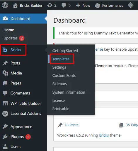
Step 1: Accessing the Templates
To commence the journey towards crafting a transparent header menu, navigate to your WordPress Dashboard and locate the “Templates” option.
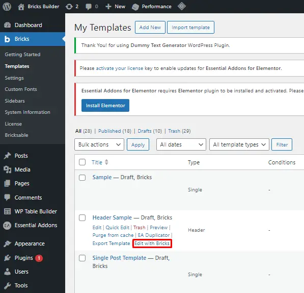
Step 2: Editing with Bricks
Upon accessing the Templates section, you’ll notice a pre-made Header Sample template. Click on “Edit with Bricks” to delve into the customization process.
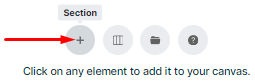
Step 3: Adding a Section
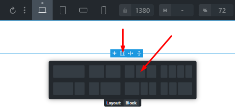
Within the Bricks Builder editor, the first step is to add a section to your template. This section will serve as the foundation for your transparent header menu.
Step 4: Incorporating a Row
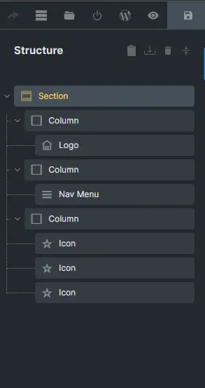
Within the newly created section, add a row. Opt for a row configuration that accommodates the various elements of your header, such as the Logo, Navigation Menu, buttons, and social icons.
Step 5: Inserting Elements
Now, populate the columns of the row with the necessary elements. These include the Logo, Navigation Menu, buttons, and social icons. Customize these elements according to your design preferences to ensure cohesiveness with the overall aesthetic of your website.
Step 6: Customizing the Section
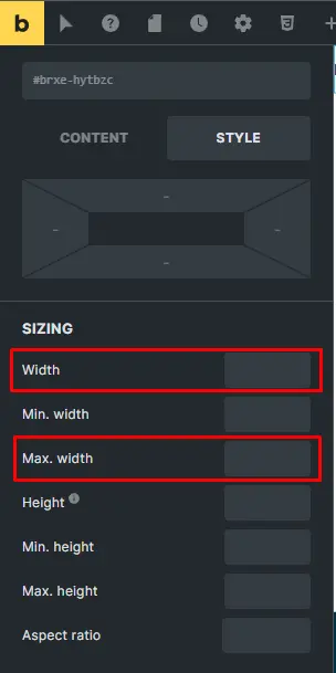
After incorporating the essential elements, proceed to customize the section itself. Adjust the content width to full width and tweak the minimum height as required. To achieve the desired transparent effect, ensure that the background color is set to transparent or with minimal opacity.
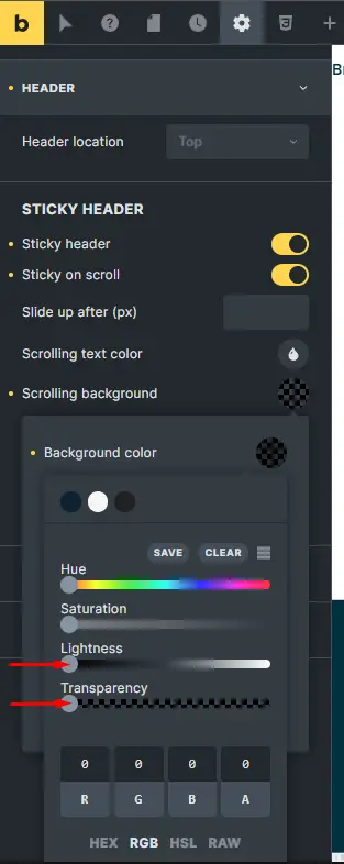
Step 7: Configuring Settings
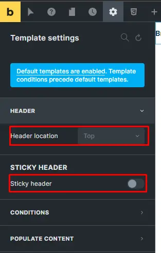
Navigate to the Settings section, go to template settings, and click on “Header”. Set the Header Location to “Top” and activate the toggle button for the sticky header and Sticky on Scroll functionality.
Step 8: Adjusting Background Transparency
Lower the transparency of the scrolling background to your liking, or opt to change it to a background style that complements the transparent header menu.
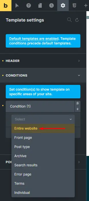
Step 9: Setting Conditions
Return to the Settings menu and click on “Conditions”. Select the entire website to ensure that the transparent header menu appears consistently across all pages. Additionally, deactivate any unnecessary toggle buttons.
Step 10: Preview and Finalize
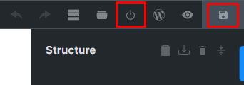
With all modifications in place, update the changes and preview the modifications to ensure a seamless user experience across various devices. This final step allows you to identify any potential issues and make adjustments accordingly.
Tips for Optimizing a Transparent Header Menu

Choosing the right background image or color: Select a background image or color that allows the menu items to remain clearly visible while still creating a sense of transparency.
Ensuring readability of menu items: Pay attention to the contrast between the menu text and the background to ensure readability, especially on smaller screens or low-resolution devices.
Testing across different devices and screen sizes: Preview your website on various devices and screen sizes to ensure that the transparent header menu maintains its visual appeal and functionality across different platforms.
Best Practices for Designing a Transparent Header Menu
Keeping it simple and unobtrusive: Avoid cluttering the header menu with too many elements or distractions. Keep it clean and minimalistic to maintain a sleek and modern look.
Consistency with website branding: Ensure that the design of your transparent header menu aligns with the overall branding and design aesthetics of your website to create a cohesive user experience.
Aligning with overall design principles: Incorporate the transparent header menu seamlessly into your website’s design layout, taking into account factors such as spacing, alignment, and hierarchy.
Conclusion
Creating a transparent header menu in Bricks Builder offers a simple yet effective way to elevate the visual appeal and functionality of your WordPress website. By following the aforementioned steps, you can seamlessly integrate this modern design element into your site, enhancing its overall aesthetics and user experience.


