

Introduction
In today’s digital age, where visual appeal is paramount, having an eye-catching image gallery on your website can significantly enhance user engagement. In this step-by-step tutorial, we will explore the process of creating a Black and White Color Image Gallery Carousel using the versatile Thrive Architect page builder.
Understanding Black and White Image Galleries
Black and white imagery has a classic allure that transcends time. Its simplicity and focus on contrast often evoke a sense of nostalgia and sophistication. Incorporating black and white images into your website can elevate its aesthetic, providing a unique and memorable user experience.
Accessing the Image Gallery
Open your editor.
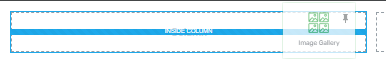
Locate and select the “Image Gallery” element from your editor’s available elements.
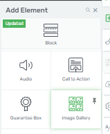
Drag and drop the “Image Gallery” element onto your editing canvas.
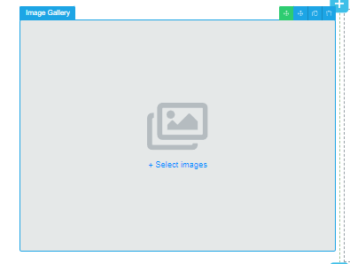
Choose Images for the Gallery
Within the newly added “Image Gallery” element, select the images you want to appear in the gallery. You can usually do this by clicking on the element and uploading or selecting the images you want to include.
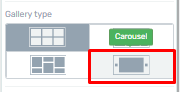
Select the Carousel Gallery Type
On the left sidebar of your editor, navigate to the gallery type options.
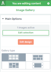
Choose the “Carousel” gallery type.
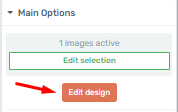
Customize the Gallery
Continue using the options on the left sidebar.
Click the “Edit Design” button to customize the gallery’s appearance.
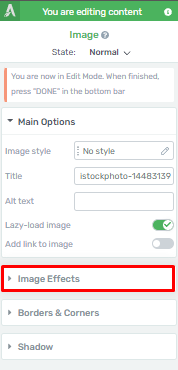
Explore the various customization options provided.
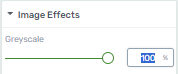
Apply Grayscale Effect
In the customization options, locate and click on the “Image Effects” section.
Adjust the “Grayscale” setting to 100 percent. This will make the images appear black and white initially.
Switch to Hover State
To make the images turn to color on hover, access the “Hover” state.
At the top of the left sidebar, find the “State: Normal” section option.
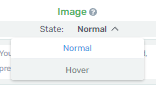
Click on “Hover” to switch to the hover state.
Customize Hover State
In the “Hover” state, customize how you want the images to appear when hovered over.
Note that changes made in the “Hover” state will affect the appearance of the images during hover.
Since you want the images to turn to color, make sure the “Grayscale” option is set to 100 percent (which it usually inherits from the “Normal” state).
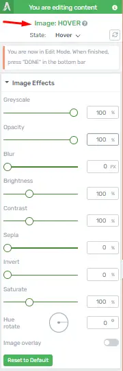
Set Grayscale to 0%
Adjust the “Grayscale” setting to 0 percent to remove the black and white effect during hover.
Save and Preview
After customizing the gallery and ensuring the hover effect is set as desired, click “Done” on the editor’s bottom section to exit “Edit Mode.”

Save your page
Preview your page to see the image gallery carousel with black and white images that transition to colored images on hover.
By following these step-by-step instructions, you can create the desired image gallery carousel effect in your editor.
Optimizing Mobile Responsiveness for Your Thrive Architect Image Carousel
To make your website look good and work well on phones and tablets, you need to make sure your image carousel works properly. This not only makes it easier for people to use your website, but it also helps your website show up higher in search results. We will show you how to make your image carousel work well on mobile devices.
Understanding the Importance of Mobile Responsiveness
Before we dive into the steps, let’s briefly discuss why mobile responsiveness is essential. With the majority of internet users accessing websites through their mobile devices, having a responsive design ensures that your content looks great and functions properly on screens of all sizes. Google also prioritizes mobile-friendly websites in its search results, which can significantly impact your site’s visibility and traffic.
Step 1: Accessing Your Thrive Architect
The first step in optimizing your image carousel is accessing your Thrive Architect. Here’s how you can do it:
Navigate to the page where your image carousel is located.
Click on “Edit with Thrive Architect” to open the editor.
Step 2: Identifying the Image Carousel Element
Once you’re in the Thrive Architect editor, you need to identify the specific image carousel element you want to optimize. Here’s how:
Click on the image carousel element within your page.
You’ll see options and settings related to the carousel in the left sidebar.
Step 3: Use the Mobile Preview Mode
To ensure your image carousel looks great on mobile devices, it’s essential to adjust the responsiveness. Follow these steps:
Use the options from the lower side of the editor.
Step 4: Testing Responsiveness
Before finalizing your changes, it’s crucial to test the responsiveness of your image carousel. Here’s how:
Exit the Thrive Architect editor and save your changes.
Preview your page on different mobile devices and screen sizes.
Ensure that the carousel adapts smoothly to varying screen dimensions.

Step 5: Optimizing Image Loading
Mobile users appreciate fast-loading websites. To optimize image loading for your carousel:
Compress and resize carousel images to reduce file size.
Use lazy loading to ensure images load as users scroll down the page.
Step 6: Mobile-Friendly Navigation
Make sure the navigation buttons of your image carousel are easily accessible on mobile devices. Adjust button size and placement as needed.
Step 7: Testing Across Browsers
Test your mobile-responsive image carousel across various web browsers to ensure compatibility and consistent performance.
Step 8: Monitoring Page Speed
Monitor your website’s page speed using tools like Google PageSpeed Insights. Address any speed-related issues that may affect mobile responsiveness.
Step 9: Regular Updates
Stay up-to-date with Thrive Architect updates and implement any mobile responsiveness improvements they offer.
Step 10: User Testing
Ask for feedback from users who access your website via mobile devices. Their insights can help you further enhance mobile responsiveness.
Conclusion
Optimizing the mobile responsiveness of your Thrive Architect image carousel is a crucial step in providing an exceptional user experience and boosting your website’s SEO ranking. By following these steps and staying committed to ongoing improvements, you’ll ensure that your website looks and performs flawlessly on mobile devices, keeping your audience engaged and satisfied.


