Table of Contents
Introduction
In the ever-evolving landscape of web design and development, creating visually appealing and user-friendly websites is paramount. Thrive Architect is a powerful page builder that can help you achieve just that. In this comprehensive tutorial, we will walk you through the process of how to float icons inside a column using Thrive Architect. By the end of this article, you’ll have a clear understanding of how to make your web content stand out and leave your competitors in the dust.
Understanding Thrive Architect Columns
Before delving into the specifics of icon placement, it’s essential to grasp the fundamentals of Thrive Architect’s column structure. Columns offer a streamlined way to organize content, allowing for a clean and structured layout on your webpage.
Step 1: Adding a Content Box
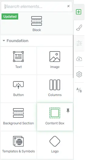
To begin, the first step to float icons inside a column is to use the content box element. This element serves as a container for your content, making it easier to manage and style.
- First, go to your Thrive Architect editor.
![]()
- Then, add a column to your desired section.
![]()
- After that, insert the content box element within the column.
Step 2: Insert an Icon and Text
Now that you have your content box in place, it’s time to add an icon and accompanying text.
- So, inside the content box, add the icon element.
![]()
- Next, insert the text element below the icon.
![]()
Step 3: Adjust Icon Size
For icons to be visually appealing and in harmony with your overall design, it’s crucial to adjust their size correctly. Here’s how to do it:
- Select the icon element.
- Then, navigate to the settings panel.
![]()
- Locate the “Size” option and adjust it to your preference.
![]()
Step 4: Layout and Position
To ensure that it will float icons inside a column correctly, follow these steps for layout and positioning:
- So, within the content box settings, go to the “Layout & Position” section.
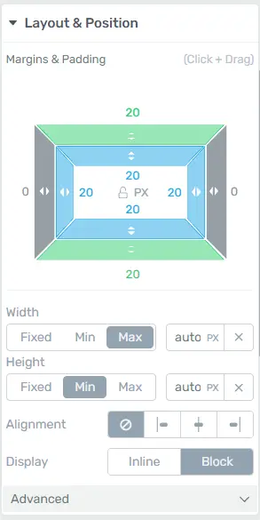
- Then, set the alignment to “Left.”
![]()
- Check the box for “Float.”
![]()
Step 5: Explore Customization Options
Thrive Architect offers a plethora of customization options for further enhancing your design:
- Background Style: Experiment with different background styles to make your content box visually appealing.
- Borders and Corners: Adjust border styles and corner radius to give your content box a unique look.
Remember, the key to success in the digital world is not just knowing the rules but mastering the tools that make it all possible. With Thrive Architect and the knowledge you’ve gained from this article, you’re well on your way to leaving other websites behind in the race for online dominance.
Responsive Design and Icon Floating in Thrive Architect: Best Practices
In the ever-evolving digital landscape, creating a seamless user experience is paramount for website owners. Responsive design and icon floating are two crucial elements that contribute to user-friendliness and overall website aesthetics. Thrive Architect, a powerful WordPress page builder, provides versatile tools to achieve this. In this article, we will guide you through the best practices for implementing responsive design and icon floating using Thrive Architect.
Why Is Responsive Design Important?
Responsive design ensures that your website adapts to various screen sizes and devices. This is crucial because users access websites on a wide range of devices, from desktops to smartphones and tablets. An unresponsive website can lead to a poor user experience and negatively impact your SEO.
The Role of Mobile-Friendly Design
![]()
Mobile-friendliness is a key aspect of responsive design. With the increasing use of smartphones for internet browsing, it’s essential to create a design that caters to the mobile audience. Thrive Architect provides tools to make your website mobile-friendly.
Thrive Architect’s Responsive Features
Thrive Architect offers an array of features that simplify the process of creating responsive designs. From flexible column layouts to mobile-specific styling, this plugin streamlines the entire design process.
Advantages of Using Floating Icons
Floating icons can significantly enhance your website. They can increase social media shares, improve navigation, and drive user interaction. Thrive Architect’s icon floating options allow for customization and creativity.
Step-by-Step Guide to Responsive Design
Responsive design involves several steps to ensure your website looks great on any device. Here’s a step-by-step guide:
Setting a Mobile-Friendly Foundation
To begin, design your website with mobile in mind. Choose a mobile-friendly theme and set the viewport meta tag.
Adapting Content for Different Screen Sizes
Use Thrive Architect’s responsive editing tools to adjust font sizes, image dimensions, and column layouts for various screen sizes.
Testing Responsiveness
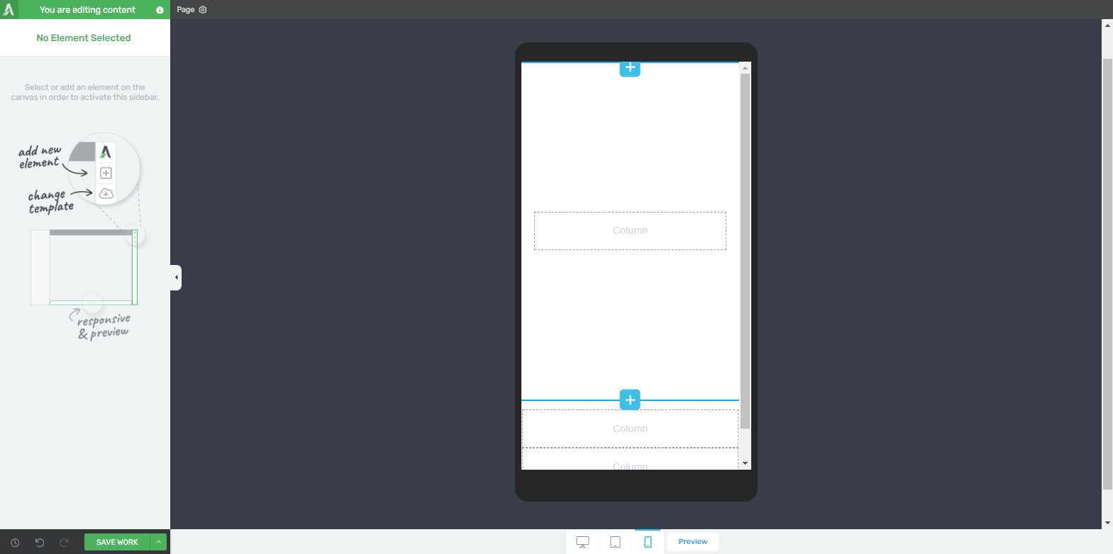
Before going live, thoroughly test your website on different devices and screen sizes. Address any issues that may arise during testing.
Implementing Floating Icons
Choosing Relevant Icons
Select icons that align with your website’s purpose. Whether it’s a shopping cart, a social media icon, or a contact button, make sure the icons serve a clear function.
Customizing Icon Placement
Thrive Architect enables you to precisely position and customize floating icons. Experiment with placements to find what works best for your website.
Animation and Interaction Options
Add subtle animations and interactions to your floating icons. These can capture users’ attention and encourage engagement.
Conclusion
Mastering the art of floating icons inside a column in Thrive Architect opens up a world of creative possibilities. Experiment, learn from your design choices, and continuously refine your approach to achieve a website that not only looks appealing but also offers a seamless user experience.
