

Introduction
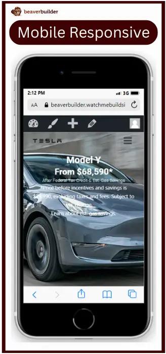
Beaver Builder is a powerful tool for creating stunning websites, but optimizing for mobile navigation requires special attention. Many users now rely on mobile devices to access the internet. Therefore, it’s crucial to optimize website navigation for mobile screens. In this guide, we’ll delve into creating a mobile-first mega menu using Beaver Builder. We’ll explore best practices to ensure your mega menu is user-friendly, accessible, and effective on mobile devices, leveraging the full potential of this robust page builder.
Understanding Mobile Mega Menus
What is a Mobile Mega Menu?
A mobile mega menu is a large, dropdown menu that displays various options in a two-dimensional layout. Unlike traditional dropdown menus, mega menus can contain multiple columns and a variety of content types, including images, icons, and even widgets.
Benefits of Using Mega Menus on Mobile
Mega menus are particularly useful for mobile devices due to their ability to display numerous options in a compact and organized manner. This helps in reducing the number of clicks needed to find content, improving navigation efficiency and overall user satisfaction.
Setting Up Mega Menus in Beaver Builder:
Let’s proceed with the step-by-step process of creating a mobile-first mega menu in Beaver Builder:
Step 1: Simplify Navigation
Hide unnecessary items and icons on mobile screens.
Limit top-level items to essentials.
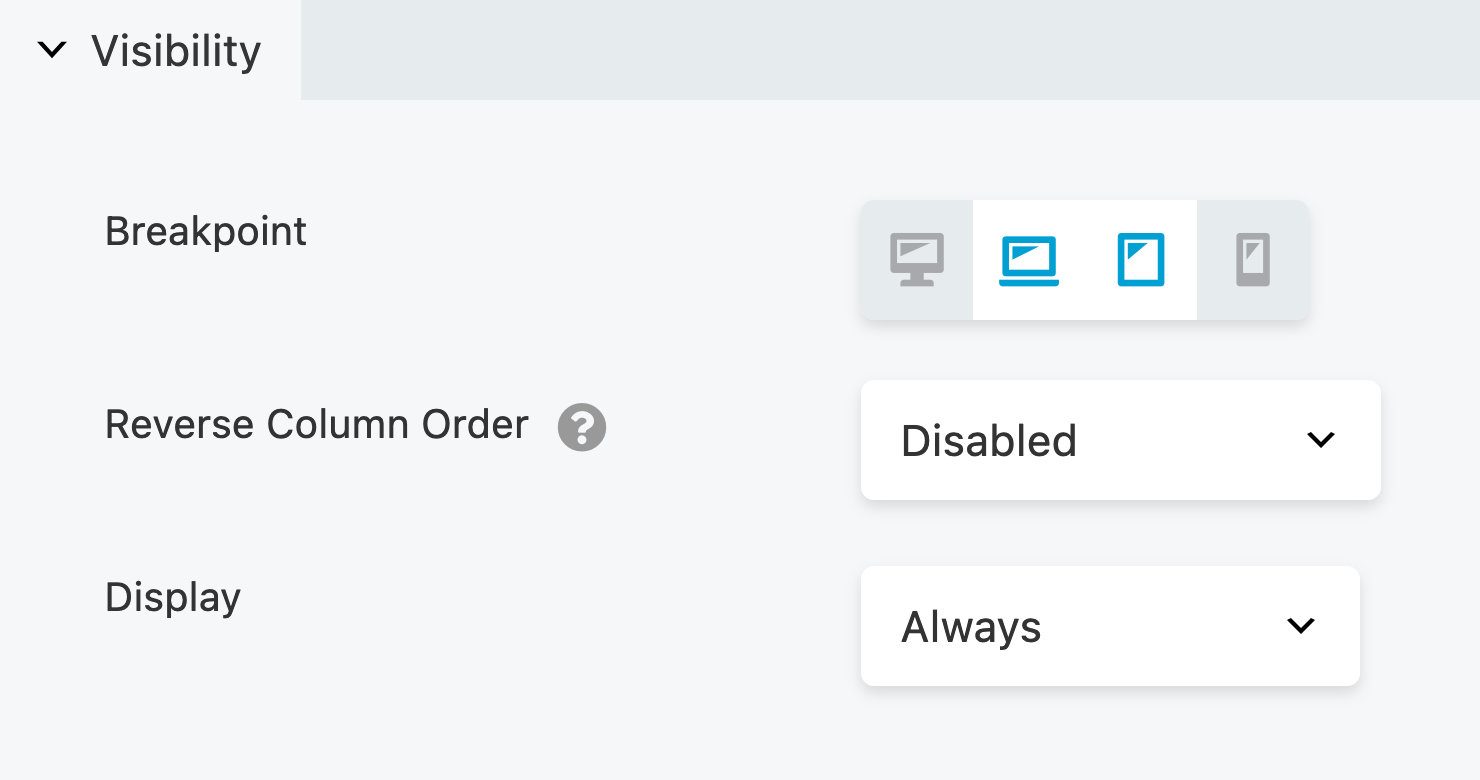
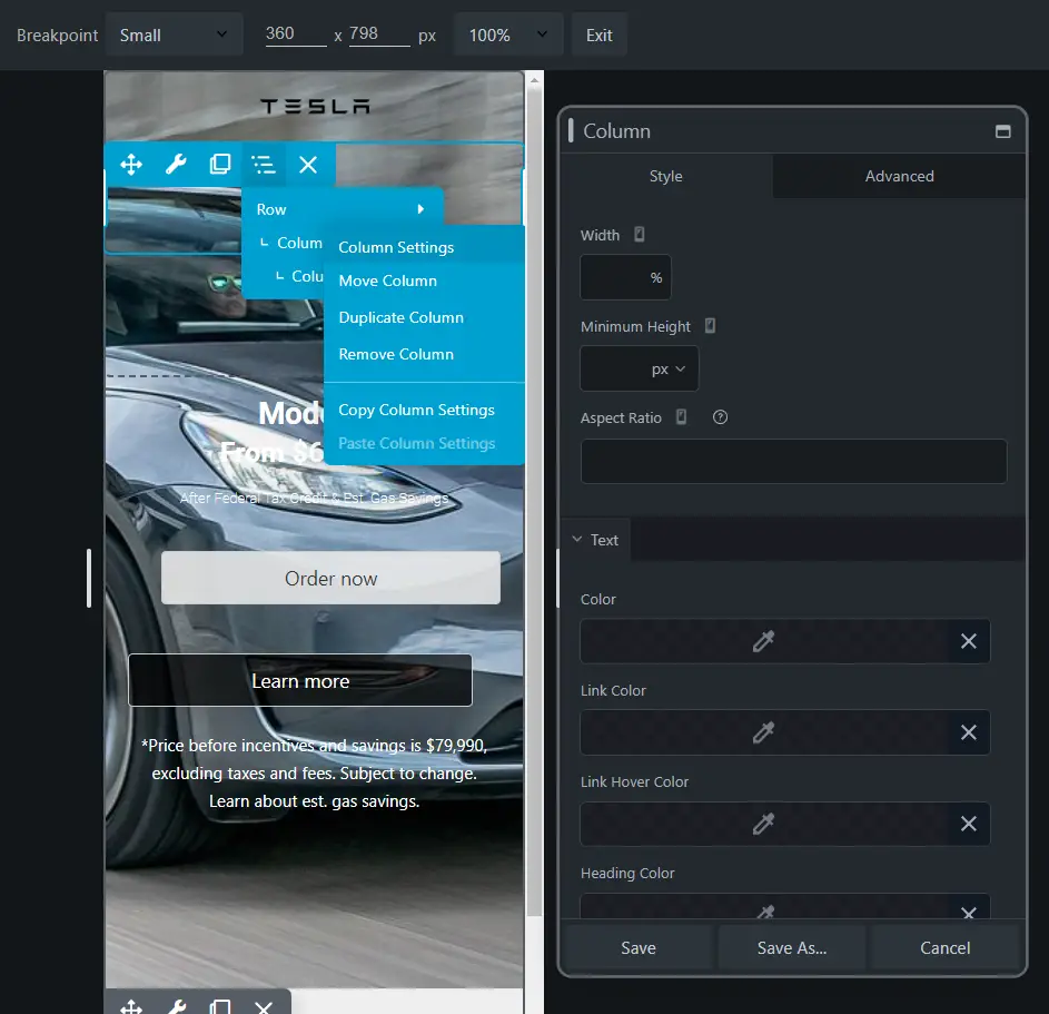
Step 2: Adjust Column Width and Alignment
Ensure the menu and logo are aligned properly on mobile screens.
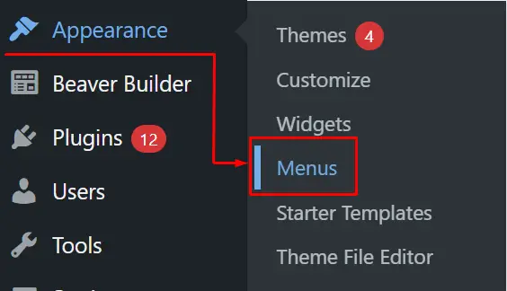
Step 3: Add Sub-menu Items
Navigate to the customize section under Appearance and click on menus to add sub-menu items.
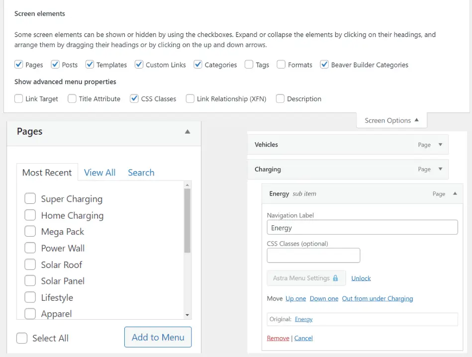
Step 4: Assign CSS Classes to Sub-menu Items
After adding sub-menu items, assign a CSS class to each menu item with sub-menu items.
Save the changes.
Step 5: Check Mega Menu on Mobile
Review the mega menu on mobile devices to ensure it’s user-friendly and accessible.
Best Practices for Mobile Mega Menus
Before we delve into the step-by-step guide, let’s review some essential best practices to ensure your mega menu is optimized for mobile users:
Simplify Navigation
Limit the number of top-level items and sub-menus to avoid overwhelming users.
Use clear, concise labeling for easy understanding.
Responsive Design
Ensure the menu adapts seamlessly to different screen sizes using media queries.
Touch-friendly UI
Make sure all elements are easy to tap with sufficiently large touch targets and proper spacing between items.
Clear Indicators for Submenus
Use visual indicators like arrows or plus signs to show expandable items.
Easy to Open and Close
Include a clear and accessible button, like a hamburger icon, for opening and closing the menu.
Provide an intuitive way to close the menu, like swiping or tapping a close icon.
Use Accordion or Full-screen Overlay
For mobile, using an accordion style or a full-screen overlay can be effective in making the best use of limited space.
Prioritize Speed and Performance
Optimize images and assets to reduce load times and ensure smooth performance.
Use Big Font
Ensure that the menu is accessible to all users, including those who use screen readers or have limited mobility.
Optimizing for Performance
- Minimizing Load Times: Large menus can slow down your site. Optimize images, use lazy loading, and minimize the use of heavy scripts to keep load times fast.
- Using Caching and Optimization Plugins: Plugins like WP Rocket and W3 Total Cache can help improve your site’s performance by caching pages and optimizing resources.
Advanced Tips and Tricks
- Integrating with Other Plugins: Enhance your mega menu by integrating it with other plugins like WooCommerce for e-commerce functionality or Yoast SEO for better search engine optimization.
- Adding Custom CSS and JavaScript: For advanced customization, consider adding custom CSS and JavaScript to tweak the appearance and behavior of your mega menu.
Conclusion
Creating a mobile-first mega menu in Beaver Builder is essential for enhancing user experience on mobile devices. By following the best practices outlined above and the step-by-step guide, you can ensure that your mega menu is user-friendly, accessible, and effective across various screen sizes.


