

Introduction
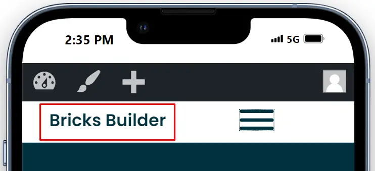
In today’s digital landscape, a mobile-first design approach is essential for creating user-friendly websites. Bricks Builder, a versatile tool for web development, simplifies the creation of responsive designs. Mega menus, which are extensive dropdown menus, enhance navigation by organizing content effectively. When integrating with tools like Bricks Builder, creating such menus becomes more efficient. Let’s dive into creating a mobile-first mega menu with a step-by-step guide using this powerful page builder.
Understanding Mobile Mega Menus
Definition and Purpose
A mobile mega menu is an extensive drop-down menu that organizes large amounts of information in a user-friendly way. Unlike traditional menus, mega menus offer a broad view of the site’s navigation options, often categorized to enhance usability.
Benefits of Mobile Mega Menus
Mobile mega menus are particularly beneficial for websites with extensive content. They improve navigation, reduce bounce rates, and enhance the overall user experience by allowing users to find what they need quickly and efficiently.
Steps to Design Mobile Mega Menus:
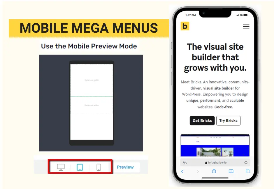
Step 1: Editing the Mobile Version
Before you start, ensure you’re editing the mobile version of your website. Mobile-first design focuses on creating a seamless user experience on mobile devices before scaling up to tablets and desktops.
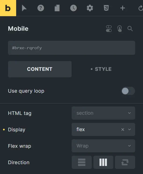
Step 2: Adding Columns for Logo and Menu
Navigate to the editor page where you can modify the header section. Here, add two columns.
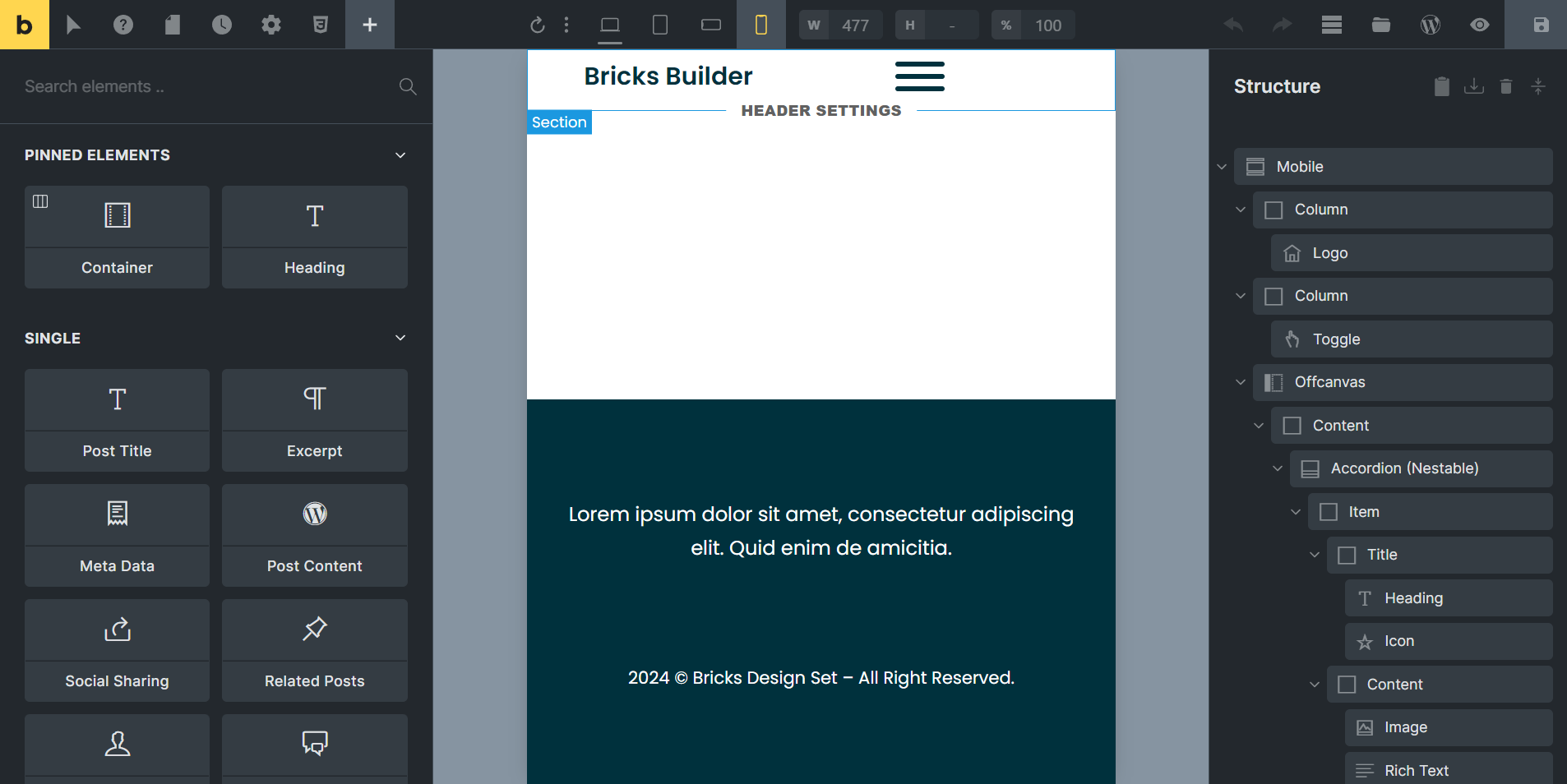
These columns will house the logo and the menu, providing a structured layout.
Step 3: Adjusting Column Widths
Since we’re optimizing for mobile, adjust the width of each column. The logo column should be narrower, while the menu column should take up more space, ensuring both elements are prominently displayed.
Step 4: Adding Logo and Toggle Button
Now, place your logo in the first column and the toggle button in the second.
The toggle button will allow users to access the mega menu. Make sure both elements are aligned properly within their respective columns.
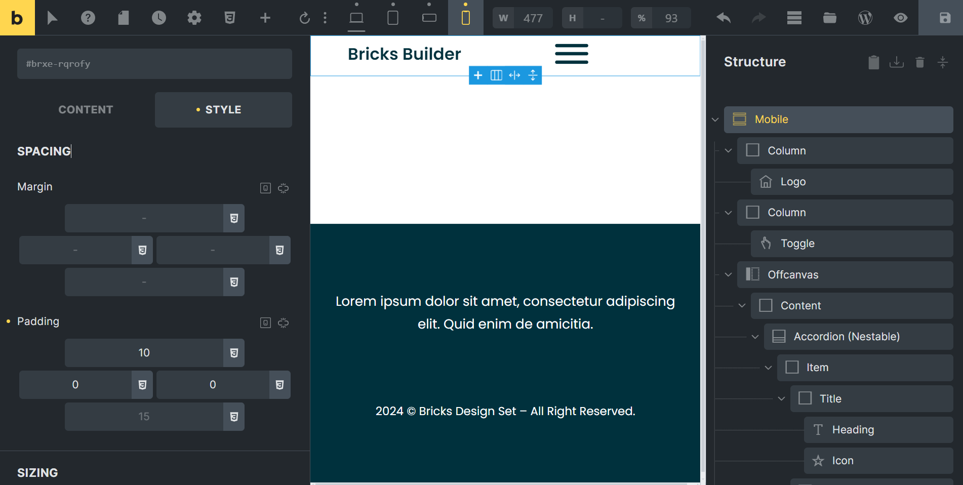
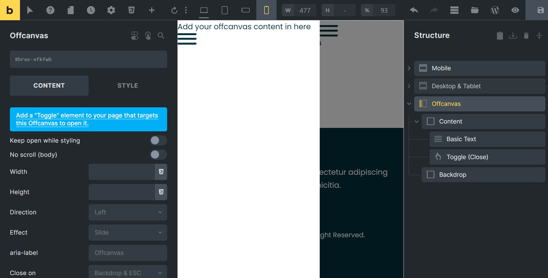
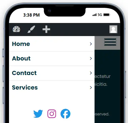
Step 5: Incorporating the Off-Canvas Element
Next, add the off-canvas element, which will contain the menu. The default off-canvas might have a burger menu and text, but we’ll remove these to make space for our custom menu.
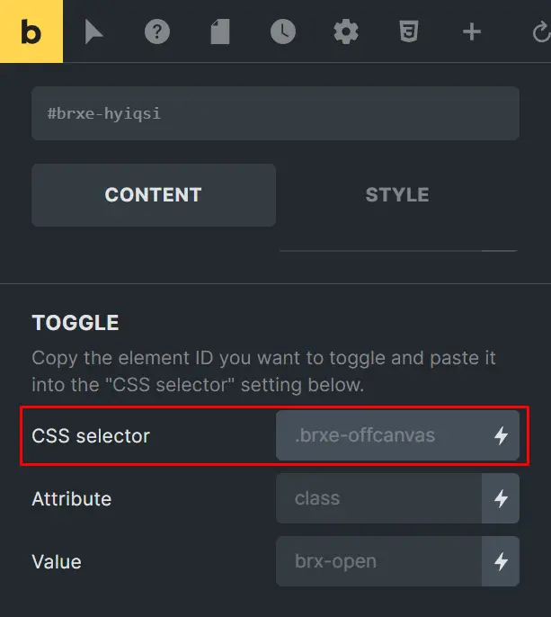
Step 6: Linking Toggle Button to Off-Canvas Menu
To link the toggle button to the off-canvas menu, copy the Element ID of the off-canvas.
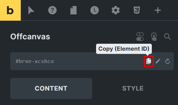
Paste this ID into the CSS Selector of the toggle button. This ensures that clicking the toggle button will reveal the off-canvas menu.
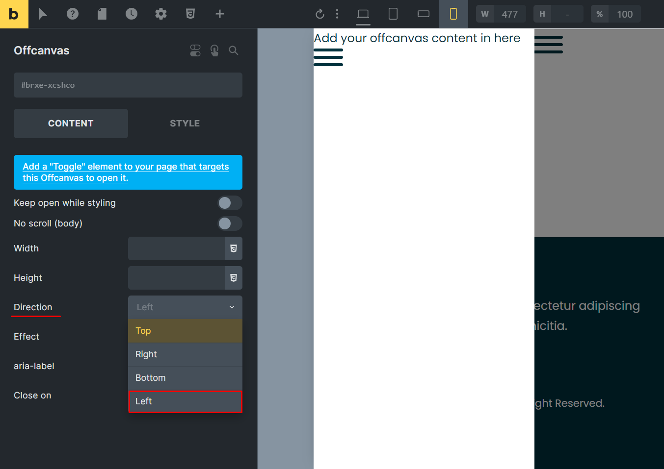
Step 7: Configuring Off-Canvas Appearance
Decide whether you want the off-canvas menu to appear from the left or right side. We’ll have it appear from the left side. This configuration makes navigation intuitive for users.
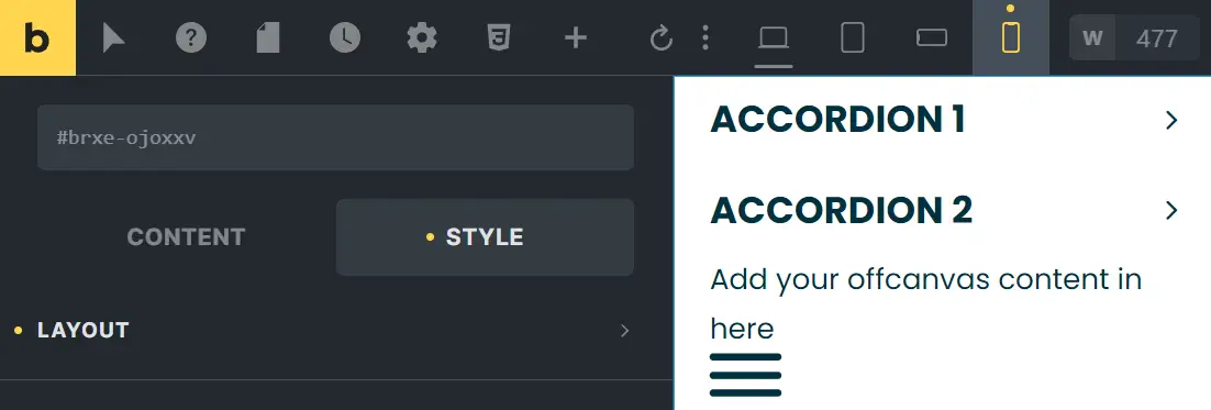
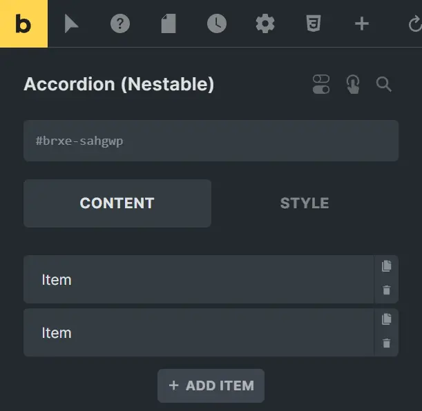
Step 8: Adding Accordion Nestable
Inside the off-canvas element, add an Accordion Nestable. This component will serve as our menu. Place it under the content of the off-canvas to ensure it appears correctly.
Step 9: Creating Submenus
Within each menu item, add submenus. You can include images and text for each submenu item. Ensure that these elements are linked, so when a user clicks on them, they are redirected to the appropriate page.
Step 10: Customizing Submenus
Customize your submenus by adding icons or other elements that enhance the user experience. Visual elements make navigation more intuitive and engaging.
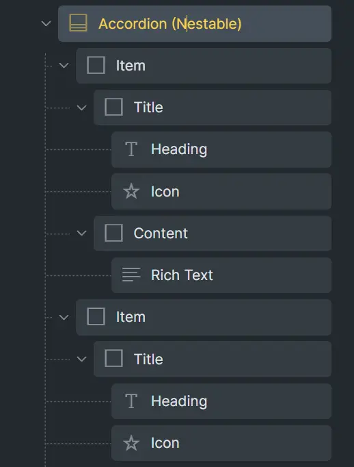
Step 11: Adding Icons for Accessibility
For better accessibility, add icons to your submenus. Place these icons next to the text, and ensure each icon has a link that redirects users appropriately.
Step 12: Checking Responsiveness
Before finalizing, check the responsiveness of your design. Ensure that the menu functions smoothly on mobile devices. Test various screen sizes to confirm usability.
Step 13: Duplicating for Different Devices
Create duplicates of your menu design for desktop and tablet views. For the mobile version, use the toggle menu. For desktop and tablet, replace the toggle with a nav nestable and hide the mobile menu elements.

Step 14: Final Adjustments and Testing
Finally, adjust the display settings for each version of your menu. Use ‘none’ to hide elements and ‘flex’ to display them as needed. Conduct thorough testing to ensure everything works seamlessly.
Best Practices for Mobile Mega Menus
Simplifying Navigation
Keep your navigation simple and straightforward. Overloading your menu with too many options can overwhelm users and detract from the overall experience.
Prioritizing Content
Prioritize the most important content and place it at the top of your menu. This ensures that users can quickly find what they are looking for without having to scroll through unnecessary options.
Testing and Feedback
Regularly test your mega menu to ensure it functions as expected. Gather feedback from users to identify any issues or areas for improvement.
Troubleshooting and Support
Common Issues and Fixes
Identify common issues that might arise with your mega menu and how to fix them. This could include problems with responsiveness, layout, or functionality.
Where to Find Help
Know where to turn for help if you run into problems. The Bricks Builder community, online forums, and official support channels are great resources.
Future Trends in Mobile Navigation
Emerging Technologies
Stay ahead of the curve by keeping an eye on emerging technologies in mobile navigation. This could include advancements in AI, voice search, and more.
Predictions for the Future
Consider where mobile navigation is headed and how you can prepare your site for future trends. Being proactive can help keep your site relevant and user-friendly.
Conclusion
Creating a mobile-first mega menu requires careful planning and design. By following these steps, you can ensure your menu is user-friendly, accessible, and visually appealing across all devices. This approach not only enhances user experience but also makes efficient use of limited screen space.


