

Introduction
Are you looking to enhance your website’s visual appeal and engage your audience effectively? The Styled Box Element in Thrive Architect is your answer. This powerful feature allows you to create eye-catching content boxes that can captivate your readers and convey information effectively. In this step-by-step guide, we will delve into the world of Styled Box Elements and show you how to use them to their full potential.
Getting Started with Styled Box Element
Thrive Architect is a well-liked tool for making a nice-looking page builder on WordPress. One of its handy features is the Styled Box, which lets you add attractive boxes to your site. This guide will teach you how to use the Styled Box step by step.
Now that you understand the importance of Styled Box Element, let’s dive into creating one.
Accessing Thrive Architect Editor
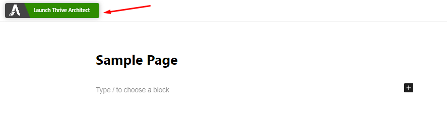
Firstly, open your page in Thrive Architect. Go to the right sidebar and locate the plus symbol (+).
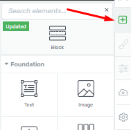
Then, look for the “Styled Box” element or type its name in the search field.
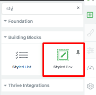
Once found, click and drag the “Styled Box” element onto the page where you want to use it.
Choosing a Template For Styled Box Element
After adding the element, a pop-up will automatically appear.
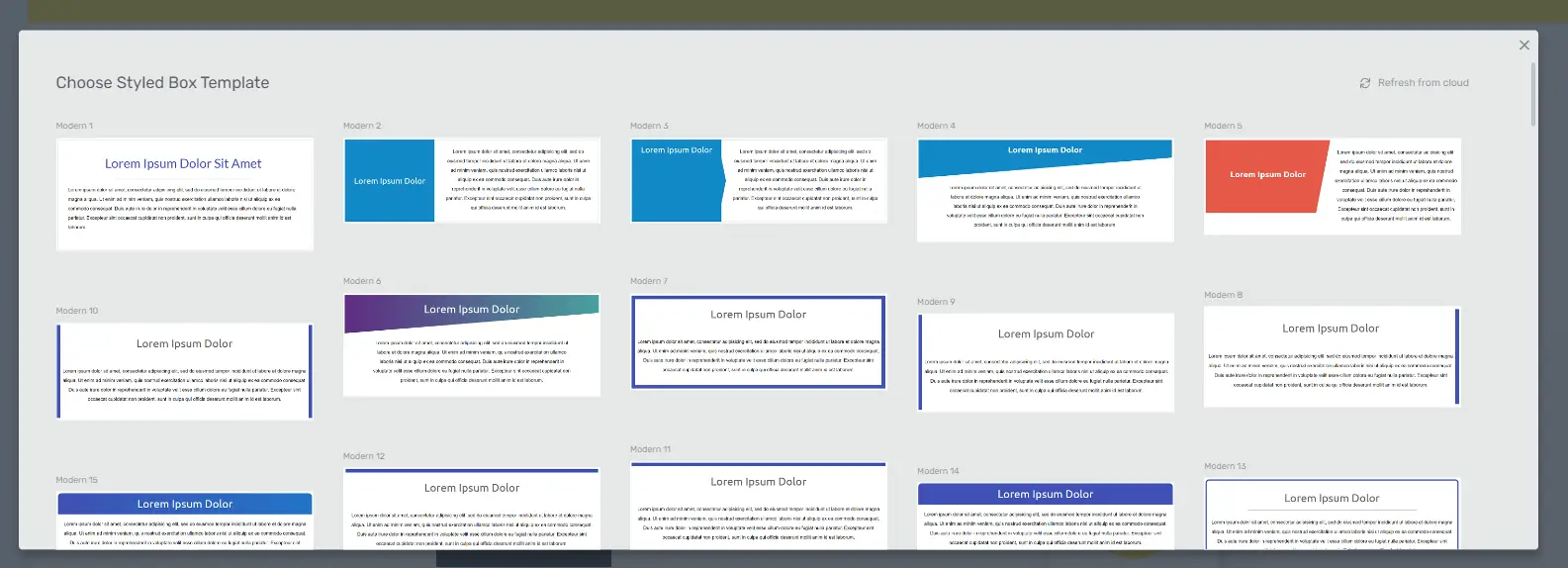
This pop-up displays a list of available templates.
Simply choose the template that best suits your design by clicking on it.
Replacing a Template (If Necessary)
If you later decide to change the template you initially selected, you can do so from the left sidebar.
Under the “Template Library” section, pick a new template.
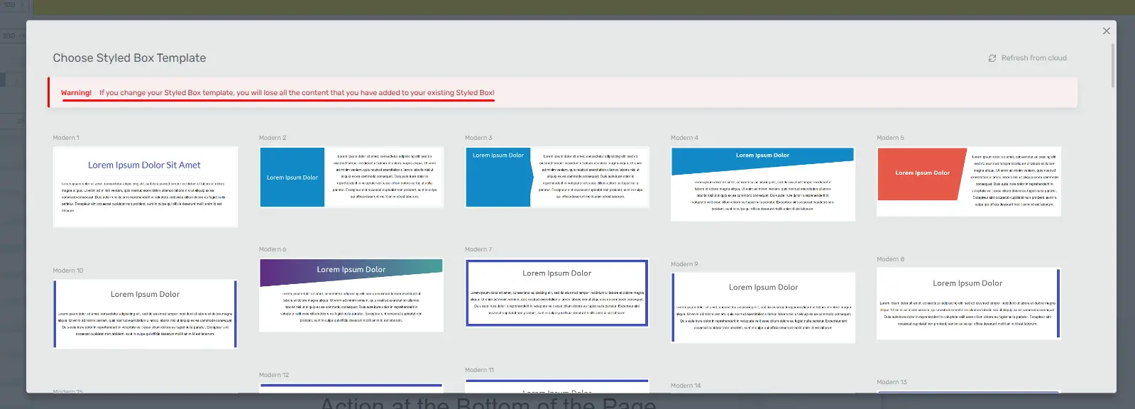
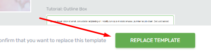
Then, make sure to replace the template before adding any content or making customizations, as changing the template will remove existing content and customizations.
Click the “Replace Template” button to confirm.
Customizing the Styled Box Element
You can now start customizing the element using the options in the left sidebar.
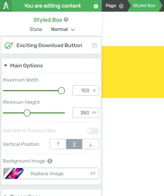
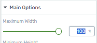
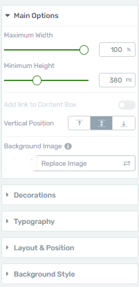
To adjust the width, use the slider provided in the “Width” section. You can also input a specific width value.
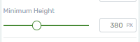
Set a minimum height for your box using the “Minimum Height” option.
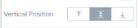
Choose the vertical position of the content inside the Styled Box element using the “Vertical Position” option. You can place it at the top, middle, or bottom of the box. The top position is the default.
Additional Customizations
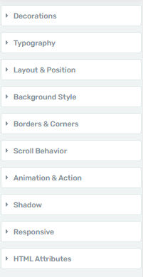
Explore additional customization options available in the general options, which include settings for borders, corners, layout, and position, among others.
Adjust these settings as needed to refine the appearance and behavior of your element.
Saving Your Changes
Once you’re satisfied with the customizations, don’t forget to save your work.
That’s it! You’ve successfully used the Styled Box element in Thrive Architect to create a visually appealing and customized element on your page.
Thank you for following this guide!
Exploring Different Styling Options
Styled boxes are a powerful element in Thrive Architect that can help you highlight content, draw attention to key information, and improve the overall aesthetics of your website. In this step-by-step guide, we will explore various styling options for these boxes in Thrive Architect.
Accessing the Thrive Architect Editor
Locate the page or post where you want to work with Styled Boxes and click on “Edit with Thrive Architect” to open the editor.
Within the Thrive Architect editor, click on the “+” icon to add a new element. In the search bar, type “Styled Box” and select it to add the element to your page.
Inserting or Selecting a Styled Box Element
Click on the element to select it. Modify the content within the Styled Box by editing the text or adding images as desired.
Access the Styling Options
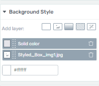
Navigate to the “Background Style” section located in the left sidebar.
Customizing Box Appearance
- Background: Adjust the background color or set an image as the box background.
- Borders: Customize border thickness, style, and color.
- Padding: Control the spacing inside the box by adjusting padding values.
- Box Shadow: Add drop shadows to the box for depth and dimension.
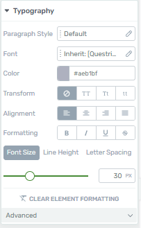
Typography Customization
- Text Style: Modify the font family, size, color, and other text formatting options.
- Text Alignment: Align the text within the Styled Box as per your design preferences.
- Line Height: Adjust the spacing between lines of text.
Exploring Advanced Styling Options
You can customize the appearance further by applying custom CSS, adding animations, or defining responsive styling in these tabs:
Once you’re done customizing. Click the “Save Work” button to save your styling changes within Thrive Architect.


