Table of Contents
Introduction
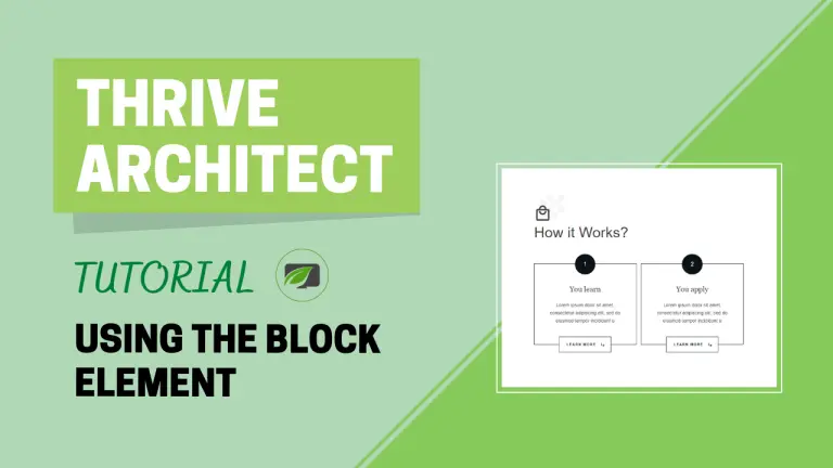
In the digital age, the presentation of content plays a pivotal role in engaging your audience. Thrive Architect, a powerful WordPress page builder, offers a versatile “Block” element that allows you to effortlessly combine various types of content blocks to create professionally designed pages and posts for your website. In this comprehensive tutorial, we will walk you through the step-by-step process of using the “Block” element effectively to elevate your content creation game.
Understanding the Block Element
At its core, the Block Element is a versatile tool that allows you to structure and design your content with ease. Whether it’s text, images, or custom HTML, the Block Element empowers you to create engaging and dynamic pages.
Adding the Block Element
To harness the potential of the “Block” element, you first need to add it to your page or post within the Thrive Architect editor. Follow these simple steps:
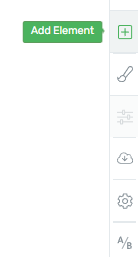
- Click on the plus sign located in the right sidebar of the editor.
- A list of elements will appear. Look for the “Block” element.
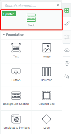
- Drag and drop the “Block” element onto your editor canvas, placing it where it suits your content best.

Please note that the “Block” element can only be placed on an empty canvas, serving as a top-level container/section, similar to the “Background Section” element. It cannot be nested within other elements.
Choosing the Right Block
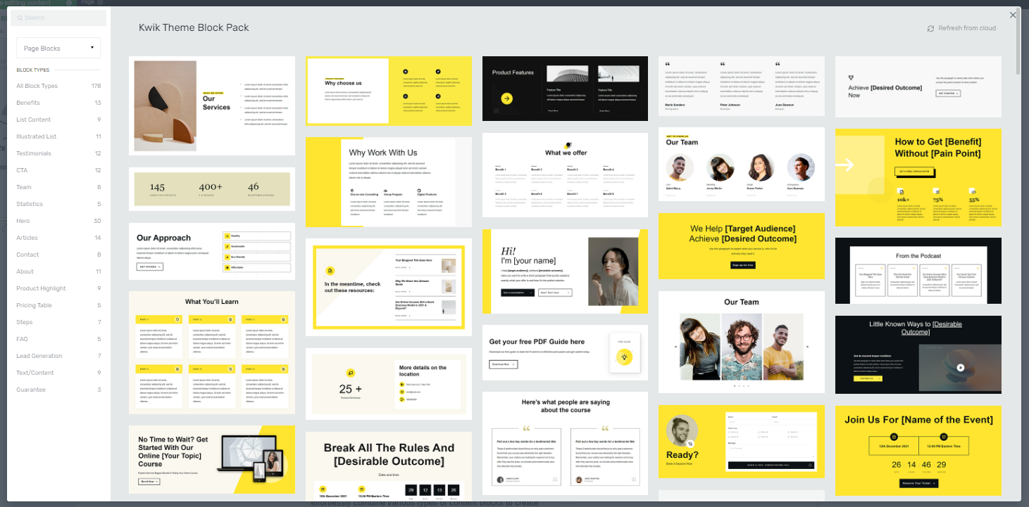
After adding the “Block” element, a pop-up window will immediately appear, allowing you to select the type of block you want to insert into your page. This choice is crucial for tailoring your content to your specific needs.
Filter Blocks
In the left sidebar of the pop-up, you will find two sections: “Filter Blocks” and a list of block types. Let’s explore your filtering options:
Show me all the blocks
This option displays all available blocks.
Content Blocks
Use this for editing a simple Thrive Architect page.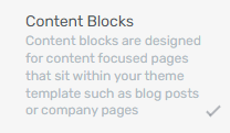
Page Blocks
Useful when editing a Landing Page.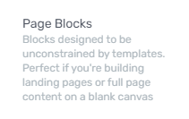
Theme Blocks
Appears when editing a page with a Thrive Theme Builder template applied.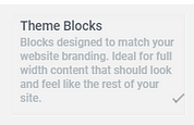
Selecting one of these options will narrow down the blocks you can choose from. For instance, if you pick “Content Blocks,” you will only see those relevant blocks in the pop-up.
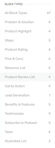
Block Types
Below the filtering options, you will find a list of all block types, categorized by their purpose on the page. This categorization simplifies your search for the perfect block. For example, if you’re looking for a “Call to Action” block, clicking on the corresponding category will display blocks designed for that purpose.
Using the Search Bar
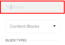
If you already have a specific block in mind, you can use the search bar on the left side of the pop-up. Simply type the name of the block you’re looking for, and it will appear on the right side. Click on it to choose it, and it will be inserted into your page.
Customizing the Block Element
Once you’ve added a block, you’ll have access to various customization options in the left sidebar. These options allow you to tailor the appearance of the block to your liking.
Content Maximum Width
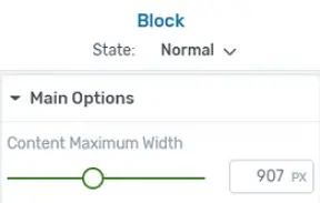
You can adjust the width of the block by dragging the slider under the “Content Maximum Width” option or by entering a specific value manually.
Content Cover Entire Screen Width
Enabling this option makes the block’s content cover the entire screen width. Note that this is available only when the “Stretch to fit screen width” option is enabled.
![]()
Section Minimum Height
This option lets you control the height of the block. You can adjust it by either dragging the slider or entering a specific value manually.

Match Height to Screen
This feature makes the block element’s height match the screen size.
![]()
Vertical Position
You can position the content within the block at the top, center, or bottom, depending on your preference.
![]()
Stretch to Fit Screen Width
Enabling this option stretches the entire block element to fit the width of your screen.
![]()
Customizing Block Content
After customizing the block’s appearance, it’s crucial to personalize its content. When you initially insert the “Block” element, it may contain default content such as placeholder text or generic images. To make the block unique to your page, follow these steps:
Click on the specific element within the “Block” that you want to customize. This will reveal options in the left sidebar.
Use the provided options to replace default content with your own text, images, button text, and more.
By personalizing each element within the “Block,” you ensure that it aligns with your business or website’s branding and messaging.
Repeating the Process
Once you’ve set up your first “Block” element, you can continue by adding additional “Block” elements to create your desired page layout. To add another “Block” element, either drag and drop it from the element list or hover over the top/bottom of an existing block and click on “+Block.” This streamlined process significantly reduces the time and effort required to build a captivating web page.
Exploring General Options
In addition to the specific options mentioned above, the “Block” element inherits several general options available to all Thrive Architect elements. When the “Block” element is selected, these can be found under “Main Options” in the left sidebar.

Conditional Display
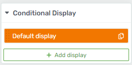
The ‘Conditional Display’ feature allows you to create alternate versions of a content block and assign different display rules to each version. This empowers you to tailor what visitors see on your page based on their permissions or other criteria.
By mastering the “Block” element within Thrive Architect, you gain the ability to craft visually stunning and engaging web content. Leveraging its versatility and customization options, you can create web pages that captivate your audience, effectively convey your message, and ultimately enhance your online presence.
Conclusion
In conclusion, the Block Element in Thrive Architect is a game-changer for content creators. Recap the benefits of using this feature and encourage readers to explore and implement it in their projects.
