
Introduction
Elementor, a widely-used page builder plugin for WordPress, provides users with the ability to create and customize web pages with ease. If you want to add an interactive and eye-catching element to your WordPress website, Fancy Flip Box in Elementor is a fantastic choice. This widget allows you to create a responsive content box with a captivating flip animation. It appears as a regular content box with an image or an icon on the front, but when a visitor hovers over it, the backside of the box reveals a stylish transition effect, often containing a call to action button. It’s an attractive feature that can grab the attention of your website visitors.
Getting Started with Flip Box Widget
In this Elementor tutorial, we are going to walk you through using the fancy flip box. But before setting your flip box, be sure to read about the best practices for making a fancy flip box below.
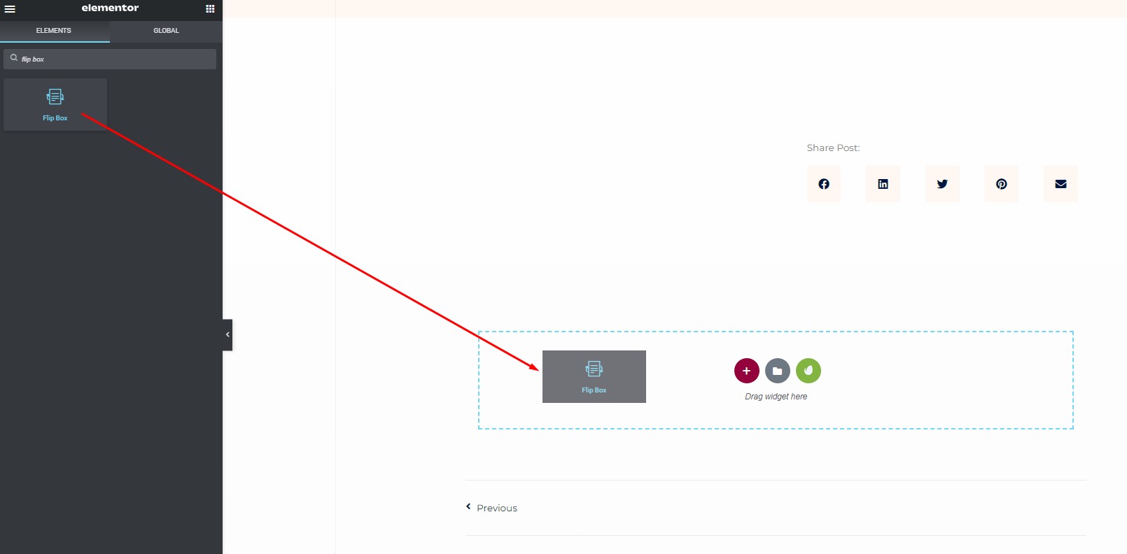
Step 1: Locate the Flip Box Widget
- Start by opening your Elementor editor.
- On the left side of your screen, you’ll find a menu bar. In this menu, search for the “Flip Box” widget.
Step 2: Set Up Your Elementor Flip Box
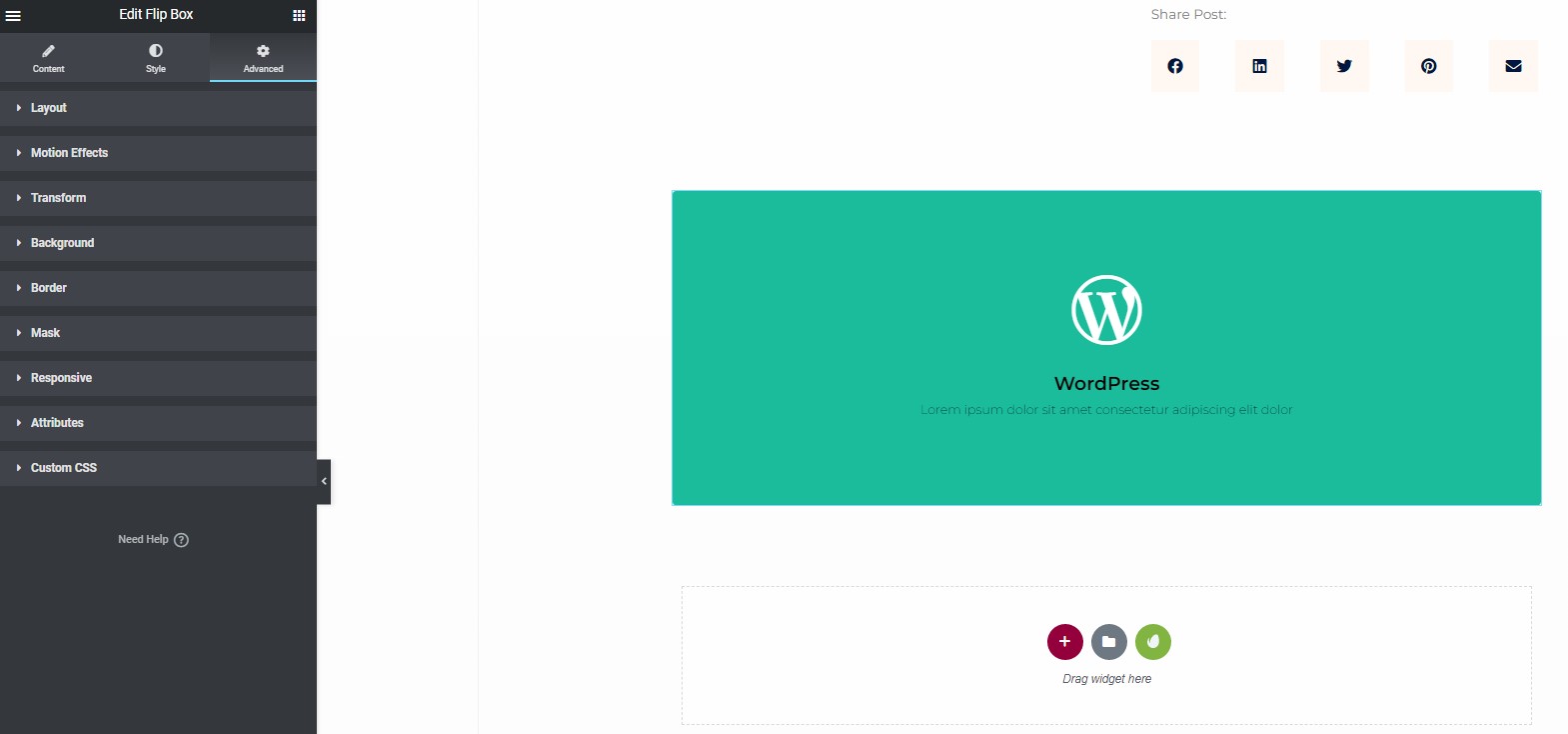
Inside the Flip Box widget, you’ll find options to customize both the front and back sides of the content box. Let’s start with the front side.
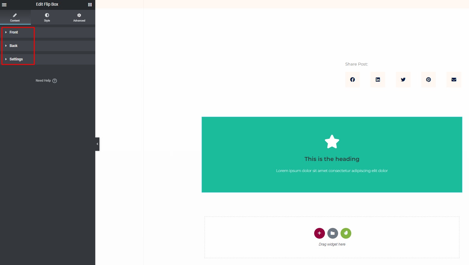
Front Side:
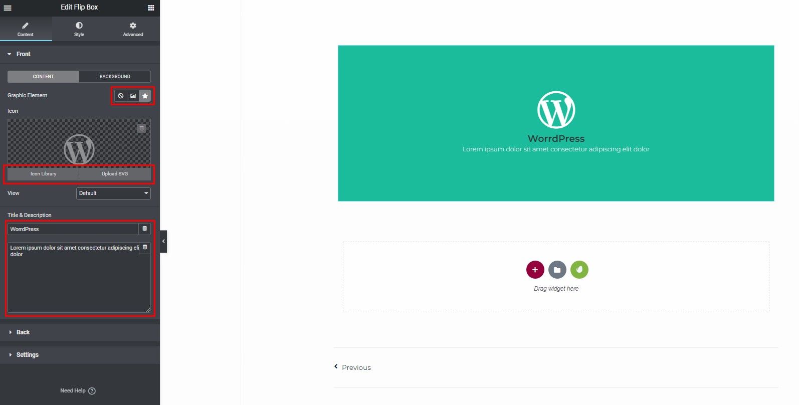
- Choose between an image or an icon for the graphic element.
- You can select an icon from the library or upload your SVG.
- Add an image or an icon, along with a title and description
- Position the text as desired within the “Front Side” section.
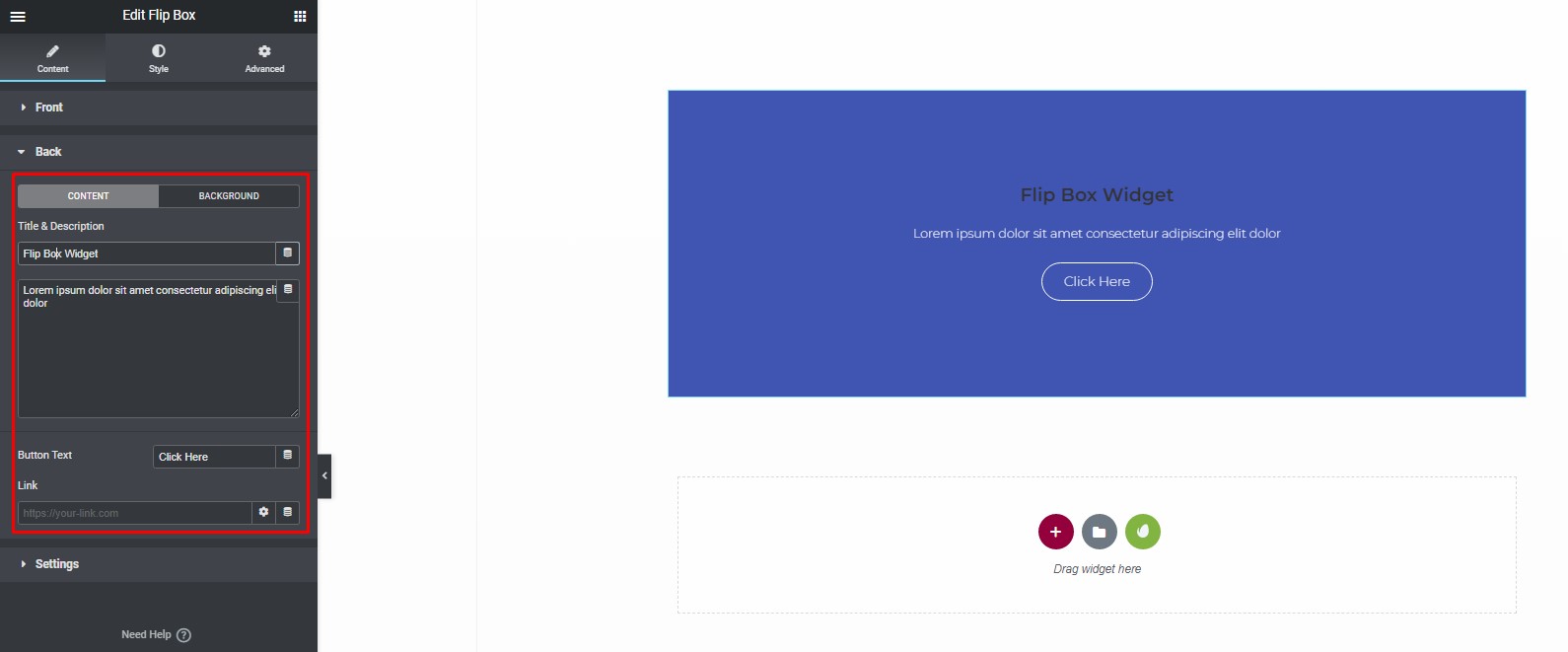
Back Side:
Similar to the front side, you can customize the content, background, and styling of the back side of the Flip Box.
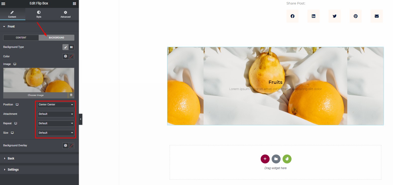
Accessing Background Settings:
Navigate to the “Background” tab to control the front side of the flip box.
- Background Type: Under “Background Type,” choose between Color, Image, or Gradient for the front of the flip box.
- Position: In the “Position” option, select the desired position for the background image (e.g., Top Center, Top Right, etc.).
- Attachment: Choose from Default, Scroll, or Fixed in the “Attachment” setting.
- Repeat: Select from Default, Auto, Cover, or Contain in the “Repeat” option.
- Size: Customize the size of the background image by choosing from Default, Auto, Cover, or Contain in the “Size” setting.
Overlay Color Selection:
Choose a color for the overlay to enhance the appearance of your image. This can also be used to adjust the opacity of the image.
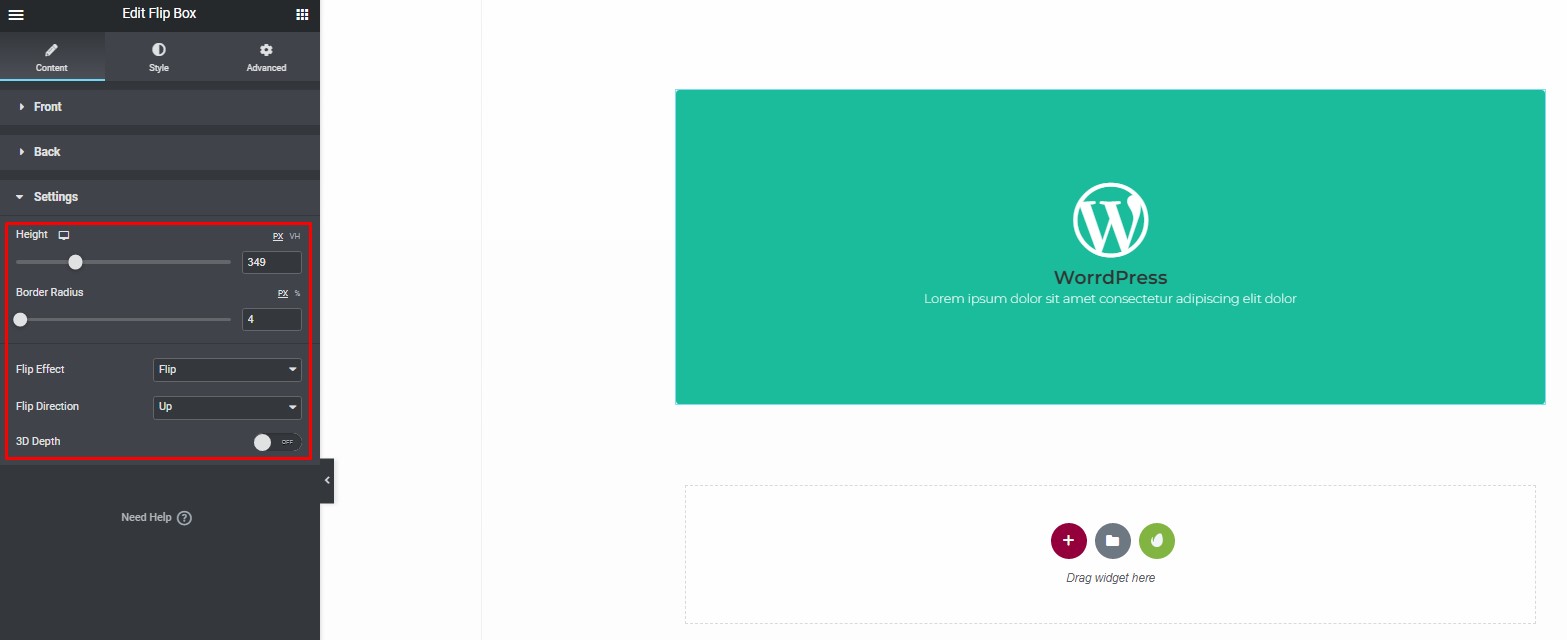
Customizing Additional Properties:
You have the option to further customize the flip box by adjusting the following properties:
- Height: Modify the height of the flip box.
- Border Radius: Adjust the curvature of the corners of the flip box.
- Flip Effect: Toggle the flip effect on or off.
- Flip Direction: Choose the direction in which the flip occurs (e.g., horizontal or vertical).
- 3D Depth: Decide whether to enable or disable the 3D depth effect for the menu.
Step 3: Customize Flip Box Styles
To fine-tune the appearance of your Flip Box, navigate to the “Style” tab. You can customize both the front and back styles.
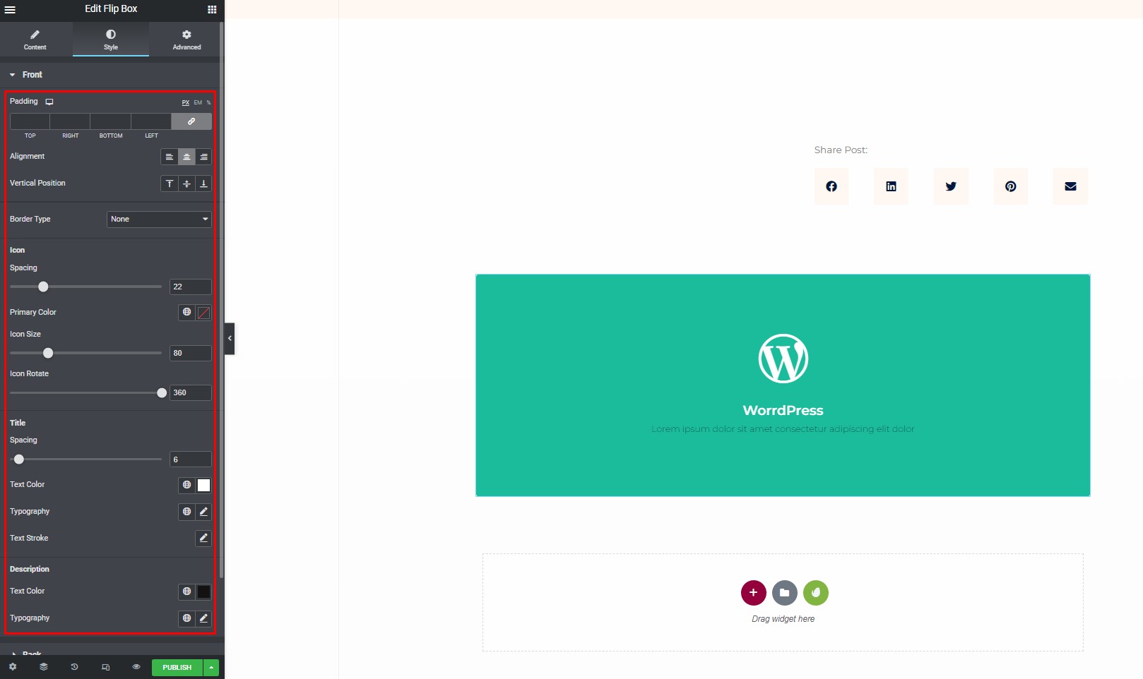
Front Style
Under the “Front” section:
- Adjust padding, alignment, vertical position, and border type.
- Configure spacing, primary color, icon size, and icon rotation for the icon.
- Set title spacing, text color, typography, and text stroke.
- Configure text color and typography for the description.
Back Style
Under the “Back” section:
- Customize the padding, alignment, vertical position, and border type.
- Adjust title spacing, text color, typography, and text stroke.
- Customize the description spacing, text color, and typography.
- Set the size of the button and its typography.
Step 4: Explore Advanced Options
If you wish to add motion effects, hover effects, a background image, or enhance responsiveness on your page, Elementor provides an “Advanced” feature.
This feature allows you to take your Flip Box to the next level with various effects and additional customizations.
Elementor Flip Box On Mobile
In this step-by-step guide, we will walk you through the process of setting up an Elementor Flip Box on mobile devices. Elementor is a popular page builder for WordPress that allows you to create stunning websites with ease. One of its great features is the Flip Box widget, which can add an interactive element to your website. We will show you how to make this widget responsive and ensure it looks fantastic on mobile screens.
Step 1: Go to Responsive Mode
The first step in making your Elementor Flip Box mobile-friendly is to access the responsive mode. Here’s how to do it:
- Open your WordPress dashboard.
- Navigate to the page or post where you want to add the Elementor Flip Box.
- Click on the “Edit with Elementor” button to enter the Elementor editor.
Once you’re inside the Elementor editor, you’ll want to switch to responsive mode to make the necessary adjustments for mobile devices. To do this, follow these steps:
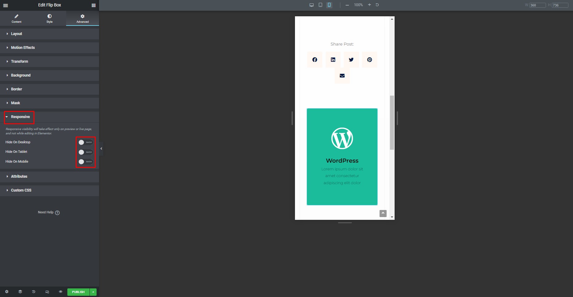
In the bottom left corner of the editor, you’ll find the device icons. Click on the one that represents a smartphone, which is typically the smallest icon.
You’re now in responsive mode, and you can proceed to the next step.
Step 2: Select Responsive Mode
Now that you’re in responsive mode, it’s time to configure the Flip Box for mobile devices. Follow these steps:
- At the top of the Elementor editor, you’ll see a menu with various options. Click on the “Mobile” option to switch to the mobile view.
- The page layout will adjust to the mobile view, and you’ll see how your content appears on smaller screens.

Step 3: Display or Conceal the Flip Box
In this step, you can choose whether to display or conceal your gorgeous Flip Box on different devices. Here’s how:
- Click on the Flip Box widget you want to customize.
- In the left panel, go to the “Advanced” tab.
- Under the “Responsive” section, you’ll find options to hide or show the widget on desktop, tablet, and mobile. Click on “Mobile.”
- You can now choose whether you want to display or hide the Flip Box on mobile devices. Toggle the switch according to your preference.
- Make sure to click the “Update” button to save your changes.
Your Elementor Flip Box is now set up for mobile devices. It will be displayed or hidden as per your choice, ensuring that your website looks great on smartphones and tablets.
Elementor makes it easy to create visually appealing websites, and with the steps provided in this guide, you can optimize your Flip Box widget for mobile users. By following these simple instructions, you can enhance the user experience and engage your audience effectively, no matter the device they’re using.
Exploring Elementor’s Flip Box Features and Options
Elementor is a popular WordPress page builder that empowers users to create stunning websites with ease. Among its many features, the Flip Box stands out as an exciting element that can add dynamic and interactive content to your website. In this article, we will guide you through the process of exploring Elementor’s Flip Box features and options. Whether you’re a beginner or an experienced user, you’ll find valuable insights into how to make the most of this unique Elementor widget.
What Is Elementor’s Flip Box?
Before diving into the specifics, it’s essential to understand what Elementor’s Flip Box is. A Flip Box is a widget that allows you to create interactive content that flips when users hover over it. This creates a dynamic effect that can capture your visitors’ attention and convey information in a more engaging manner.
Getting Started with Flip Box
To start using Elementor’s Flip Box, follow these simple steps:
Step 1: Create a New Page or Edit an Existing One
Navigate to the page you want to add the Flip Box to. You can either create a new page or edit an existing one using Elementor.
Step 2: Add the Flip Box Widget
Within the Elementor editor, you’ll find a wide range of widgets on the left panel. Look for the “Flip Box” widget and drag it to the desired section of your page.
Customizing Flip Box
Now that you have added the Flip Box widget, it’s time to explore the various customization options available.
Step 4: Content and Design
- Front Content: This is what users will see initially. You can add text, images, or any other content you prefer.
- Back Content: The content that appears when users hover over the Flip Box. Customize it to convey additional information.
Step 5: Styling
Elementor provides a plethora of styling options to ensure your Flip Box matches your website’s design.
- Background: Adjust the background color, image, or gradient.
- Border: Customize the border style, color, and width.
- Typography: Modify the font family, size, and style for text elements.
Step 6: Advanced Settings
- Animation: Choose from various animation effects to make your Flip Box even more dynamic.
- Responsive: Ensure that your Flip Box looks great on all devices by adjusting responsiveness settings.
Tips for Using Flip Box Effectively
To make the most of Elementor’s Flip Box, consider these tips:
- Keep it concise: Use the Flip Box to highlight key information or call-to-action elements.
- Use compelling visuals: High-quality images or icons can enhance the overall impact.
- Test on different devices: Ensure the Flip Box is responsive and functions correctly on all screen sizes.
Conclusion
Elementor’s Flip Box is a powerful tool for enhancing your website’s user engagement and design. With its user-friendly interface and a myriad of customization options, it’s accessible to both beginners and experienced web designers. By following the steps and tips outlined in this article, you can create eye-catching, interactive content that sets your website apart.


