
Introduction
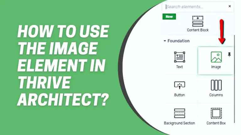
If you’re using Thrive Architect to design your website or blog, you’ll want to make the most of its features. One crucial element in web design is images. In this step-by-step tutorial, we will walk you through how to effectively use the “Image” element in Thrive Architect to enhance the visual appeal of your content.
Understanding the Image Element
Thrive Architect’s Image Element is more than just a tool for inserting pictures. It’s a versatile feature with a plethora of customization options. Whether you’re a seasoned designer or a novice, understanding the Image Element is crucial for unlocking the full potential of Thrive Architect.
Accessing the Image Element
To get started, you need to locate the “Image” element within the Thrive Architect editor. Follow these simple steps:
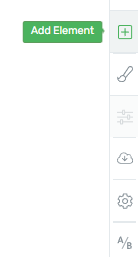
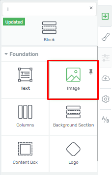
Step 1: Add the “Image” Element
Look for the “Image” element in the list of available elements. It should be listed in the menu options for adding elements to your page.
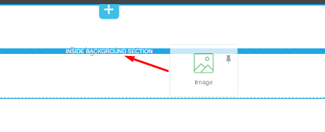
Step 2: Drag and Drop
Once you’ve found the “Image” element, simply drag and drop it onto your page where you want to insert an image.
Managing Your Media Library
After you’ve added the “Image” element to your page, you’ll need to interact with your media library. Here’s how to do it:
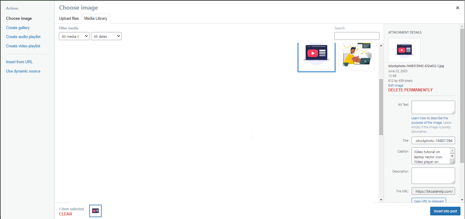
Step 3: Open Your Media Library
Click on the “Image” element you’ve just added. This action will open your media library.
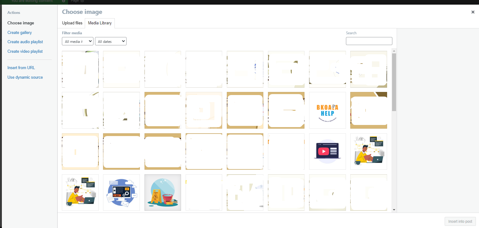
Step 4: Choose Your Image
Within your media library, you can select an existing image or upload a new one from your device.
Customizing Your Image
Now that you have your image selected, it’s time to customize it according to your preferences:
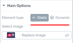
Step 5: Image Gallery Options
In the main options for the “Image” element, you’ll find settings for customizing your image gallery. Here, you have two choices:
Static: Choose this option for a fixed image display.
Dynamic: Select this option if you want the image to change dynamically.
Step 6: Adjusting Image Size
To ensure your image fits perfectly on your page, use the following options:
Drag the slider in the size section to adjust the width.
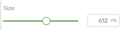
Do the same with the height to maintain the correct aspect ratio.
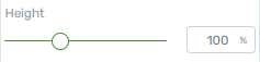
To reset to the default size, click the reset button.
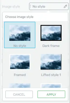
Step 7: Styling Your Image
Enhance the visual appeal of your image by applying styles. Click on the “Image Style” option to explore various styling choices.
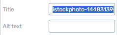
Step 8: Adding Title and Alt Text
For better SEO and accessibility, add a title and alt text to your image. This helps search engines understand your content and assists users with visual impairments.
Step 9: Adding Caption Text and a Link
If you want to provide additional context or link your image to another page, enable the “Add Caption Text” and “Add Link to the Image” options.

Saving Your Work
After customizing your image to your satisfaction, don’t forget to save your changes:
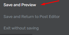
Step 10: Save Your Work
Locate the “Save Work” button at the bottom left corner of the Thrive Architect editor. Click it to save all your edits and settings.
Responsive Design: Making Images Look Great on All Devices with Thrive Architect
Responsive design is crucial for ensuring that your website looks great and functions well on all devices, including desktops, tablets, and mobile phones. With Thrive Architect, you have powerful tools at your disposal to optimize images for different screen sizes. This step-by-step guide will walk you through the process.
Understanding the Importance of Responsive Images
Before we delve into the steps of making images look great on all devices, let’s understand why it’s so crucial:
1. Enhancing User Experience (UX)
When images are not properly optimized for different screen sizes, it can lead to a poor user experience. Visitors may struggle to view or interact with your content, leading to frustration and increased bounce rates.
2. SEO Benefits
Search engines favor websites with responsive design. By ensuring your images are responsive, you improve your website’s chances of ranking higher in search engine results pages (SERPs).
3. Improved Conversion Rates
A visually appealing website can significantly impact conversion rates. If your images look great on all devices, users are more likely to engage with your content and take desired actions, such as making a purchase or signing up for a newsletter.
Now that we understand the importance of responsive images let’s move on to the practical steps to achieve this using Thrive Architect.
Step-by-Step Guide on How to Add Images
Step 1: Select Your Image
Once Thrive Architect is up and running, navigate to the page where you want to add or edit an image. Select the image element you wish to make responsive.
Step 2: Open Image Settings
Click on the selected image, and a toolbar should appear. Look for the “Image Settings” or “Edit Image” option, and click on it.
Step 3: Adjust the Image Size
In the image settings, you will find options to adjust the image size. Ensure that the “Responsive” option is selected. This tells Thrive Architect to make the image adapt to different screen sizes.
Step 4: Preview and Test
Before finalizing your changes, it’s essential to preview your page on various devices. Thrive Architect allows you to switch between desktop, tablet, and mobile views. Make sure the image looks great on all of them.
Step 5: Save and Publish
Once you’re satisfied with how your image appears on different devices, save your changes and publish your page. Congratulations! You’ve successfully made your image responsive with Thrive Architect.
Conclusion
Responsive design is no longer optional; it’s a necessity in today’s digital landscape. Ensuring that your images look great on all devices is a crucial part of this process. With Thrive Architect, you can achieve this effortlessly, enhancing user experience, improving SEO, and boosting conversion rates. Start implementing responsive images on your website today to reap the benefits.


