

Introduction
Web design has evolved, and today’s users crave interactive and engaging websites. One powerful tool that exemplifies this evolution is the Toggle Element, a dynamic component that allows you to hide and reveal content with a click. This tutorial will guide you through its use, benefits, and optimization for SEO, specifically within the framework of the user-friendly Thrive Architect Page Builder.
Getting Started with Thrive Architect
Thrive Architect is a cutting-edge page builder designed for WordPress users. It empowers both beginners and seasoned developers to create stunning websites effortlessly. The introduction of interactive elements, like the Toggle Element, takes user engagement to the next level, making Thrive Architect a go-to choice for those seeking a seamless web design experience.
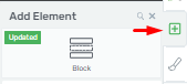
Accessing Thrive Architect
To get started, open your Thrive Architect editor by clicking the plus sign in the right sidebar of your WordPress dashboard. You can also type “Toggle” into the search field to locate the element quickly.
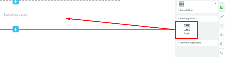
Add the Toggle Element
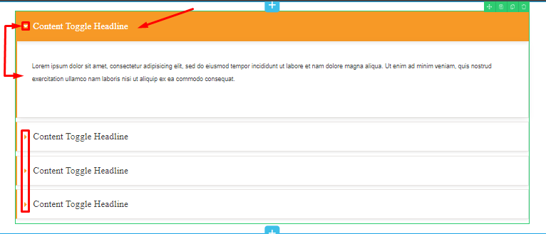
Once you’ve found the “Toggle” element, simply drag and drop it onto your page where you want to create a collapsible section.
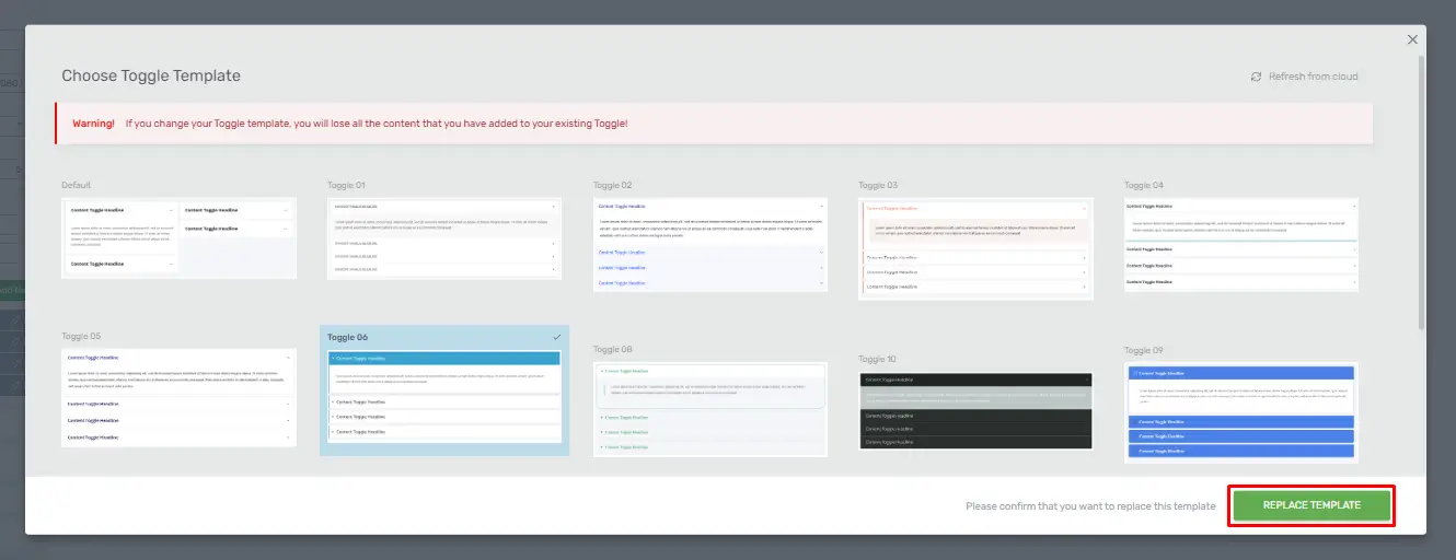
Choose a Template
After adding the “Toggle” element, the first available section, you can change the template of the element. you’ll have the option to select a template that suits your design preferences. Scroll down to explore the available templates, and when you find one you like, click on the “Replace Template” button to apply it.
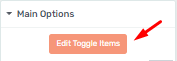
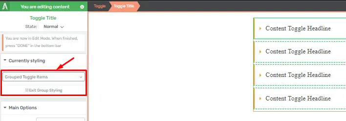
Modify Toggle Items
To customize the content within the toggle, click on the orange button associated with the option “Group Styling.” This feature allows you to make changes to the “Toggle” element efficiently.
Group Styling Options
When you access the “Group Styling” section, you can edit multiple aspects of the “Toggle” element at once. Here are some key modifications you can make:
Change Text Type
Select the text type you want to use within the “Toggle” element. This allows you to control the appearance and formatting of the content.
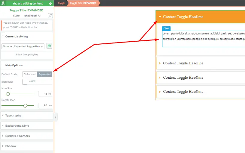
Default State
Choose whether the toggle items should be collapsed or expanded by default in the “Default State” section. You can also enable or disable the display of an icon associated with each toggle item.
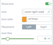
Icon Customization
You can select an icon for your toggle items and customize its color, placement (left or right side of the headers), and size according to your preferences.
Exit Group Styling
After you’ve finished customizing various aspects of the “Toggle” element, you can exit the “Group Styling” section by clicking on “Exit Group Styling” or simply clicking “Done” at the bottom of the sidebar.
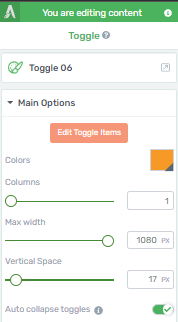
Main Options
Return to the “Main Options” section of the “Toggle” element. Here, you can adjust settings such as the number of columns, maximum width, and vertical alignment. You can also control whether users can open multiple toggles simultaneously.
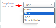
Dropdown Animation
In the “Dropdown Animation” section, you can choose from animation options like “None,” “Slide,” “Fade,” or a combination of “Slide and Fade” to determine how the toggle items appear when opened.
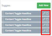
Add, Edit, or Delete Toggle Items
You have the flexibility to add new toggle items, edit their titles, change their order, or delete them as needed. Hover over the element in the editor to access these options.
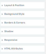
Additional Customization
Beyond the main options, you can explore further customization possibilities, such as adjusting layout and positioning, borders, and corners, to fine-tune the appearance of your toggle element.
By following these step-by-step instructions, you can effectively use the “Toggle” element in Thrive Architect to create engaging and organized web content that enhances user experience. Whether you’re building a FAQ section, product details, or any other content that benefits from collapsible sections, Thrive Architect’s “Toggle” element has you covered.
Creating Interactive FAQ Sections with Toggle Elements in Thrive Architect
In this guide, you’ll learn how to create interactive FAQ sections using toggle elements in Thrive Architect. This will allow you to provide a user-friendly experience for your website visitors.
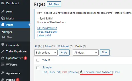
Accessing Thrive Architect
Open your WordPress dashboard.
Navigate to the page or post where you want to create the interactive FAQ section.
Click on “Edit with Thrive Architect” to open the Thrive Architect editor.
Adding the Toggle Element
In Thrive Architect, hover over the area where you want to add the FAQ section.
Click on the plus icon (+) to find the “Toggle” element.
Creating Toggle Elements
Click on the “Edit Toggle Items” button in the “Main Options”.
Then, click “Expanded” in the “Default State” section.
Write the question for your FAQ in the text element.
Below the question, click on the “Toggle” icon (looks like an arrow pointing down) in the toolbar.
Styling and Customizing
Click on any element (question or answer) to access the options panel on the left.
Use the options panel to customize the appearance, fonts, colors, and spacing as desired.
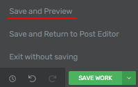
Save and Preview
Click the “Save and Preview” button to see how your FAQ section looks to visitors.
Publish Your Page
Once you’re satisfied with the layout and content, click “Save Work” and then “Exit Thrive Architect” to return to the WordPress editor.
Finally, click “Publish” or “Update” to make your interactive FAQ section live on your website.
Conclusion
In conclusion, mastering responsive design with toggle elements in Thrive Architect is a game-changer for web developers. By following best practices, staying abreast of trends, and leveraging the SEO benefits, you can create a website that not only looks great but also performs exceptionally well across devices.


