
Introduction
Understanding Beaver Builder
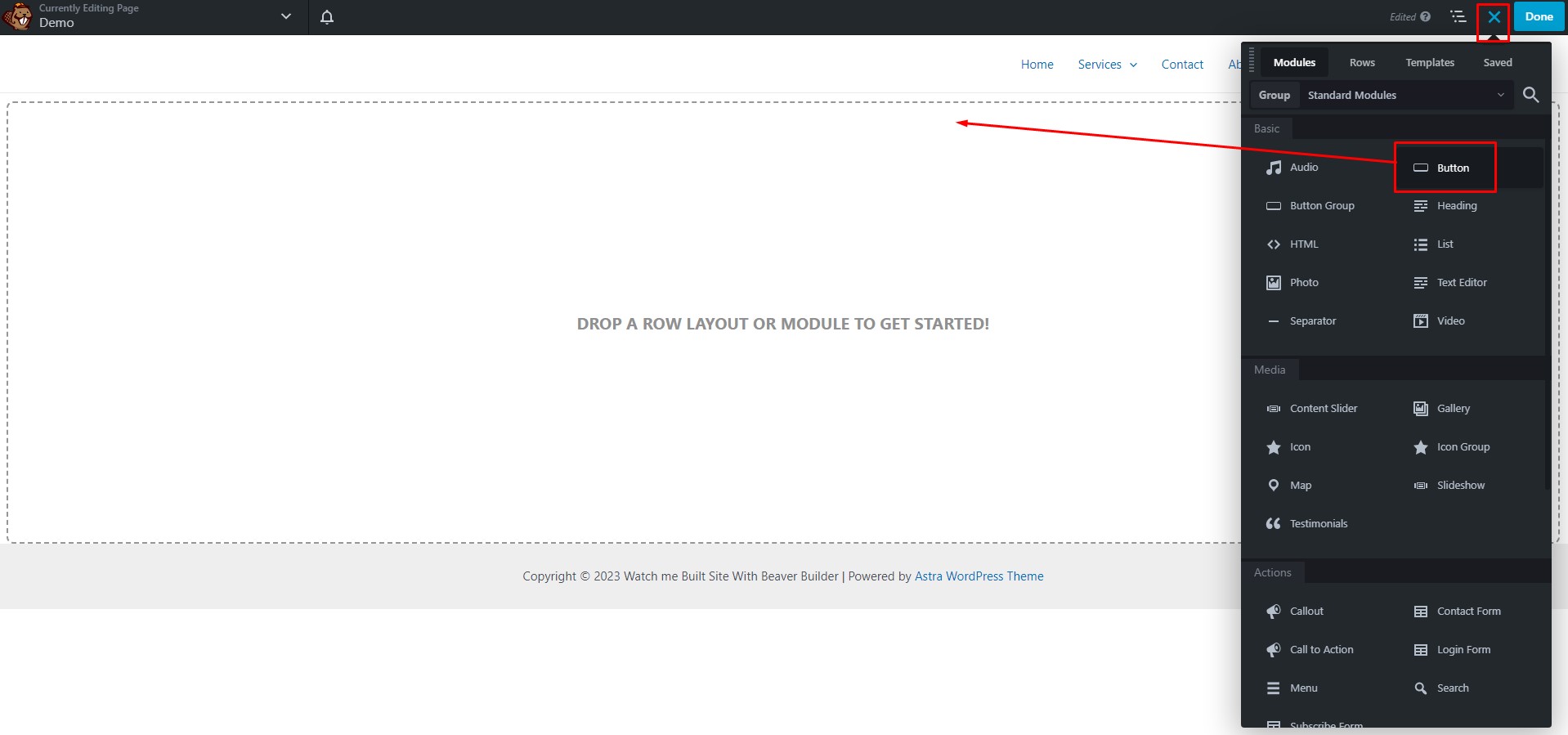
Accessing the Beaver Builder Editor
From the right-side Beaver Builder panel, drag and drop the button module on the page.
Customizing Button Text and URL
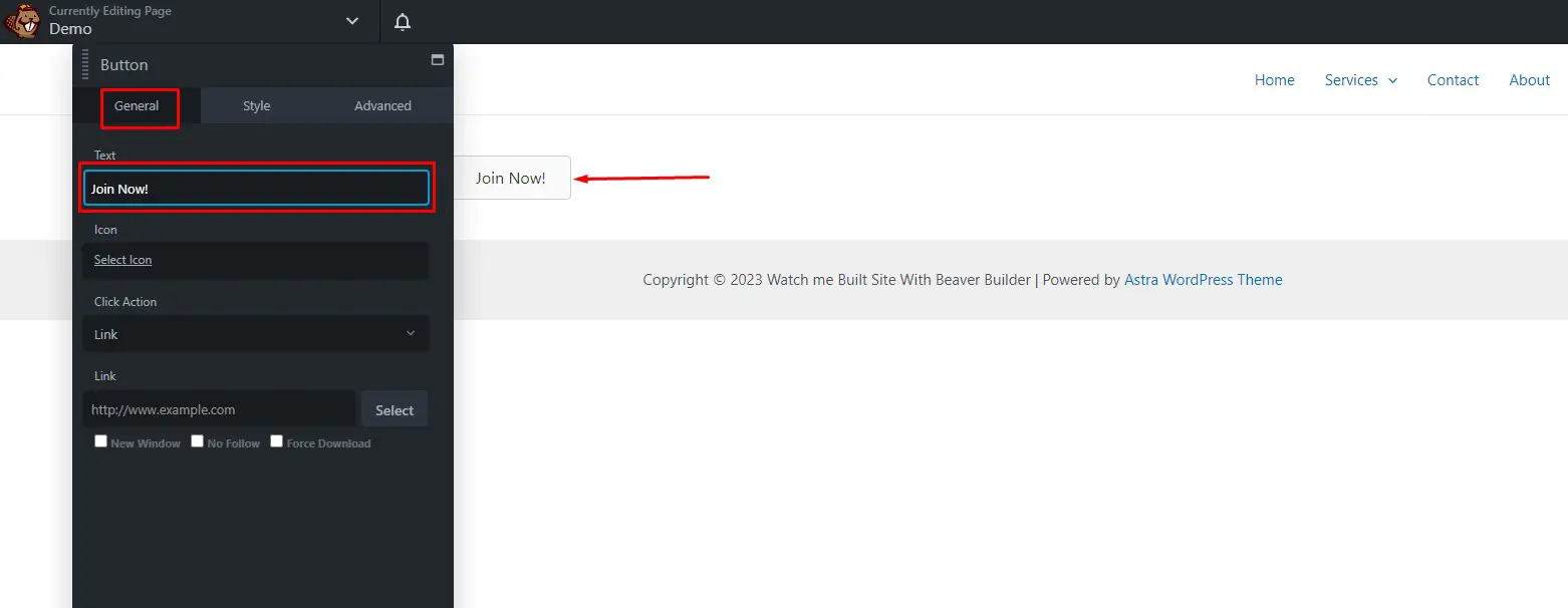
Set the Beaver Button Under the General Tab
1. Set the button’s text in the text field.
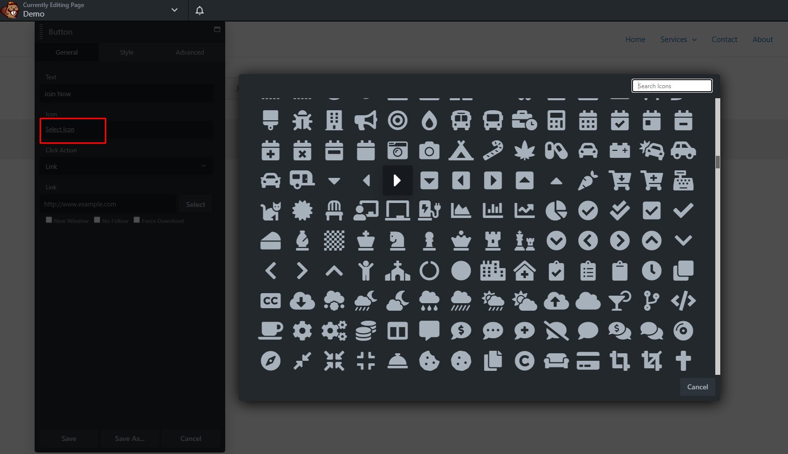
2. Set the icon for your button. In the icon library, select the icon you want.
3. Set the icon position where you can select Before and After Text.
4. Choose always visible or fade in on hover from the icon visibility menu.
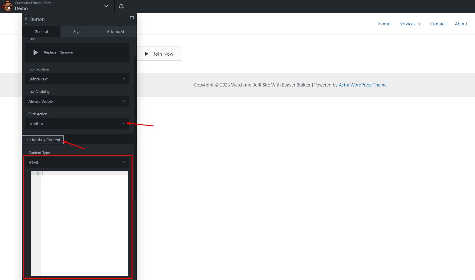
5. Choose between a link or lightbox for your click action.
If you choose the link, enter the URL of the page you want to open.
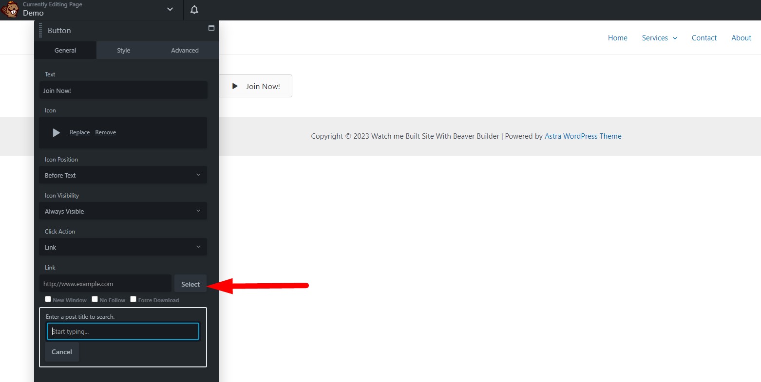
If you choose lightbox, click the lightbox content.
6. Select HTML or Video under the content type field.
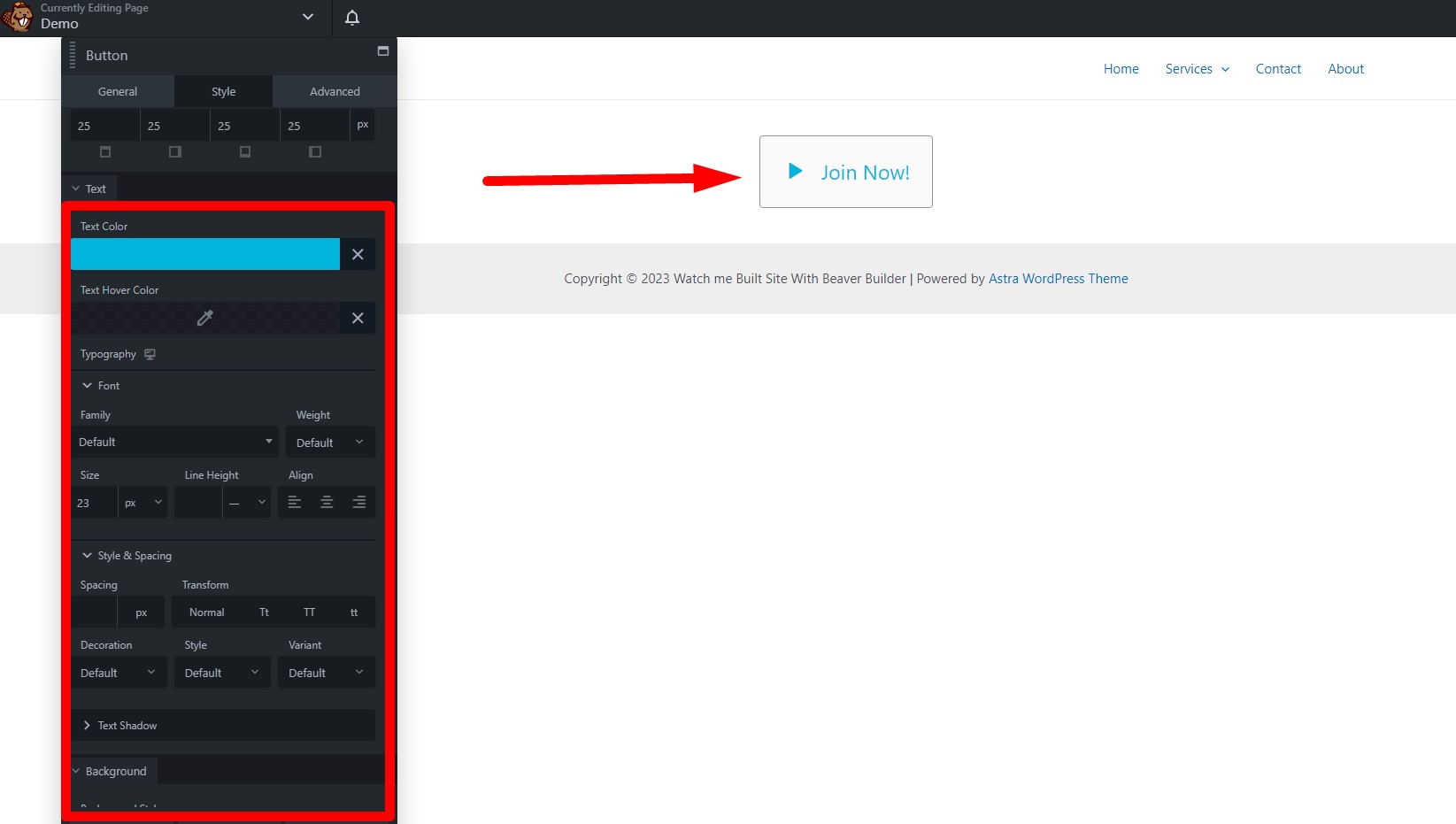
Customize the Button Styles
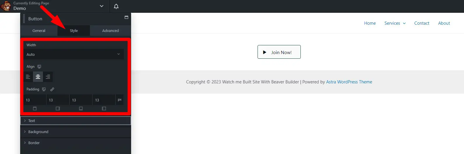
You can set the styles of the width, alignment, padding, text, background, and border under the Style tab.
1. Set the width of your button where you can choose auto, full width, and custom.
2. Align the button to the left, right, or center.
3. Adjust the button`s padding.
4. Under the text, change the text color, text hover color, and typography.
5. Under the background, set the background style whether you can choose flat, auto gradient, or advanced gradient.
6. Choose the background color and background hover color.
7. Select whether the background animation is disabled or enabled.
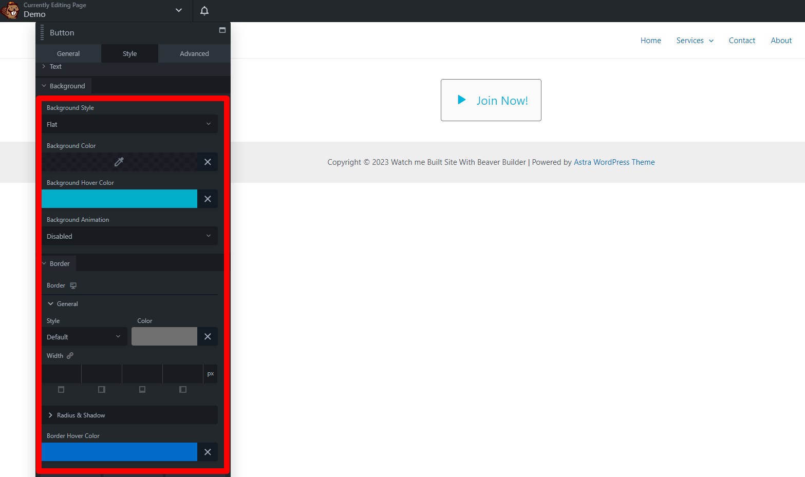
8. Under the border, set the general style and color.
9. Set the width of the button’s border.
10. Set the radius, box shadow, and border hover color.
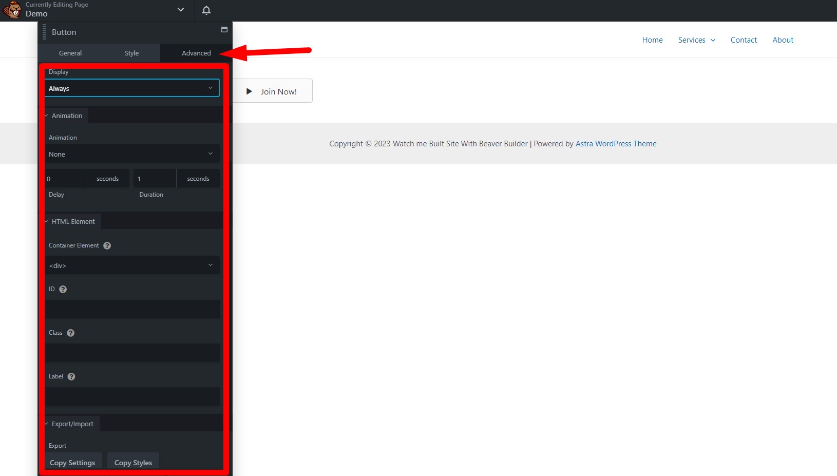
If you want to change the motion of the button, click on the advanced tab and use the other settings.
Once you have finished designing the button save the button settings, click Done in the upper right corner, and select one of the following:
Publish: Makes the changes live, and access to the world at large if you`re working on a public site.
Save Draft: Saves your page and exits the Beaver Builder editor. The changes made in that editing session are not visible except when editing in Beaver Builder.
Discard: Discards all changes made or saved since the last time the page was published. This includes all saved but unpublished work from previous sessions.
Cancel: Returns you to the editing page.

Customizing Button Styles in Beaver Builder
Do you want to make your website’s buttons stand out? Customizing button styles in Beaver Builder is an effective way to add a touch of uniqueness to your website. In this guide, we’ll walk you through the process step by step, ensuring that you have the knowledge and skills to create buttons that not only catch the eye but also enhance the overall user experience.
Button Basics: Buttons consist of several elements: text, shape, size, color, and animation. Understanding these elements is the first step to customizing your buttons effectively.
Text: The text on a button is crucial because it conveys the action. You can choose a font, size, and color that align with your website’s theme.
Shape and Size: Buttons can come in various shapes and sizes. You can modify these aspects to ensure your buttons fit seamlessly with your website’s layout.
Color: The color scheme of a button plays a significant role in user engagement. Choose colors that match your brand identity and evoke the right emotions.
Animation: Subtle animations can make your buttons more attractive. Beaver Builder allows you to add hover animations for that extra flair.
Accessing Beaver Builder
To begin customizing button styles in Beaver Builder, follow these steps:
Log in to your WordPress dashboard.
Navigate to the page where you want to customize the button.
Click on the page using Beaver Builder.
Customizing Button Styles
Now, let’s get into the nitty-gritty of customizing button styles. Here’s a step-by-step guide to help you through the process:
Click on the button you want to customize.
In the button settings, you can adjust text, shape, size, and color.
Explore advanced options for animations and responsive design.
Save your changes.
Advanced Tips
To take your button customization to the next level, consider the following tips:
Consistency: Ensure that the button styles align with your website’s overall design.
A/B Testing: Experiment with different button styles to see which ones yield the best results.
Mobile Optimization: Check how your buttons look on mobile devices, as this is where most users will engage with them.
Customizing button styles in Beaver Builder is an exciting journey into enhancing your website’s visual appeal and functionality. By following the step-by-step instructions and embracing advanced tips, you can create buttons that leave a lasting impression on your visitors. Remember, the devil is in the details, so pay attention to every aspect of your buttons to make your website shine.
Best Practices for Button Design in Beaver Builder
Buttons are the unsung heroes of web design. They guide visitors, prompt actions, and enhance user experience. In this comprehensive guide, we’ll explore the best practices for button design in Beaver Builder, a powerful WordPress page builder. Whether you’re a web designer or a business owner looking to improve your site’s user interface, these insights will help you create buttons that captivate and convert.
The Importance of Button Design
Buttons are more than just colorful shapes on a webpage. They are the interactive elements that prompt visitors to take specific actions. Whether it’s signing up for a newsletter, making a purchase, or navigating to another page, buttons are gateways to interaction.
Characteristics of a Well-Designed Button
Creating a visually appealing button is just the tip of the iceberg. A well-designed button should encompass the following characteristics:
1. Clarity
The button’s purpose should be crystal clear. Users should immediately understand what will happen when they click it.
2. Consistency
Buttons should maintain a consistent style and color scheme throughout your website, ensuring a cohesive and professional appearance.
3. Size and Position
Buttons should be appropriately sized and strategically positioned to catch the user’s attention without being obtrusive.
4. Color Choice
Color psychology plays a vital role in button design. Choose colors that evoke the desired emotions and actions from your users.
5. Typography
The font used in the button text should be easily readable and in harmony with your website’s overall typography.
6. Responsiveness
Buttons should look and function well on all devices, from desktops to mobile phones.
Conclusion
Effective button design in Beaver Builder is a vital aspect of creating an engaging and user-friendly website. By implementing the best practices outlined in this guide, you can enhance the functionality and aesthetics of your buttons, ultimately driving higher user engagement and conversions.
Don’t underestimate the power of well-designed buttons in web development. They are the key to unlocking the full potential of your website.


