
Introduction
Beaver Builder is a user-friendly page builder for WordPress that empowers users to design and customize their websites without the need for coding skills. The Icon module within Beaver Builder enables you to incorporate icons into your web pages, providing a visually appealing way to convey information. In this tutorial, we’ll explore the ins and outs of styling the Icon Module to elevate your website’s design.
Understanding the Icon Module in Beaver Builder
In this section, we’ll provide an overview of the Icon Module, highlighting its significance in web design. Learn how this module contributes to creating visually appealing and user-friendly websites.
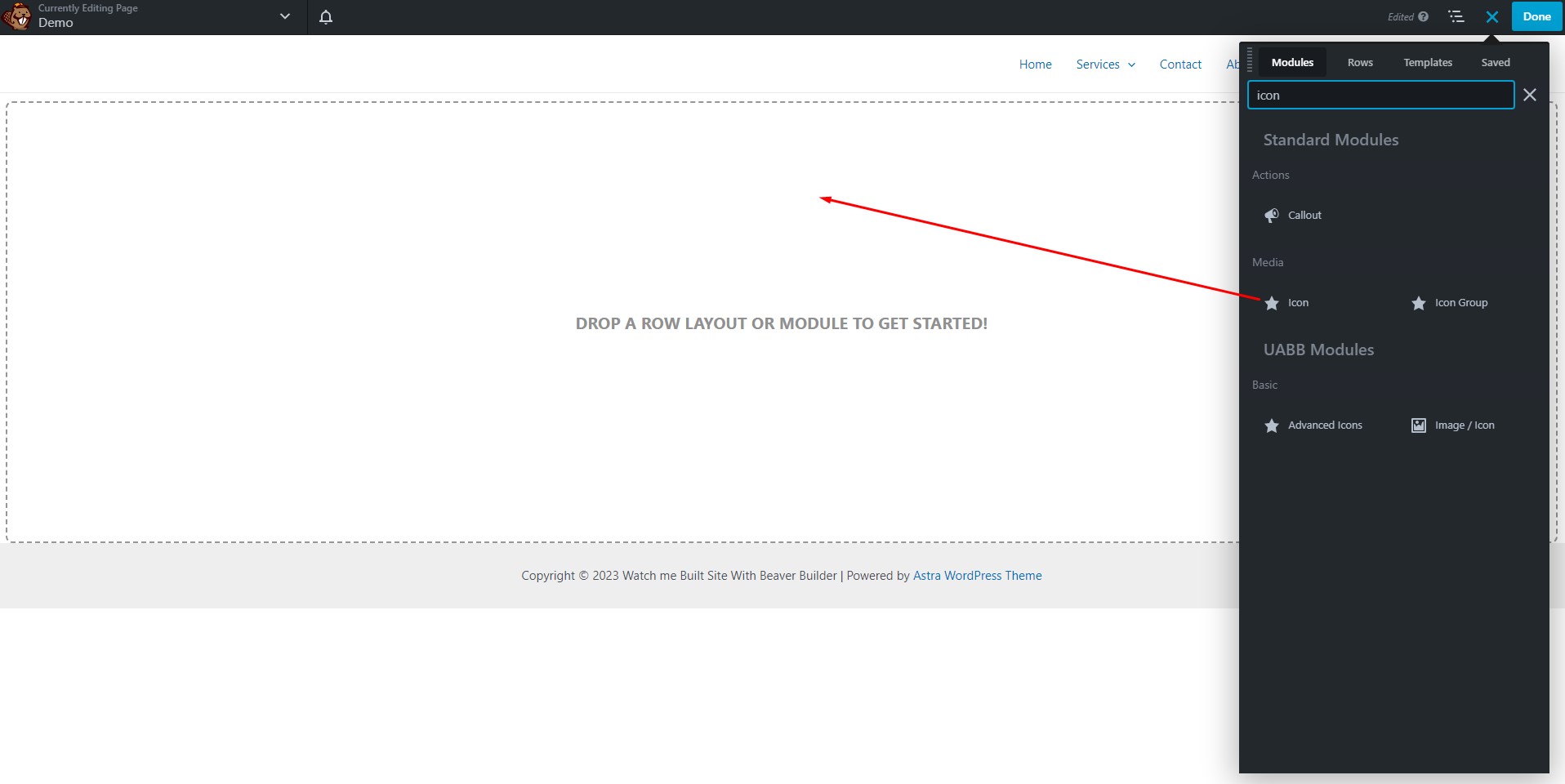
Step 1: Adding the Icon Module to Your Page
The first step in the process is to add the Icon Module to your web page using the Beaver Builder panel, conveniently located on the right-hand side. This panel provides easy access to a wide range of modules that can enhance your web design.
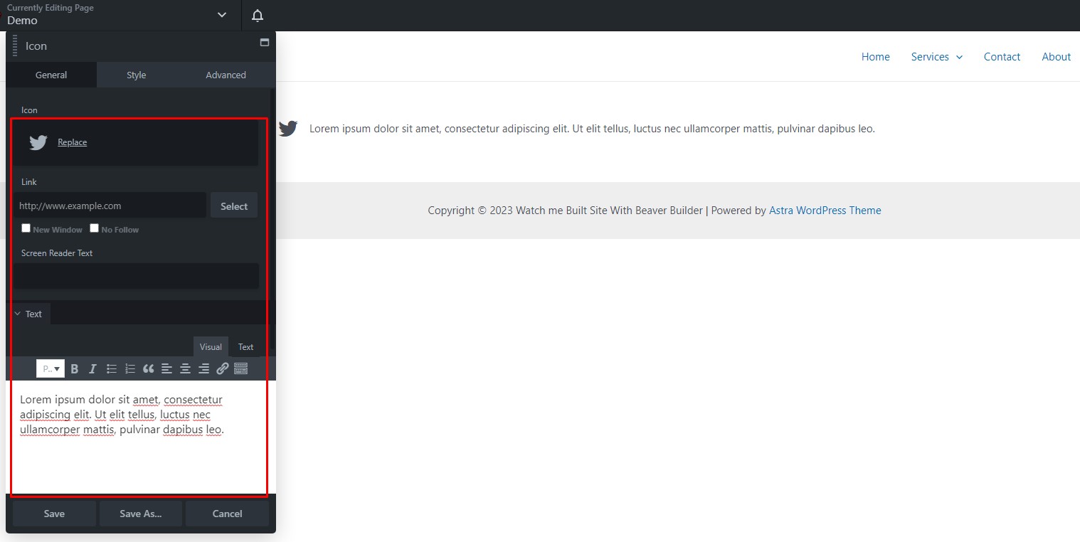
Step 2: Configuring the Beaver Icon Module
Once you’ve added the Icon Module to your page, it’s time to configure its settings. In the General Tab, you will find several options to personalize your icon.
Choose Your Icon
From the library of available icons, pick the one that best suits your content. Whether you want a symbol, an illustration, or a specific icon, you have a plethora of choices at your disposal.
Specify the Link and Text
In this section, you can set the link that the icon and accompanying text will redirect to. This is a crucial step if you want to make your icons clickable. Additionally, you can define screen reader text, which is essential for web accessibility. Finally, add the text content for the icon, which will appear beside it.
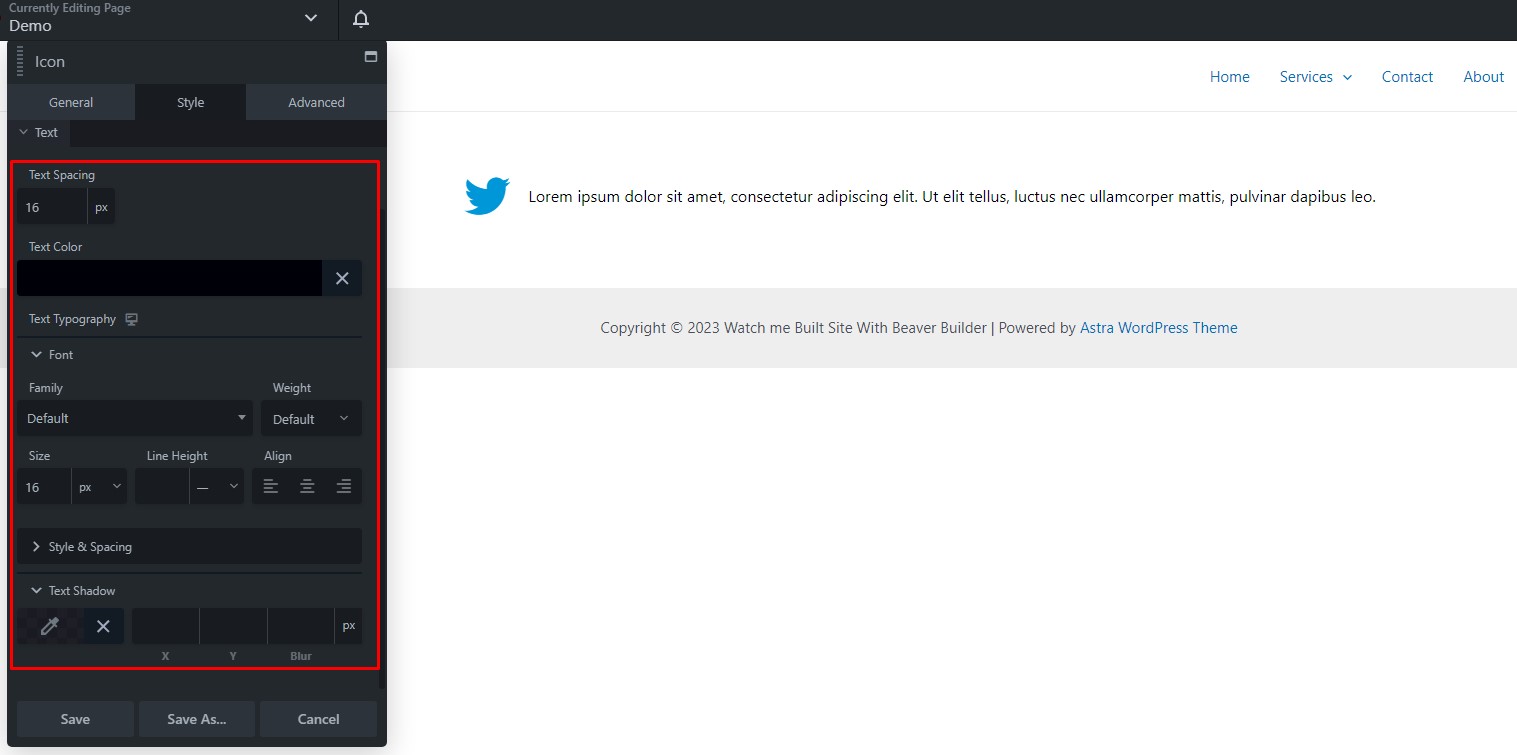
Step 3: Customizing the Styles of the Icon Module
Now, let’s make your icon stand out by customizing its appearance. Under the Style Tab, you have several options to play with.
Icon Styles
- Adjust the Icon Size: You can make the icon larger or smaller to fit your layout perfectly.
- Define the Icon’s Alignment: Choose how you want the icon to align in relation to the text or other elements on the page.
Icon Colors
- Select Icon Colors: Pick the color of the icon itself.
- Choose Hover Color: When a user hovers over the icon, you can make it change color to draw attention.
- Background Color: Define a background color for the icon.
- Background Hover Color: Similar to the hover color, this is for the background when the user hovers.
- Apply Gradient Effect: Decide if you want a gradient effect to be applied to the icon for that extra visual pop.
Text Styling
- Set Text Spacing: Define the space between the icon and the text. This is crucial for achieving the desired layout.
- Choose Text Color: Decide on the color for the accompanying text.
- Configure Typography: Play around with font choices, styles, spacing, and even add a text-shadow for that extra flair.
Step 4: Advanced Customization
If you need to further fine-tune the Icon Module to match your precise design requirements, you can utilize the Advanced Tab. Here, you’ll find additional settings that offer more control over the module’s behavior and appearance.
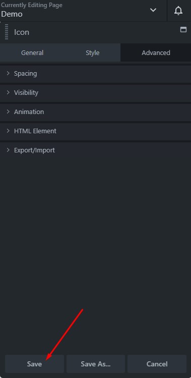
Step 5: Save and Publish
After you’ve made all your desired changes and are satisfied with the look of your icon module, don’t forget to click “Save.” Once saved, you can click “Done” in the upper right corner. This action will take you back to the Beaver Builder interface, where you can choose to “Publish” your page if it’s ready to go live, “Save Draft” if you need to come back to it later, or “Discard” if you decide not to use the changes you’ve made.
Incorporating icons into your web design has never been easier. With the Icon Module, you have the power to enhance your page layouts and create a more engaging user experience
Tips for Icon Module Styling in Beaver Builder
In today’s digital age, having a captivating website is crucial for any business or personal brand. And when it comes to web design, Beaver Builder is a go-to choice for many. One of its most versatile features is the Icon Module, which allows you to integrate icons into your website. In this article, we will guide you through the process of styling the Icon Module effectively to enhance your website’s overall aesthetics and user experience.
Using the Icon Module
Now that you have Beaver Builder up and running, let’s explore the tips for styling the Icon Module.
Add the Icon Module
In your page editor, simply add a new row or module where you’d like to place the icon. Within the module library, search for the “Icon” module and add it to the desired location.
Select an Icon
Upon adding the Icon Module, you can choose from a wide range of icons to best suit your content. Beaver Builder offers a diverse collection of icons, ensuring you find the perfect one for your needs.
Adjust Icon Size
Icon size matters when it comes to web design. You can easily adjust the size of the icon to fit your layout perfectly. Play around with different sizes until you achieve the desired visual balance.
Customize Icon Color
To make your icon stand out, customize its color to match your website’s color scheme. Consistency in color can significantly impact the visual appeal of your site.
Add Effects
Beaver Builder allows you to add various hover effects to the icon. These effects can make the icon more interactive and engaging for your visitors.
Enable Animation
Animating your icon can be a creative way to draw attention. Beaver Builder offers animation options for your icons, such as zooming or rotating.
Set Margins and Padding
Fine-tuning the spacing around your icon is crucial. You can set margins and padding to ensure your icon is perfectly aligned with the rest of your content.
Advanced Styling Techniques
Let’s take the Icon Module styling up a notch with some advanced techniques.
Use Custom CSS
If you have specific styling requirements beyond the built-in options, Beaver Builder allows you to add custom CSS to your Icon Module. This provides limitless design possibilities.
Using Icon Backgrounds
Enhance the visual appeal of your icon by adding a background. This can make your icon pop and create a more pronounced effect.
Combine with Text
Icons work great when integrated with text. Experiment with different layouts to combine icons and text harmoniously for a polished look.
Implement Icon Alignment
Play around with the alignment options to find the perfect spot for your icon. Center, left, or right alignment can drastically change the look and feel of your design.
Conclusion
In conclusion, mastering the art of Icon Module styling in Beaver Builder is essential for creating an appealing and user-friendly website. By following these step-by-step instructions and subheadings, you can elevate your web design skills to the next level. So, get creative and start enhancing your website’s visual appeal today.


