
Introduction
In the realm of web design, creating visually appealing and user-friendly pages is paramount. Beaver Builder, a renowned page builder plugin for WordPress, empowers users with its intuitive interface and powerful features. In this tutorial, we’ll explore one of its standout features—the Accordion Module—and guide you through the process of seamlessly integrating it into your Beaver Builder pages.
Understanding Accordion Modules
Accordion modules act as collapsible containers, providing an organized way to present content. Their benefits extend beyond aesthetics, offering improved user experience and efficient information delivery.
Step-by-Step Guide to Adding Accordion Modules
Step 1: Find and Add the Accordion Module
Find the “Accordion” module in Beaver Builder.
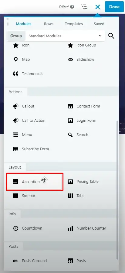
Drag and drop the Accordion module onto your page.

Step 2: Customize Accordion Settings
Once you’ve added the Accordion module, you’ll see “Accordion Settings” in the left sidebar. Click on it to customize your accordion.
Step 3: Edit the Accordion Items
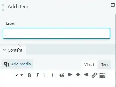
To add content to your Accordion module, click the “Edit Item” button.
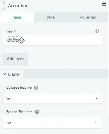
In the edit window, provide a label for your Accordion item.
Add the content you want to display when the Accordion item is expanded.
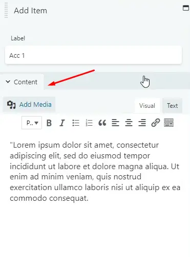
Click “Save” to save your changes.

Step 4: Configure Display Settings
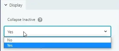
In the “Display Section,” you can choose whether the Accordion items should collapse when inactive. You can select “Yes” or “No” based on your preference.
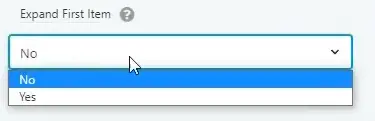
Similarly, you can choose whether the first Accordion item should be expanded by default in the “Expand First Item” option.
Step 5: Style Your Accordion
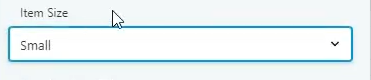
Head over to the “Style Tab” to customize the appearance of your Accordion.
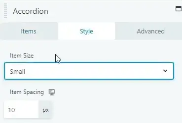
Here, you can set the item size and adjust item spacing for a polished look.
Utilize the “Item Border’s General” settings to add radius and shadow effects.

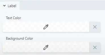
Add a color for text and background to match your website’s design.
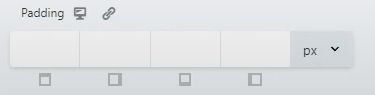
Set padding in the “Padding Section” to control spacing within the Accordion.
If you wish, you can also add an icon to your Accordion item for visual appeal.
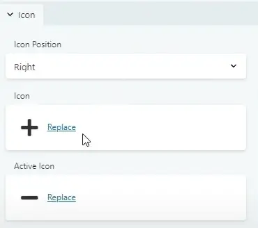
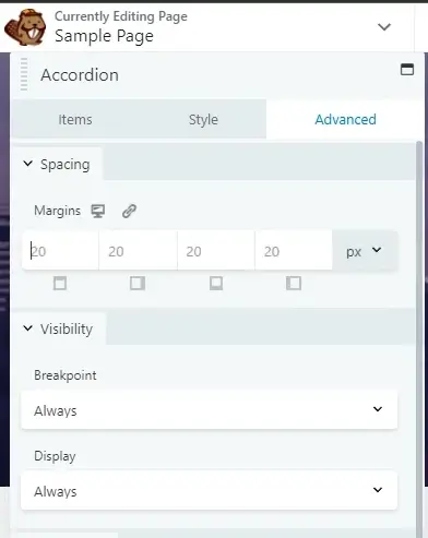
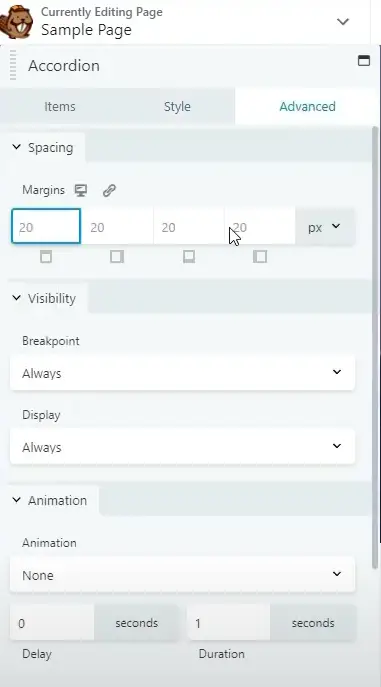
Step 6: Advanced Customization
For more advanced customization, go to the “Advanced Tab” and explore additional options to fine-tune your Accordion module’s behavior and appearance.
That’s it! You’ve successfully added and customized an Accordion module in Beaver Builder.
Responsive Design with Accordion Modules in Beaver Builder
Responsive design is all about providing an optimal viewing experience for your website visitors, regardless of the device they use. Accordion modules are an excellent addition to this, allowing you to present information in a space-saving, organized manner. Let’s dive into the steps to create this engaging and user-friendly design.
Getting Started with Beaver Builder
Before we delve into creating a responsive design with accordion modules, let’s ensure you’re familiar with Beaver Builder. Here are the initial steps:
Choose Your Page
Select the page where you want to implement the responsive design. Beaver Builder works with both existing and new pages, so you have the flexibility to choose.
Designing Responsively
Now that you’re set up let’s start designing responsively:
Select a Responsive Theme
Ensure you’re using a responsive WordPress theme. A responsive theme is essential as it lays the foundation for your design’s adaptability across different devices.
Create Rows and Columns
In Beaver Builder, you’ll work with rows and columns to structure your content. Create rows and columns based on your content layout, keeping in mind the various screen sizes.
Adding Content Modules
To make your design engaging, use Beaver Builder’s content modules. These modules include text, images, videos, and more. Each module is designed to be responsive, so your content looks great on any device.
Accordion Modules
Accordion modules are perfect for organizing content that you want to reveal gradually. Here’s how to add them:
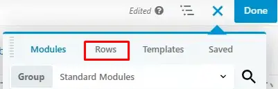
Step 1: Add a New Row
Within Beaver Builder, click on the “+” button to add a new row. You can choose the number of columns based on your content.
Step 2: Add the Accordion Module
In your new row, click on the “+” button again and search for the “Accordion” module. Add it to the column where you want the accordion to appear.
Step 3: Customize the Accordion
Now, customize your accordion by adding titles and content sections. Users can click on the titles to expand or collapse the content beneath them.
Optimizing for Mobile
Mobile Responsiveness
Beaver Builder automatically optimizes your design for mobile devices. However, it’s essential to preview and fine-tune the mobile view to ensure a seamless experience.
Testing Across Devices
Before publishing, test your responsive design on various devices to make sure it looks and functions as intended. Beaver Builder provides device preview options for this purpose.


