

Introduction
Beaver Builder, a popular WordPress page builder, empowers users to create visually stunning websites without the need for complex coding. One of its standout features is the Accordion Module, a dynamic tool that enhances the user experience by organizing content in an interactive and space-efficient manner.
In the world of web design and content organization, the accordion module stands out as a versatile and space-saving tool. It allows you to present a variety of content by expanding and collapsing text sections, keeping your web pages clutter-free while maintaining a professional appearance. This tutorial will walk you through how to use the accordion module effectively.
Understanding Beaver Builder
Beaver Builder is a versatile drag-and-drop page builder plugin for WordPress. With its intuitive interface, it allows users to create visually appealing websites without the need for coding skills. The plugin offers a range of modules to enhance website functionality, and one such module is the accordion, which proves to be an excellent tool for organizing and presenting content effectively.
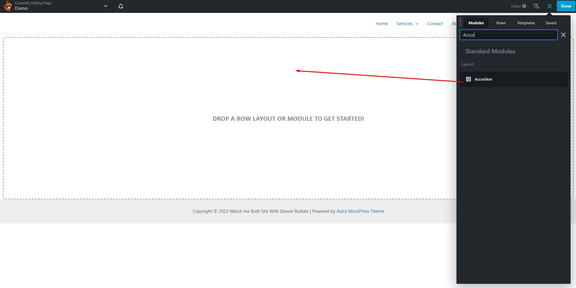
Step 1: Adding the Accordion Module
Locate the Accordion Module
Start by finding the Accordion module in the right-side panel of your web design platform. Simply drag and drop it onto the desired page.
Step 2: Setting up the Beaver Accordion Module
The Beaver Accordion Module offers two content source options: Post and Custom Content. You can choose the one that best suits your needs.
Content Source: Select either ‘Post’ or ‘Custom Content.’
- By choosing ‘Post,’ you can automatically add pages, posts, or custom post types to the Accordion module.
- For ‘Custom Content,’ you have the flexibility to create your content using the WordPress classic editor or import content from a saved row, column, module, or template.
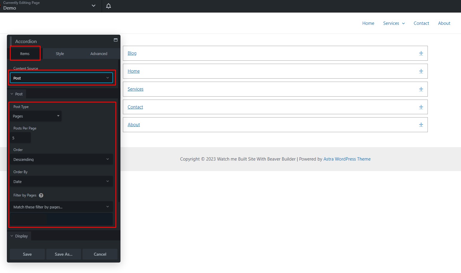
- Post Type: Decide between ‘Posts’ or ‘Pages.’
- Number of Accordion Items: Specify how many items you want to display per page.
- Order: Choose between ‘Descending’ or ‘Ascending’ for item organization.
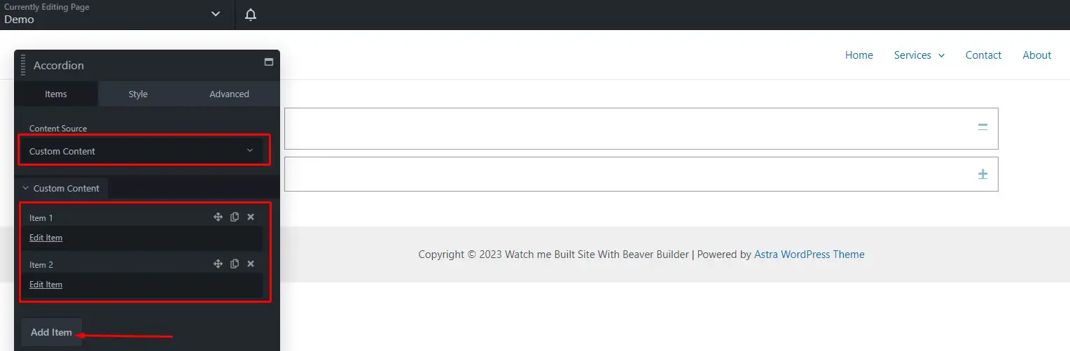
- Edit Item: Click this option to customize each accordion item.
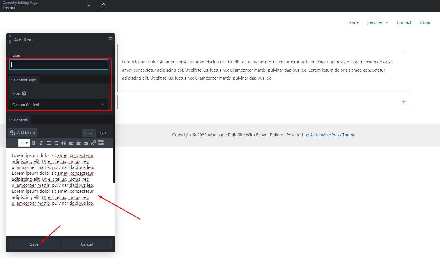
- Accordion Name: Give each item a unique name to identify it in the Accordion module settings panel.
- Accordion Type: Select the style of accordion you prefer.
- Add Content: Populate the accordion item with your desired content.
- Save: Don’t forget to save your changes.
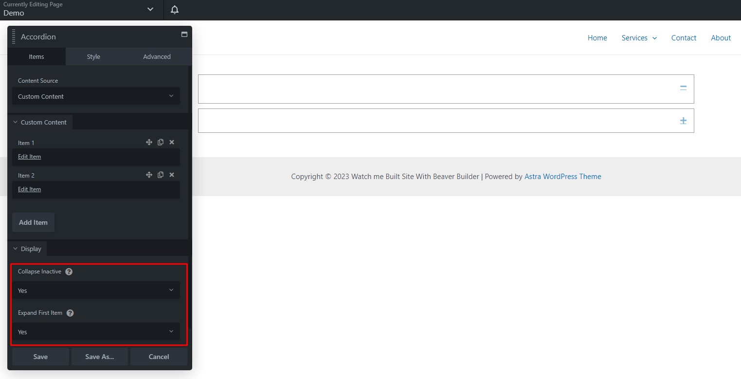
- Display Options: Decide whether to enable ‘Collapse Inactive’ and ‘Expand First Item.’
- Collapse Inactive: Selecting ‘Yes’ allows only one item to be expanded at a time, whereas ‘No’ permits multiple expanded items simultaneously.
- Expand First Item: If set to ‘Yes,’ the first item will automatically expand on the initial view.
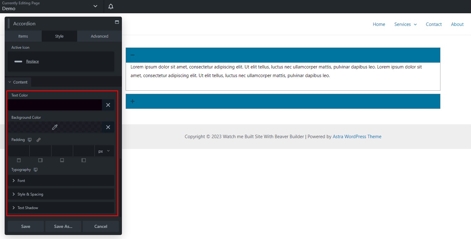
Step 3: Customizing Accordion Styles
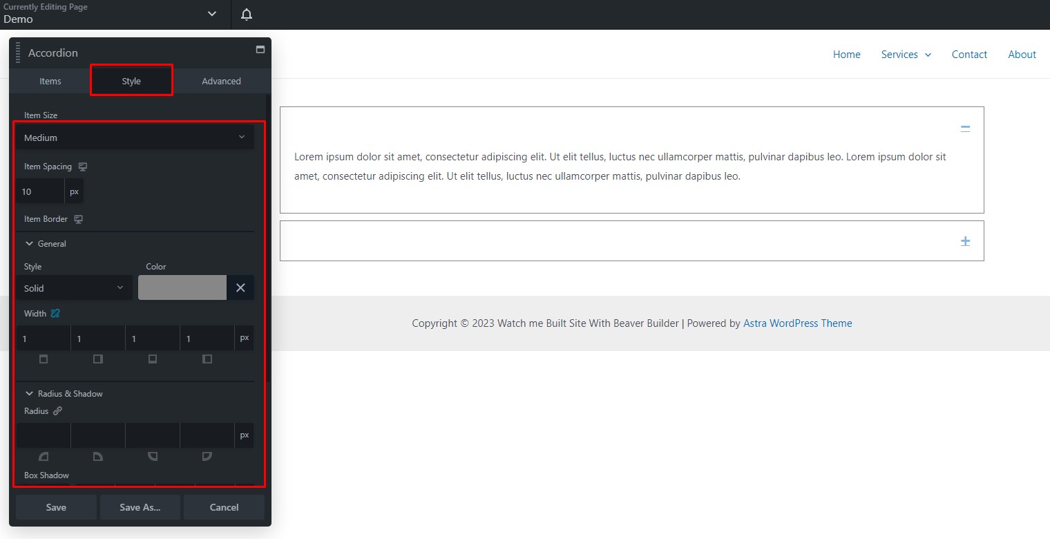
The Style tab provides options for customizing the appearance of your accordion.
- Item Size: Choose from ‘Small’ to ‘Large.’
- Item Spacing: Determine the spacing between accordion items.
- Item Border: Set the general, radius, and shadow properties for the item border.
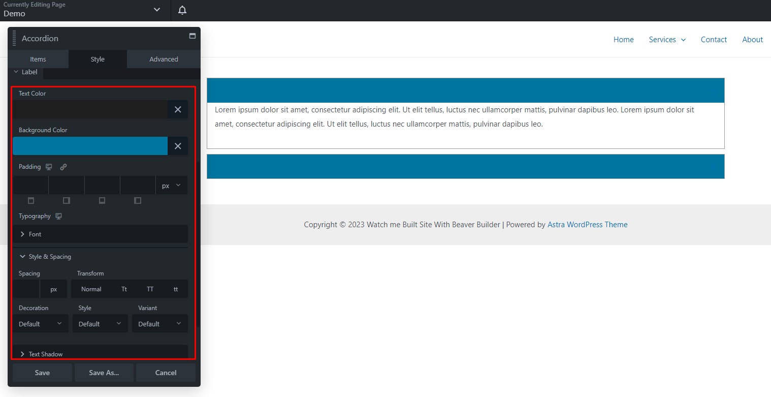
Label Styling
- Text: Customize the text color, background color, and padding for the accordion labels.
- Font: Adjust the typography of the label text.
- Style and Spacing: Set the style and spacing of the label text.
- Text-Shadow: Define text-shadow properties.
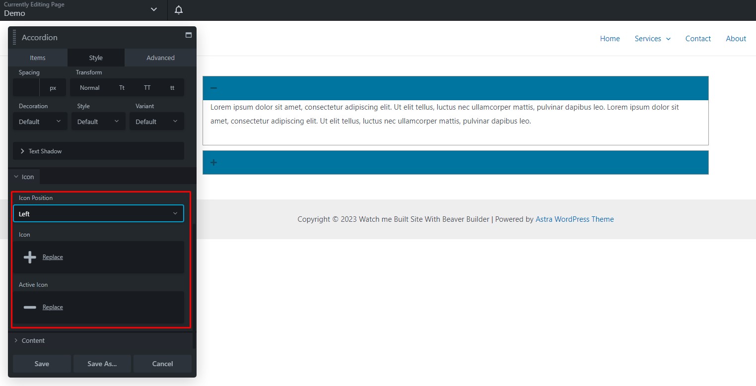
Icon Styling
- Position: Specify the icon’s position (left or right).
- Icon Selection: Choose an icon from the library or use a custom one.
- Custom Icon: If needed, select a custom icon.
Content Styling
- Text: Configure the text color, background color, and padding for the accordion content.
- Font: Customize the typography of the content text.
- Style and Spacing: Adjust the style and spacing of the content text.
- Text-Shadow: Define text-shadow properties for the content text.
Once you’ve customized the accordion to your liking, click ‘Done’ in the upper right corner. You can then choose from the following options: ‘Publish,’ ‘Save Draft,’ ‘Discard,’ or ‘Cancel.’
By following these step-by-step instructions, you can efficiently create and customize accordion modules for your web content, making it easy for your audience to access and engage with the information they need.
Accordion Module Tips and Tricks for Beaver Builder
Beaver Builder is a fantastic tool for creating stunning websites with ease. The Accordion Module is one of the many features that allows you to present information in a structured and visually appealing way. In this article, we’ll walk you through the steps to make the most out of the Accordion Module in Beaver Builder.
Understanding the Accordion Module
The Accordion Module is a user-friendly way to organize and display content in a collapsible format. It’s commonly used for FAQs, product features, or any content that benefits from a space-saving, user-friendly approach.
Step 1: Adding the Accordion Module to Beaver Builder
- Open the Beaver Builder editor.
- Select the row or column where you want to add the Accordion Module.
- Click the “+” button to add a new module.
- Search for “Accordion” and drag the Accordion Module to your chosen location.
Step 2: Configuring the Accordion Module
Once you’ve added the module, you can configure its settings. You can choose to have multiple sections within the Accordion Module, making it perfect for grouping related information.
Step 3: Customizing Accordion Content
- Add the title for each section.
- Fill in the content for each section.
- Customize the colors and fonts to match your website’s design.
Step 4: Styling the Accordion Module
Beaver Builder provides various styling options to ensure the Accordion Module fits your design preferences. You can adjust spacing, borders, and other visual elements.
Step 5: Responsiveness and Mobile-Friendly Design
Beaver Builder is known for its responsiveness. The Accordion Module is no exception. Your accordion content will adapt seamlessly to different screen sizes.
Tips and Tricks for Accordion Module Efficiency
- Use clear and concise titles for each section.
- Organize content logically to enhance user experience.
- Test your accordion on various devices to ensure it looks great everywhere.
Using Accordion Module for FAQ Sections
The Accordion Module is a fantastic tool for creating FAQ sections. It keeps your page tidy while offering users a simple way to find the information they need.
Enhancing User Experience
With Beaver Builder’s Accordion Module, you can significantly improve user experience on your website. It’s an intuitive way to provide information and engage your visitors.
Conclusion
Beaver Builder’s Accordion Module is a valuable asset for anyone looking to present information in an organized and user-friendly manner. With the easy-to-follow steps and tips mentioned in this article, you can create stunning accordion sections that enhance user experience and boost your website’s SEO.


