
Introduction
In the vast realm of website development, the Beaver Builder Page Builder stands out as a powerful tool that allows users to create stunning and dynamic pages effortlessly. Known for its user-friendly interface and an array of customization options, Beaver Builder provides an ideal platform for crafting visually appealing websites. In this tutorial, we will explore the step-by-step process of adding a post carousel in Beaver Builder, making your content more engaging and visually appealing.
Understanding Beaver Builder
Before diving into the intricacies of post carousels, let’s take a moment to appreciate Beaver Builder’s capabilities. This drag-and-drop page builder empowers users to create stunning layouts without any coding knowledge. Its user-friendly interface makes it a favorite among both beginners and seasoned developers.
Step-by-Step Guide: Adding a Post Carousel in Beaver Builder
To begin, follow these steps:
Step 1: Add the Post Carousel
Open your page in Beaver Builder.
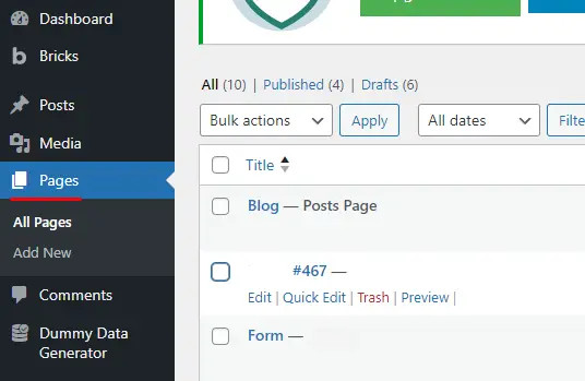
Look for the “Plus” symbol and click on it.
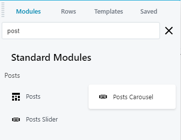
Search for “Post Carousel” and select it.
Step 2: Access Carousel Settings
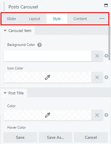
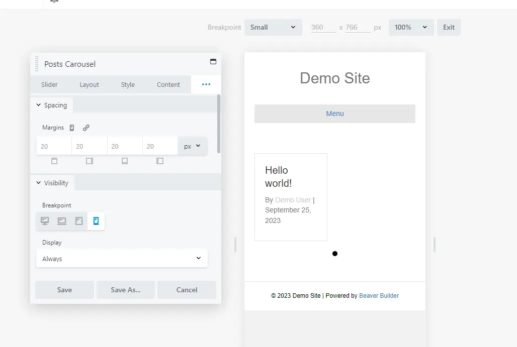
Once you’ve added the post carousel module, the settings will appear on the left sidebar of the page. These settings are categorized into four tabs: “Slider,” “Layout,” “Style,” and “Content.”
Customizing the Carousel
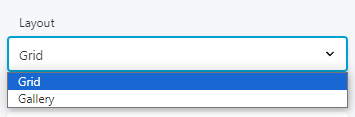
Slider Tab: Choose Your Layout
In the “Layout” section, you can choose the layout that best suits your website’s design.
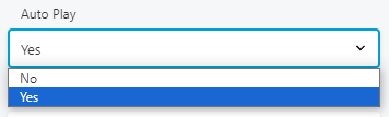
Auto Play
Decide whether you want the carousel to automatically play by selecting “Yes” or “No” in the “Auto play” option.
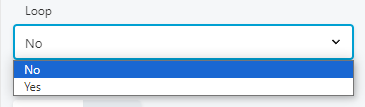
Loop Section
Choose “Yes” or “No” to determine if the carousel should loop.
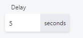
Delay Section
Set the number of seconds for the delay between slides.
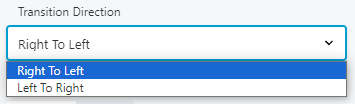
Transition Direction
Select either “Right to Left” or “Left to Right” for the transition direction.
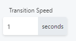
Transition Speed
Adjust the speed of the transition between slides.
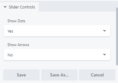
Slider Controls
Decide if you want to show dots and arrows by selecting “Yes” or “No.”
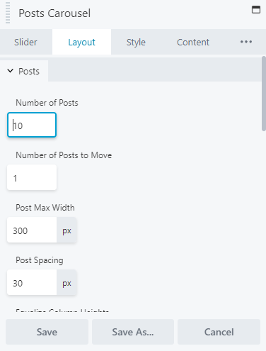
Layout Tab: Customizing Post Display
Set the number of posts, number of posts to move, post max width, and post spacing.
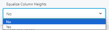
Equalize Column Heights
Select “Yes” to ensure that the borders surrounding each post are the same size.
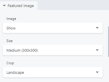
Featured Image
Choose whether to show or hide the featured image and set its size. You can also crop the featured image to a specific shape.
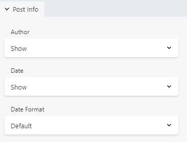
Post Info
Decide whether to show or hide the post author and post date. You can also select the default WordPress date format specified in settings.
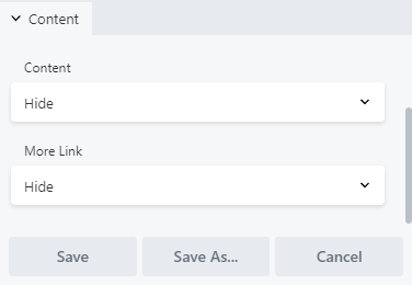
Content
Choose to show or hide post content and the link.
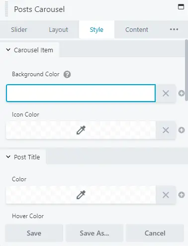
Style Tab: Customize Appearance
Change the arrow color, background color, and background shape. You can also add color and modify typography for your post carousel, title, and info.
Advanced Customization
If you want to take your post carousel customization further, explore the options in the “Content” tab, “Advanced” tab, and other available settings.
Step-by-Step Guide: Responsive Design for Post Carousels in Beaver Builder
Responsive design ensures that your post carousels created in Beaver Builder look great on various devices and screen sizes. Follow these steps to achieve responsive post carousels:
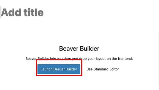
Step 1: Open Your Beaver Builder Project
Launch Beaver Builder and open the project where you want to create or edit a post carousel.
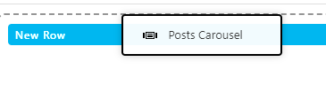
Step 2: Add a Post Carousel Module
Click on the “+” icon or the “Add Content” button to open the module library.
Search for “Post Carousel” module.
Drag and drop the “Post Carousel” module onto the desired section of your page.
Step 3: Configure Post Carousel Settings
Click on the Post Carousel module to open its settings.
Configure the basic settings such as the number of posts to display, post categories, order, and more. Make sure to set these options according to your content and design preferences.
Step 4: Design Your Post Carousel
Navigate to the tabs within the Post Carousel module settings.
Customize the design elements like fonts, colors, spacing, and borders to match your website’s style and branding.
Step 5: Set Up Responsive Layouts
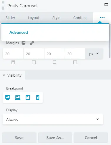
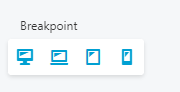
In the Advanced Tab, scroll down to find the “Breakpoint” section.
Beaver Builder offers a variety of breakpoints to adjust the carousel’s appearance on different screen sizes (desktop, tablet, and mobile). Click on the desired breakpoint to configure its specific settings.
Step 6: Customize Each Responsive Breakpoint
For each breakpoint (desktop, tablet, and mobile), adjust the following settings as needed:
Number of posts to display.
Spacing and alignment.
Font sizes.
Any other design or layout elements that require modification.
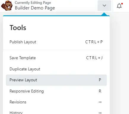
Step 7: Preview and Test
To ensure your post carousel looks good on various devices, use Beaver Builder’s responsive preview mode. You can toggle between different device views (desktop, tablet, and mobile) to see how your changes affect the carousel’s appearance.
Test your post carousel on actual devices to confirm that it displays correctly and is easy to navigate.
Step 8: Publish or Update Your Page
To make your responsive post carousel live on your website, click the “Publish” button or “Update” if you are editing an existing page.
Step 9: Regularly Review and Adjust
As your website evolves or new devices with different screen sizes emerge, periodically review and adjust the responsive design of your post carousel to ensure it continues to look great and function well across all devices.
By following these steps, you can create or enhance the responsive design of post carousels in Beaver Builder, providing a seamless user experience for visitors on various devices.


