
If you’re looking to enhance the navigation experience on your WordPress website, creating a mega menu with Elementor could be just the solution you need. Mega menus are expansive navigation panels that display multiple options at once, making it easier for users to find what they’re looking for. In this guide, we’ll walk you through the process of creating a mega menu using Elementor, a popular page builder plugin for WordPress.
Introduction
Elementor is a powerful drag-and-drop page builder plugin for WordPress that allows users to design and customize their websites without any coding knowledge. With its intuitive interface and extensive library of widgets and templates, Elementor has become a favorite among both beginners and experienced web developers.
Understanding Mega Menus
Mega menus are advanced navigation menus that allow website owners to display a large number of options in a structured and visually appealing manner. Unlike traditional drop-down menus, mega menus often feature multiple columns, images, and even widgets, providing users with a comprehensive overview of the site’s content.
Importance of Mega Menus for Websites
Mega menus offer several benefits for website owners and visitors alike. They improve navigation by organizing content into logical categories, reducing the number of clicks required to find information. Additionally, mega menus can enhance the visual appeal of a website and provide opportunities for branding and promotion.
Definition and Benefits
A mega menu is a type of website navigation menu that typically displays multiple columns of links and options, often organized into categories or sections. It is designed to accommodate a large amount of content and provide users with quick access to various sections of a website.
Benefits of a mega menu include:
- Enhanced usability: Mega menus make it easier for users to navigate through a website by providing a clear and organized structure, reducing the number of clicks needed to find the desired information.
- Efficient space utilization: Mega menus utilize screen space effectively, allowing websites to display a large amount of content without cluttering the interface.
- Improved accessibility: Mega menus can enhance accessibility by providing alternative navigation options for users with disabilities, such as keyboard navigation and screen reader compatibility.
- Increased engagement: By making it easier for users to discover and access relevant content, mega menus can help increase user engagement and retention on a website.
- Better SEO performance: Mega menus can improve the internal linking structure of a website, which can positively impact search engine optimization (SEO) by making it easier for search engine crawlers to discover and index content.
Overall, mega menus offer a user-friendly and efficient way to navigate complex websites, leading to a better user experience and improved website performance.
Why Use Elementor for Mega Menus?
Elementor is a powerful WordPress page builder plugin that stands out for its ability to create dynamic and visually appealing mega menus. With its user-friendly drag-and-drop interface, extensive customization options, and seamless integration with WordPress themes, Elementor makes it easy to design and implement mega menus that enhance website navigation and user experience. Its responsiveness ensures that mega menus look great on any device, while its extensive widget library allows for the inclusion of various elements to make menus engaging and interactive. Whether you’re a novice or an experienced user, Elementor offers the tools needed to craft stunning mega menus that elevate your website’s design and functionality.
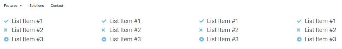
Setting Up the Mega Menu in Elementor
Step 1: Create a Template for the Mega Menu
- Access the Theme Builder: Navigate to your WordPress dashboard and click on “Templates” and then “Theme Builder.”
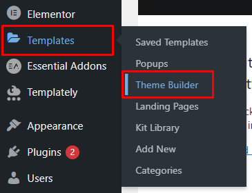
- Add New Template: Select “Add New Template,” give it a descriptive name, and click “Create Template.”
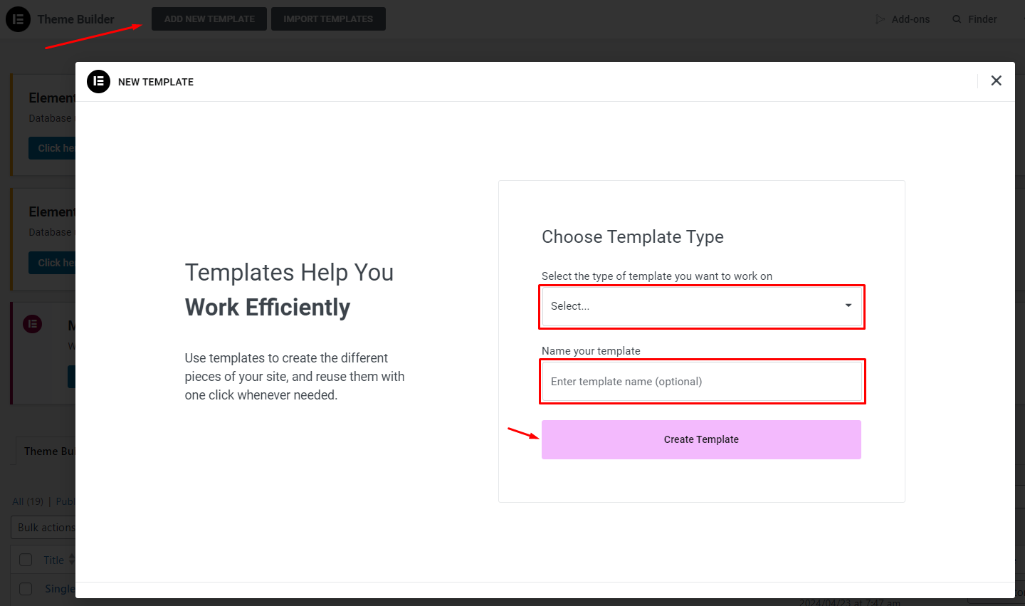
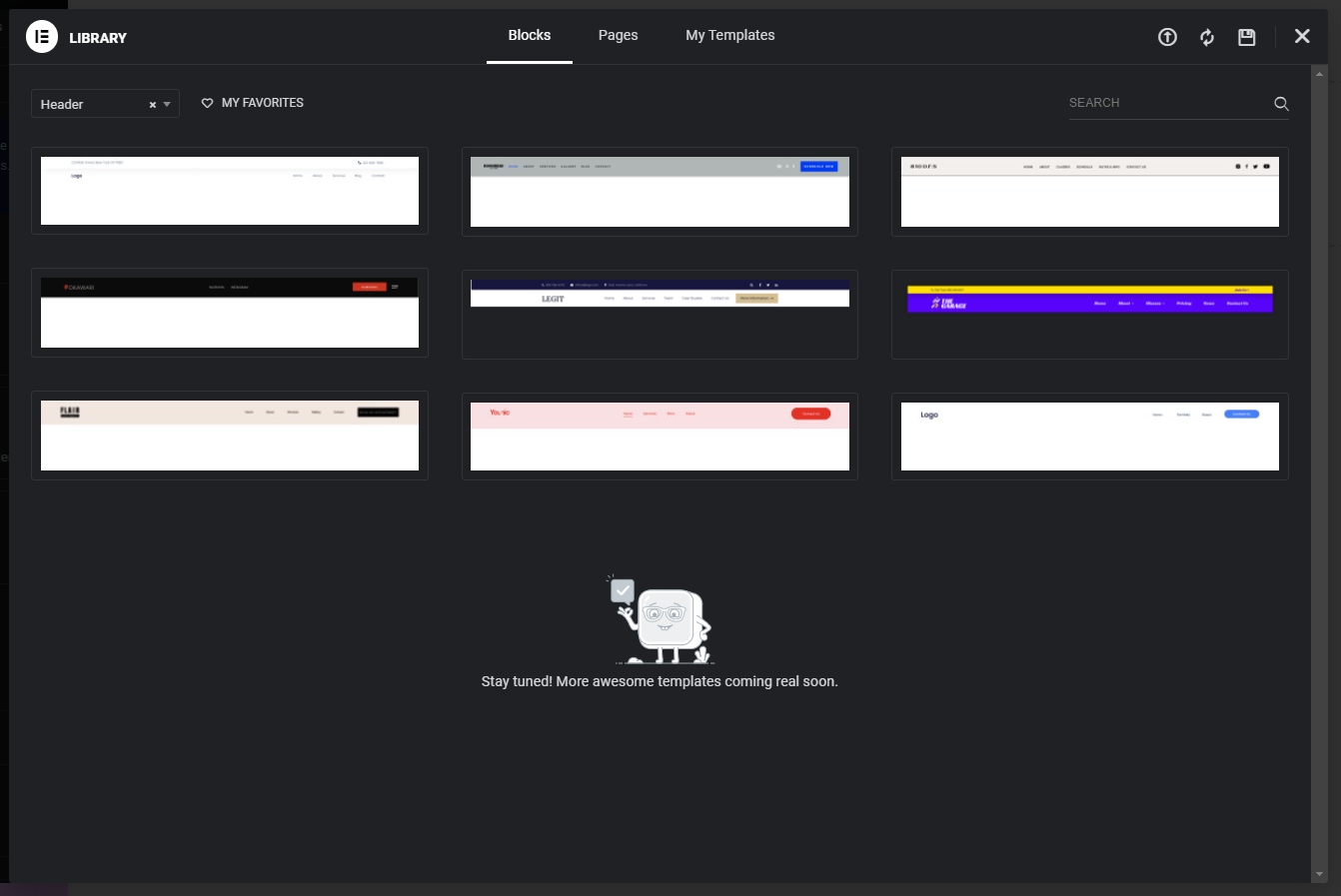
- Choose Header Template: You can either select an existing header template from the library or create a new one from scratch.
Step 2: Add a Menu to the Header
- Locate the Menu Widget: Within the header template editor, find the “Menu” widget.
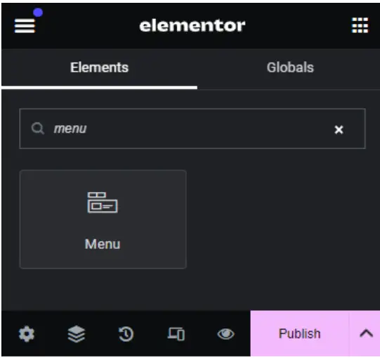
- Position the Menu: Drag the “Menu” widget to the desired location within your header layout.
- Remove Default Menu Items: Remove any default menu items that come with the widget.
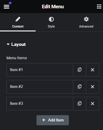
- Customize Menu Items: Replace the default menu items with your desired options.
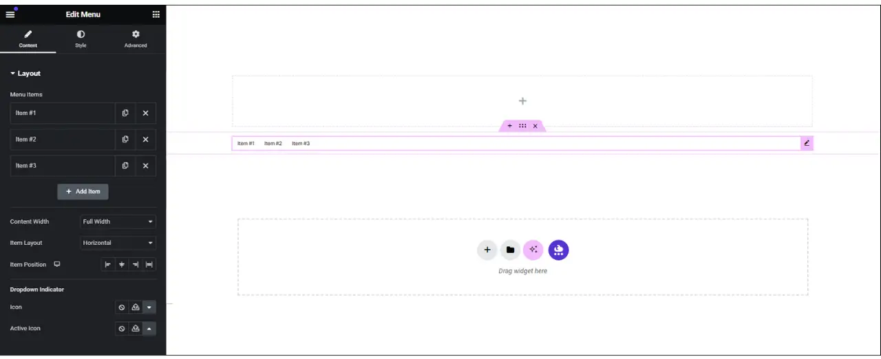
Step 3: Designating the Mega Menu Items
- Access Menu Item Settings: Click on each menu item to access its settings.
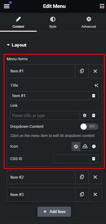
- Enable Dropdown Content: Toggle the “Dropdown Content” switch to enable the mega menu feature.
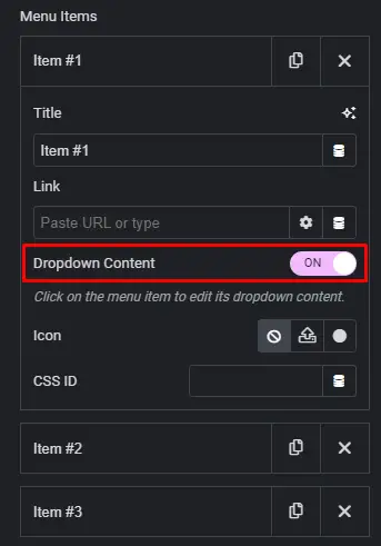
- Select Mega Menu Content: Choose the type of content you want to display in the mega menu, such as “Blogs” or “Features.”
Step 4: Customize the Mega Menu Layout
- Design the Mega Menu Layout: Utilize Elementor’s drag-and-drop interface to design the layout of your mega menu.
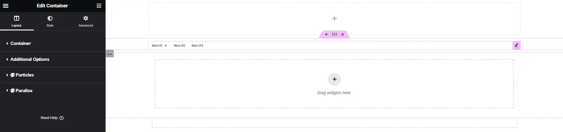
- Add Widgets and Content: Incorporate various Elementor widgets to add dynamic content to your mega menu, such as recent blog posts or featured products.
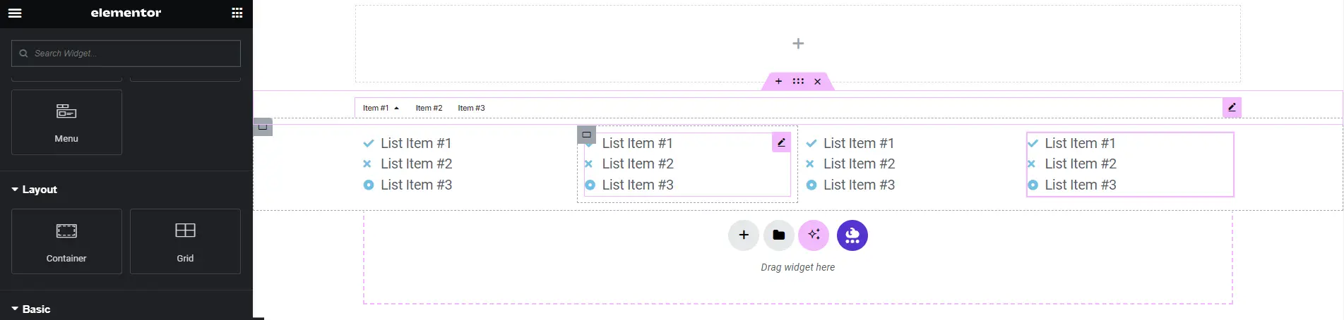
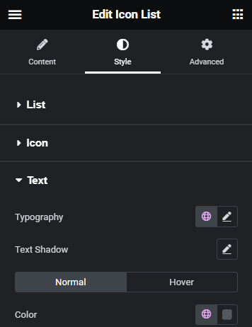
- Customize Appearance: Modify the appearance of the mega menu by adjusting text, fonts, colors, and layout options.
Step 5: Adding Widgets and Content
- Preview Your Mega Menu: Take a look at how your mega menu appears on the frontend of your website.
- Make Adjustments: Fine-tune any elements or layouts as needed.
- Save Your Template: Once you’re satisfied with the design, save your template to apply the mega menu to your website.
Troubleshooting and Tips
Common Issues and Solutions
Common issues with mega menus and their potential solutions include:
- Responsive design problems: Mega menus may not display properly on smaller screens or mobile devices, leading to layout issues or navigation difficulties. To address this, ensure that your mega menu is responsive and mobile-friendly.
- Accessibility issues: Mega menus may pose accessibility challenges for users with disabilities, such as those using screen readers or keyboard navigation. To improve accessibility, ensure that your mega menu is properly structured with semantic HTML elements, such as lists and headings.
- Performance concerns: Mega menus with a large amount of content or complex designs can impact website performance, leading to slower page load times or increased server load.
- Compatibility issues: Mega menus may not display or function correctly in certain browsers or devices due to compatibility issues or differences in rendering behavior.
- Usability challenges: Mega menus that are poorly designed or overly complex can confuse users and hinder navigation. To improve usability, keep your mega menu simple and intuitive, with clear labeling and logical organization of content.
By addressing these common issues and implementing appropriate solutions, you can ensure that your mega menu provides a seamless and user-friendly navigation experience for your website visitors.
Best Practices for Mega Menu Design
Best practices for mega menu design include:
- Clear hierarchy and organization: Structure your mega menu with a clear hierarchy and logical organization of content. Group related items together and use meaningful labels to help users understand the menu structure.
- Limited number of items: Avoid overcrowding your mega menu with too many items or submenus, as this can overwhelm users and make navigation more difficult. Keep the number of items manageable and prioritize the most important or frequently accessed content.
- Visual consistency: Maintain visual consistency with the rest of your website’s design, including colors, typography, and branding elements. This helps users recognize and navigate the mega menu more easily.
- Use of visual cues: Use visual cues such as icons, arrows, or hover effects to indicate interactive elements and provide feedback to users. Visual cues can help users understand the menu structure and navigate more efficiently.
- Accessibility considerations: Ensure that your mega menu is accessible to users with disabilities by following best practices for web accessibility. Use semantic HTML elements, provide keyboard navigation support, and test your mega menu with assistive technologies to ensure compatibility.
- Responsive design: Design your mega menu to be responsive and adapt to different screen sizes and devices. Use responsive design techniques such as media queries and flexible layouts to ensure that the mega menu displays properly on desktops, tablets, and smartphones.
- Performance optimization: Optimize the performance of your mega menu by minimizing the use of heavy graphics or animations, optimizing images and multimedia content, and reducing unnecessary JavaScript or CSS. This helps improve page load times and overall website performance.
- User testing: Conduct usability testing with real users to gather feedback and identify any usability issues with your mega menu design. Use the feedback to iterate on your design and make improvements to enhance the user experience.
By following these best practices, you can create a well-designed mega menu that provides users with a seamless and intuitive navigation experience on your website.
Conclusion
Creating a mega menu with Elementor is a straightforward process that allows you to enhance your website’s navigation and user experience. By following the step-by-step instructions outlined in this guide, you can create a customized mega menu that meets your specific needs and preferences.


