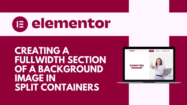

In today’s digital landscape, designing visually appealing web pages is crucial to captivate your audience’s attention. One common challenge is achieving a layout where a fullwidth background image seamlessly integrates with neatly boxed and aligned text content. Fortunately, with Elementor, a powerful WordPress page builder, you can effortlessly create such layouts using split containers. Let’s dive into step-by-step instructions on how to achieve this stunning design.
Introduction
Ever wished to design a two-column layout where an image spans from the center to the edge, all while maintaining neatly boxed and aligned text content with other sections on your page? This tutorial will guide you through the process of creating a visually appealing webpage section using Elementor.
Understanding fullwidth background images
A fullwidth background image spans the entire width of a webpage, creating a visually impactful design element. In Elementor, users can easily add fullwidth background images to sections, columns, or individual widgets.
Benefits of using fullwidth background images
Enhanced visual appeal: Fullwidth background images can help capture visitors’ attention and create a memorable browsing experience.
Improved storytelling: By incorporating relevant images, websites can effectively convey their brand message and engage users.
Increased engagement: Visual elements like fullwidth background images can encourage users to explore further and stay longer on a website.
Creating multiple split containers in Elementor
Elementor allows users to create dynamic layouts by dividing sections into multiple columns. By adding fullwidth background images to these split containers, designers can create visually stunning and immersive web pages.
Using Elementor’s column structure
Elementor’s column structure provides flexibility in designing layouts. Users can easily add, delete, or rearrange columns to achieve their desired design.
Adding background images to columns
To add a fullwidth background image to a column in Elementor, users can simply select the column, navigate to the style settings, and choose an image from their media library or upload a new one.
Splitting columns for a dynamic layout
By splitting columns within a section, designers can create visually interesting layouts that showcase different content or emphasize key elements.
Steps to create a fullwidth background image in multiple split containers
Setting Up the Layout
Step 1: Launch Elementor and Select Layout
Begin by launching Elementor and selecting the desired page to edit. To add a new section, click on the “Plus” icon.
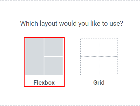
Step 2: Choose Flexbox Layout
Within the section settings, choose the Flexbox layout for optimal flexibility.
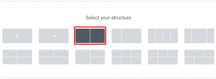
Step 3: Set Up Column Structure
Select the 2-column structure to accommodate the text widget and the fullwidth background image.
Adding Content to Columns
Step 4: Add Text Widget
In the first column, add a text widget and align it to the center for a clean presentation.
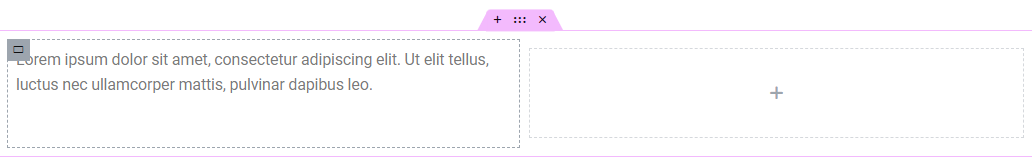
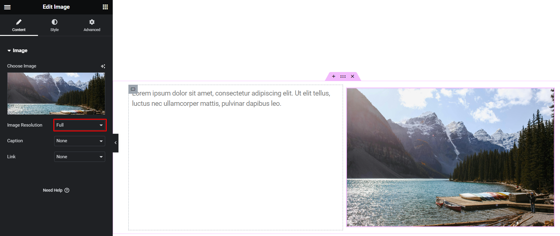
Step 5: Insert Image
Add an image to the second column and ensure the image resolution is set to “Full” for optimal display.
Adjusting Container Settings
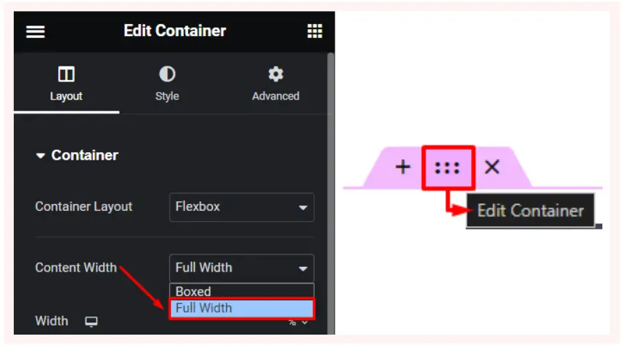
Step 6: Configure Container Settings
Select “Edit Container” for the parent container. Set the “Content Width” to “Fullwidth” to enable the image to span the entire width of the container.
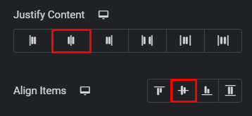
Step 7: Adjust Justify Content and Align Items
Within the container settings, choose “Center” for both “Justify Content” and “Align Items” to center-align the content.
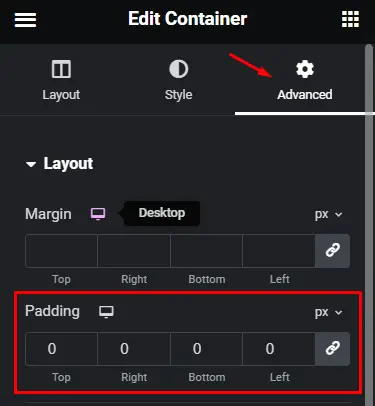
Step 8: Customize Padding
In the “Advanced Settings,” set the padding to zero to eliminate any unwanted spacing around the container.
Configuring First Column
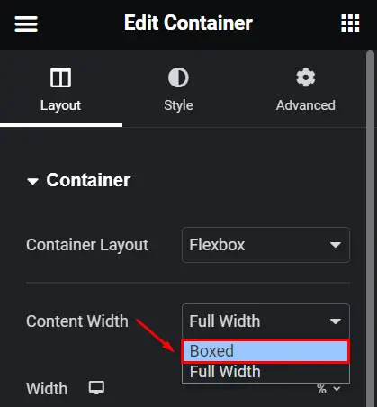
Step 9: Customize Text Column
Navigate to the settings for the first column. Choose “Boxed” for “Content Width” to confine the text within a boxed layout.
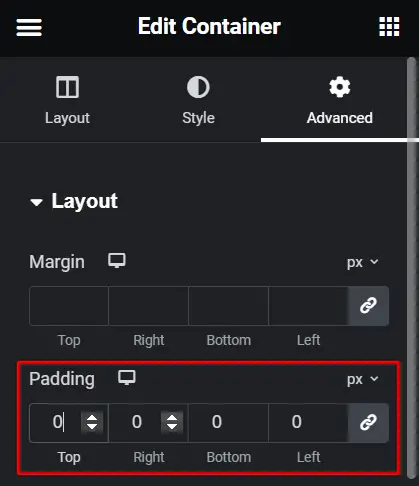
Step 10: Adjust Padding
Set the padding for the first column to zero in the “Advanced Settings” to ensure the text aligns seamlessly with the image.
Configuring Second Column
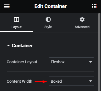
Step 11: Customize Image Column
Proceed to the settings for the second column. Set the “Content Width” to “Boxed” to confine the image within a boxed layout.
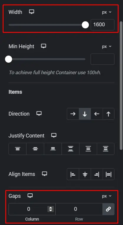
Step 12: Adjust Width and Gaps
Increase the width of the second column to 1600 pixels to ensure the image extends to the edge of the screen. Set the “Gaps” to zero for a seamless transition between columns.
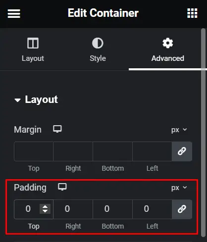
Step 13: Customize Padding
Similar to the text column, set the padding for the second column to zero in the “Advanced Settings” to eliminate any unwanted spacing.
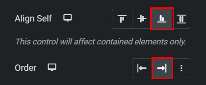
Step 14: Align Content
Align the content within the second column to “End” for a polished presentation. Additionally, adjust the order of elements as needed.
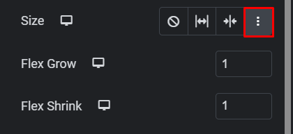
Step 15: Customize Flexbox Settings
Click on “Custom” in the size settings and add 1 to both “Flex Grow” and “Flex Shrink” for optimal flexibility.
Tips for optimizing fullwidth background images
- Choose high-quality images that are relevant to your content and brand.
- Experiment with different blending modes and opacity settings to create unique visual effects.
- Test your design across various devices to ensure compatibility and responsiveness.
Conclusion
By following these step-by-step instructions, you can effortlessly create a visually stunning webpage section with two columns using Elementor. Say goodbye to design limitations and hello to seamless integration of fullwidth background images and neatly organized text content.


