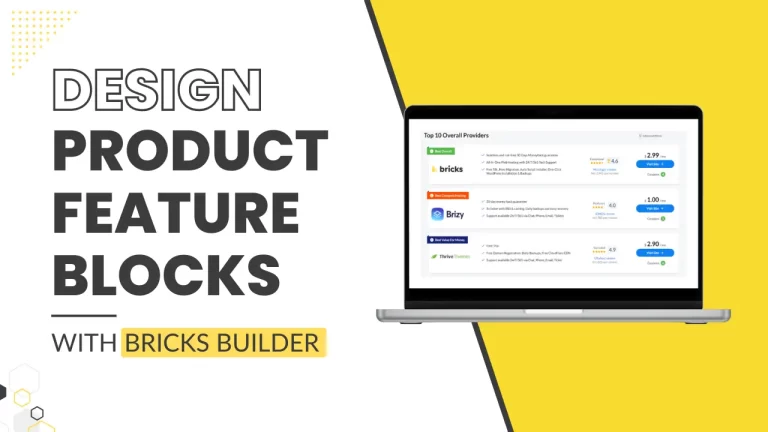

Introduction
In today’s tutorial, we’re diving into the process of designing product feature boxes using Bricks Builder for your website. These boxes are commonly seen on review sites, where they provide a visual summary or comparison of various products. Specifically, we’ll be creating a page with several product comparison boxes to compare WordPress Page Builders. Let’s get started!
Understanding Bricks Builder
What is Bricks Builder?
Bricks Builder is a versatile tool that simplifies the process of creating complex layouts and feature-rich content on websites. It operates on a drag-and-drop interface, making it accessible for users without deep coding knowledge.
Features of Bricks Builder
Bricks Builder offers extensive customization options, allowing users to personalize every aspect of their website’s design effortlessly. It supports responsive design principles, ensuring your content looks great on all devices.
Step-by-Step Guide to Designing Product Feature Blocks
Step 1: Accessing the Page
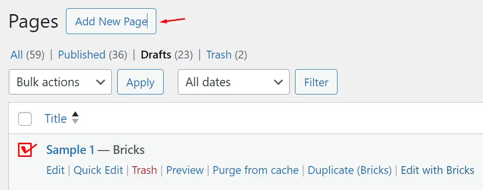
First things first, let’s navigate to the page where you’ll be adding your product display. This can be done from your WordPress dashboard by going to Pages.
Step 2: Creating or Selecting a Page
Once you’re on the Pages interface, you have the option to either create a new page or select an existing one. This flexibility allows you to integrate the product grid into your current layout or start from scratch.
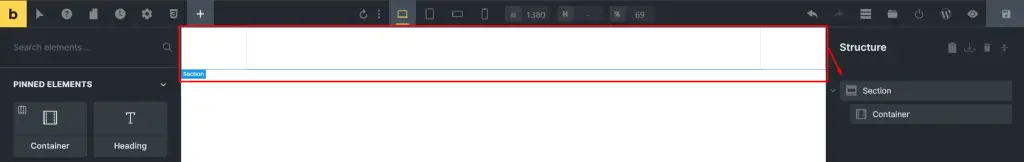
Step 3: Adding a Section
To begin, add a new section to your page. This section will serve as the container for your product grid.
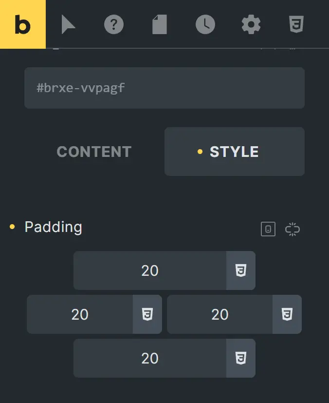
Step 4: Adjusting the Layout for Padding
Next, you’ll need to adjust the layout to add 20 pixels of padding on each side of the container. This padding ensures that your content isn’t cramped and has some breathing room.
Step 5: Configuring the Container
Click on the container to start adding elements inside it. The container is your primary workspace for the product grid.
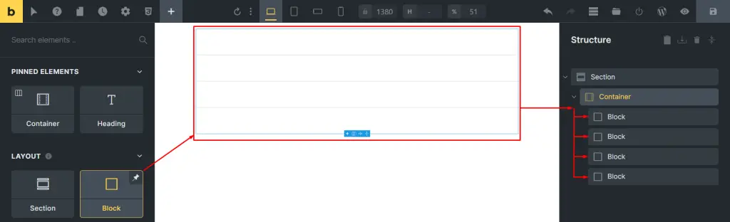
Step 6: Adding Blocks within the Container
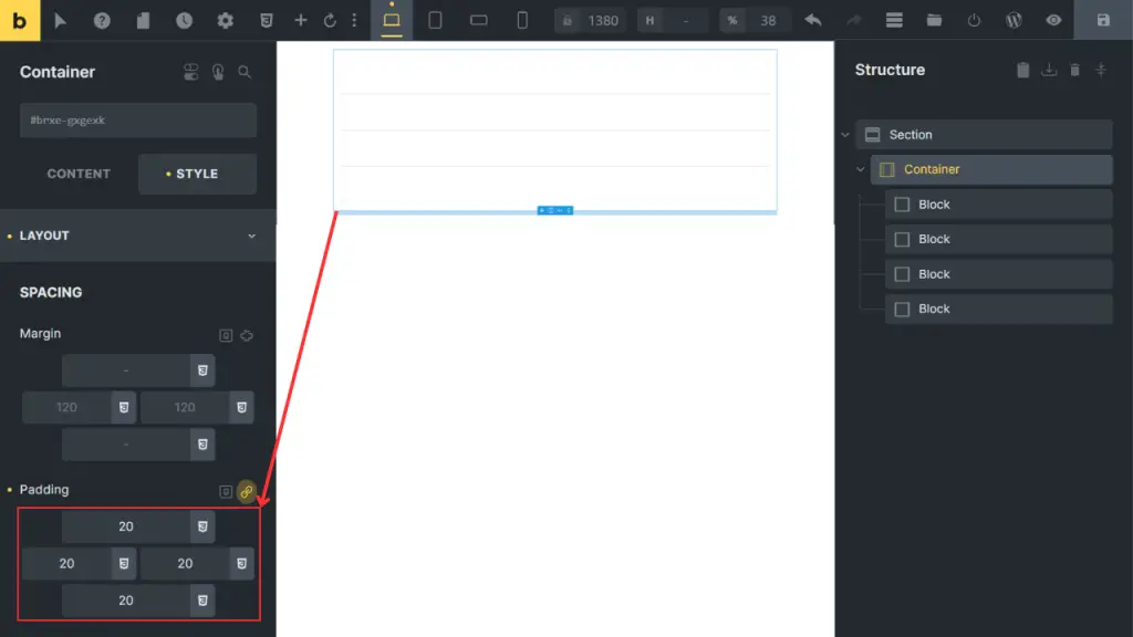
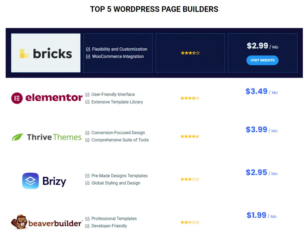
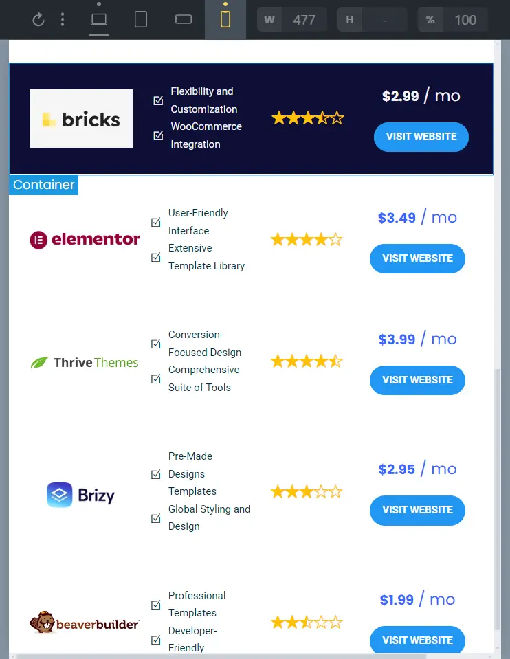
Within the container, add four blocks. These blocks will hold the following elements: Logo, List, Rating, and Price. This structure helps keep your content organized and easy to manage.
Step 7: Styling the Container
Return to the container settings, go to the “Style” tab, and then to “Layout”. Here, you’ll add another 20 pixels of padding to maintain consistent spacing.
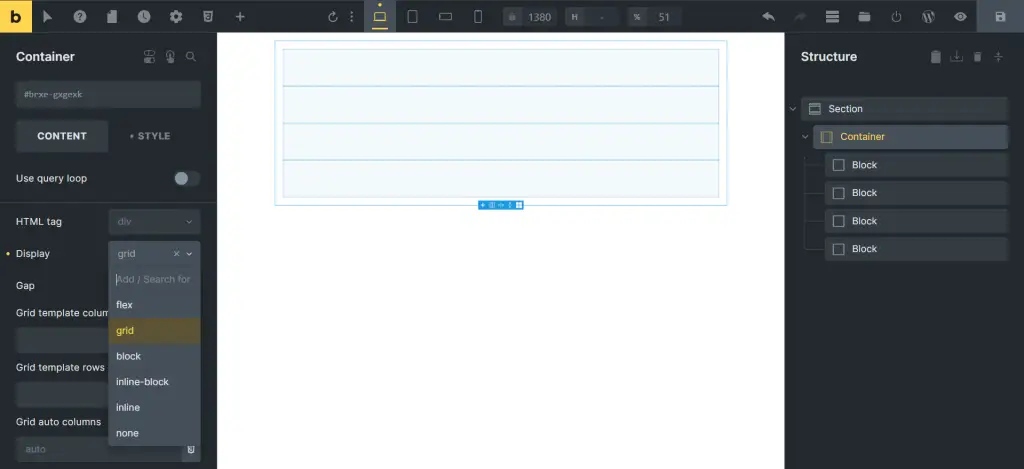
Step 8: Setting Up the Grid Display
Navigate to the “Content” tab, click “Display,” and select “Grid.” This setting transforms your container into a grid layout, making it easier to align your elements neatly.
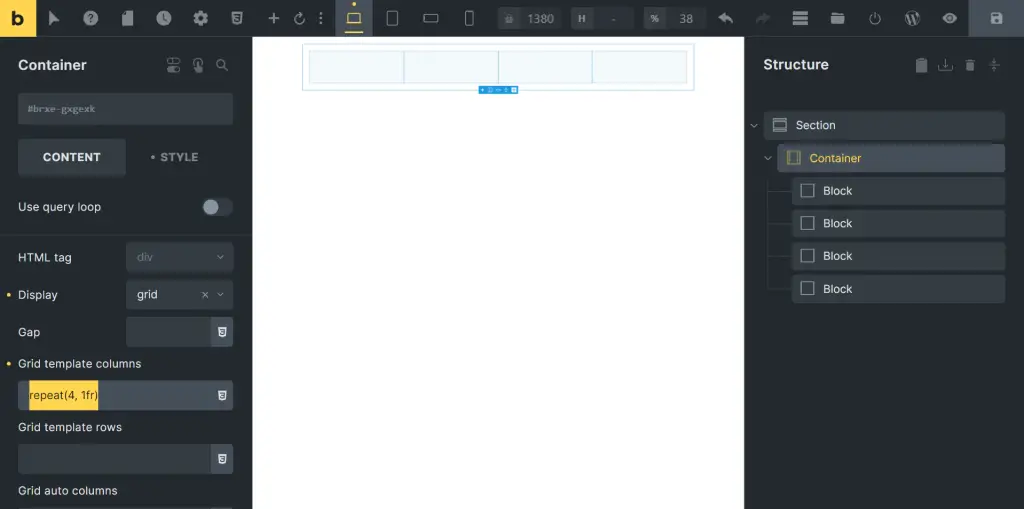
Understanding the Grid Template Columns
In the Grid Template Columns section, add the following code:
CSS / Copy code:
This CSS function creates a grid with four equal columns, ensuring each element has equal space.
Step 9: Adding Elements to Each Column
Now, let’s add the specific elements to each column of the grid.
First Column: Logo
Add the “Logo” element to the first column. This is where your product’s logo will be displayed.
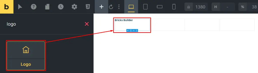
Second Column: Icon List
In the second column, add an “Icon List” element. This can be used to showcase key features or benefits of the product.
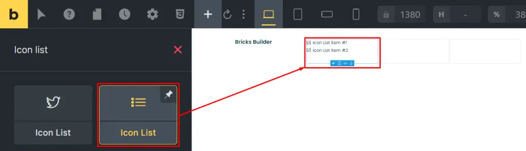
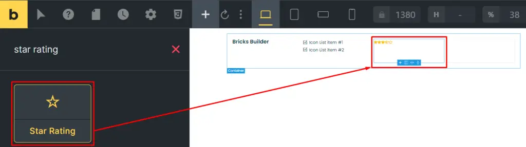
Third Column: Star Rating
Add a “Star Rating” element to the third column. Ratings help build trust and provide quick insights into the product’s quality.
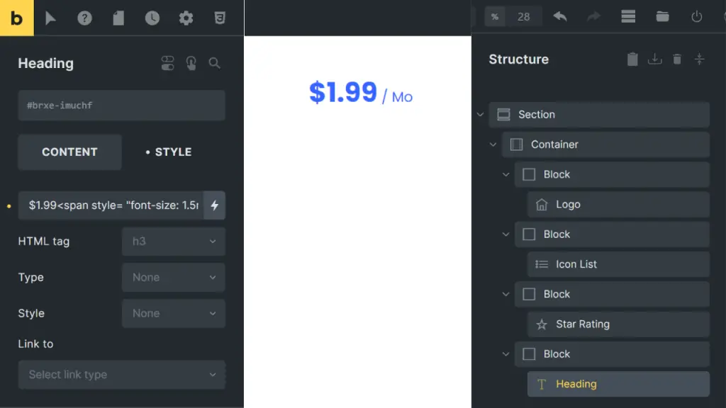
Fourth Column: Price
In the fourth column, add a Basic Text or Heading element to display the price. For example:
HTML / Copy code:
This format clearly shows the pricing details.
Step: 10 Aligning Elements
Return to the first column to center-align the logo. Do the same for the elements in the second, third, and fourth columns to ensure uniform alignment.

Step 11: Customizing the Price Display
Change the Basic Text element to a Heading element for the price. This enhances visibility and emphasis on the pricing.

Step 12: Adding a Background Color
Add a background color to the section to make your product grid stand out. This helps in visually separating the product grid from other content on the page.

Step 13: Duplicating the Section for Other Products
If you have multiple products to display, duplicate the section. This keeps the layout consistent across different products.
Step 14: Adding and Customizing Buttons
Below the pricing, add a button element. Customize the button settings to fit your design preferences:
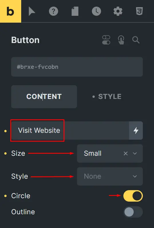
Set the button style to none.
Change the size to small.
Update the text to “Visit Website.”
Step 15: Setting Links for Buttons
For each product, add a link to the button:
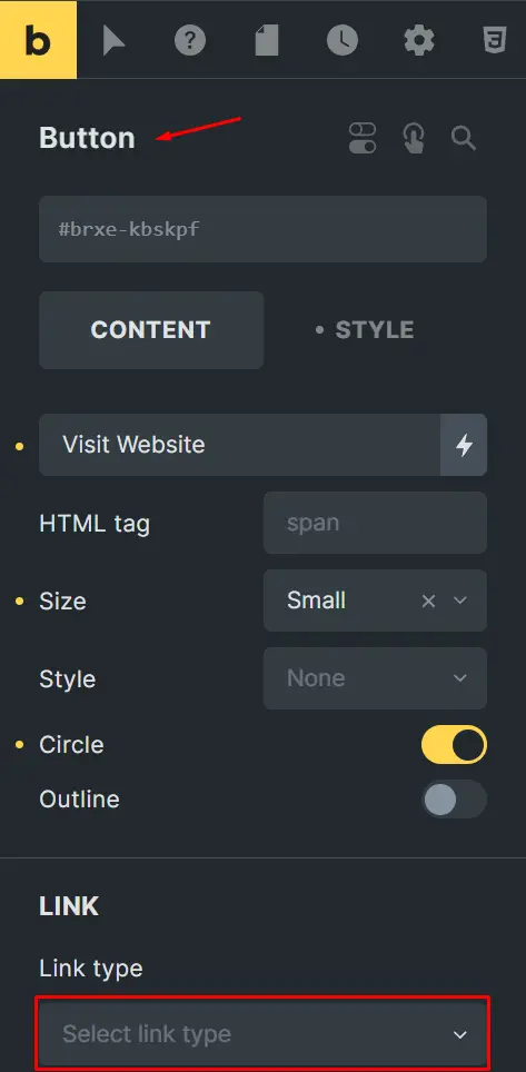
Go to the button settings in the left sidebar.
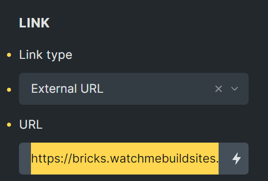
Select the link type.
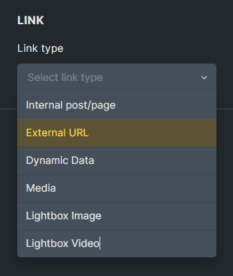
Choose “External URL,” and paste the link.
Repeat this for each product’s button.
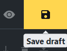
Step 16: Saving and Previewing
Save your work as a draft. This allows you to preview the layout before making it live.
Ensuring Mobile Responsiveness
Check how the layout looks on both desktop and mobile devices to ensure it’s mobile-responsive. Adjust and modify the mobile version if necessary to provide a seamless experience across all devices.
Best Practices for Optimizing Product Feature Blocks
SEO Optimization Tips
Optimize your feature blocks by using relevant keywords in headings and descriptions. Ensure your content is structured logically with appropriate HTML tags.
Loading Speed Considerations
Avoid using heavy graphics or animations that could slow down page loading times. Opt for optimized images and CSS styles to enhance performance.
Conclusion
By following these steps, you’ll create an attractive, functional product display grid that enhances user experience and potentially increases conversions. The key is to ensure proper padding, alignment, and responsive design.


