
Introduction
Beaver Builder is a powerful and user-friendly page builder plugin for WordPress that allows users to create stunning and responsive websites without any coding knowledge. With its drag-and-drop interface and extensive customization options, Beaver Builder empowers users to design and customize their websites with ease. In this tutorial, we will explore how to enhance your website’s visual appeal by incorporating sticky and parallax effects using the Beaver Builder page builder.
In the world of web design, the term “parallax” brings a touch of magic to your website. It’s that captivating effect where the background image and foreground content seem to dance at different speeds as you scroll. However, like any magic trick, it’s best not to overuse it. You want your visitors to enjoy the show but not to the point where they forget about your valuable content.
Understanding Beaver Builder
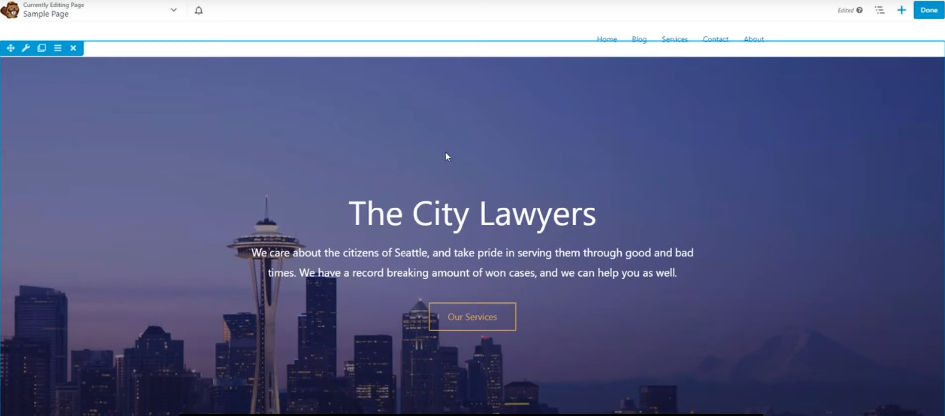
Before diving into the world of effects, let’s understand Beaver Builder. It’s a popular drag-and-drop page builder plugin for WordPress, known for its user-friendly interface and flexibility in design. Whether you’re a seasoned developer or a novice, Beaver Builder simplifies the process of creating stunning websites without the need for complex coding.
Adding Rows to Your Page
The first step in creating a stunning parallax effect is to add rows to your page. Here’s how you can do it:
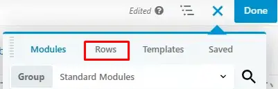
- Click on Rows: Look for the “Rows” tab in the Beaver Builder interface. Click on it to add a new row to your page.
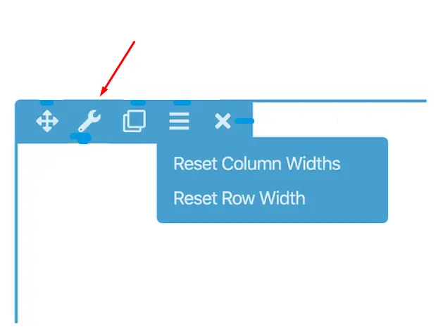
- Row Settings: After adding a row, click on its settings. This is where the magic begins.
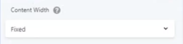
Adjusting Row Width and Content Width
Now that you’re in the row settings, it’s essential to get the width and content width just right:
- Width: You’ll see options for row width. Adjust this to your preference, keeping in mind your overall design.
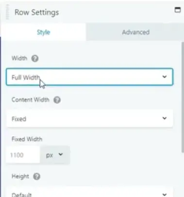
- Content Width: Similarly, adjust the content width according to how much space you want for your content within the row.
Adding Parallax Effect
Here comes the exciting part—adding the parallax effect to your row:
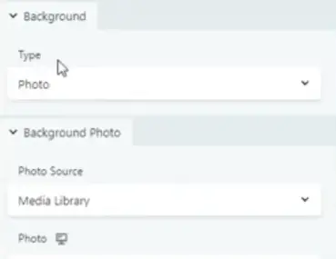
- Background Section: In the row settings, find the background section. You’ll notice a “type” field option.
- Select Parallax: Click on the “type” field and select “parallax.” This tells Beaver Builder that you want to create that eye-catching effect.
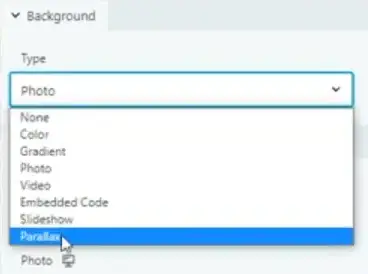
- Background Parallax Option: After selecting parallax, scroll down within the background section. You’ll find the background parallax option at the bottom.
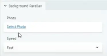
Choosing the Perfect Background Photo
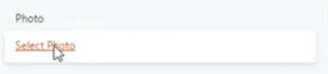
A parallax effect isn’t complete without a striking background photo. Here’s how to select one:
- Photo Selection: In the background parallax option, click on “Choose Image” to select the photo you want for your background.
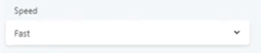
- Adjusting Speed: You’ll also see an option to adjust the speed of your parallax effect. Experiment with different speeds to find the one that suits your design best.
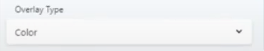
- Overlay Type: Additionally, you can choose the overlay type that enhances the visual appeal of your parallax.
Customize to Perfection
If you’re not entirely satisfied yet, don’t worry. Beaver Builder offers more customization options:
Explore Other Sections: Still want to fine-tune your parallax or background? Beaver Builder provides various other sections within the row settings. Dive into these options to tailor your design to perfection.
Now, you have the power to create stunning, captivating parallax effects on your website using Beaver Builder. Remember, moderation is key. Use this feature wisely to enhance your site’s aesthetics without overshadowing your valuable content.
Responsive Web Design: Making Parallax Work on Mobile with Beaver Builder
It’s important to make sure your website looks good and works well on all devices, like phones. Adding a cool scrolling effect called “parallax” can make your site more interesting, but it can be tricky to do on mobiles. In this guide, we’ll teach you how to use Beaver Builder, a popular tool for WordPress websites, to make parallax work on mobiles.
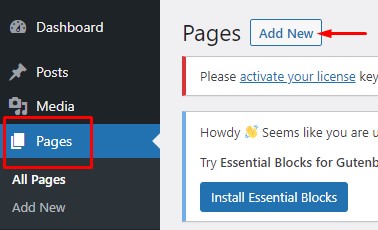
Step 1: Create or Edit a Page
In the WordPress dashboard, go to “Pages” and either create a new page or edit an existing one where you want to implement the parallax effect.
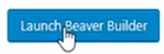
Step 2: Launch Beaver Builder
After creating or editing the page, click the “Launch Beaver Builder” button to open the Beaver Builder editor.
Step 3: Add a Row
In the Beaver Builder editor, click the “+ Rows” button to add a new row to your page layout.
Step 4: Choose Row Settings
Click on the newly added row to select it.
In the row settings panel on the right, go to the “Advanced” tab.
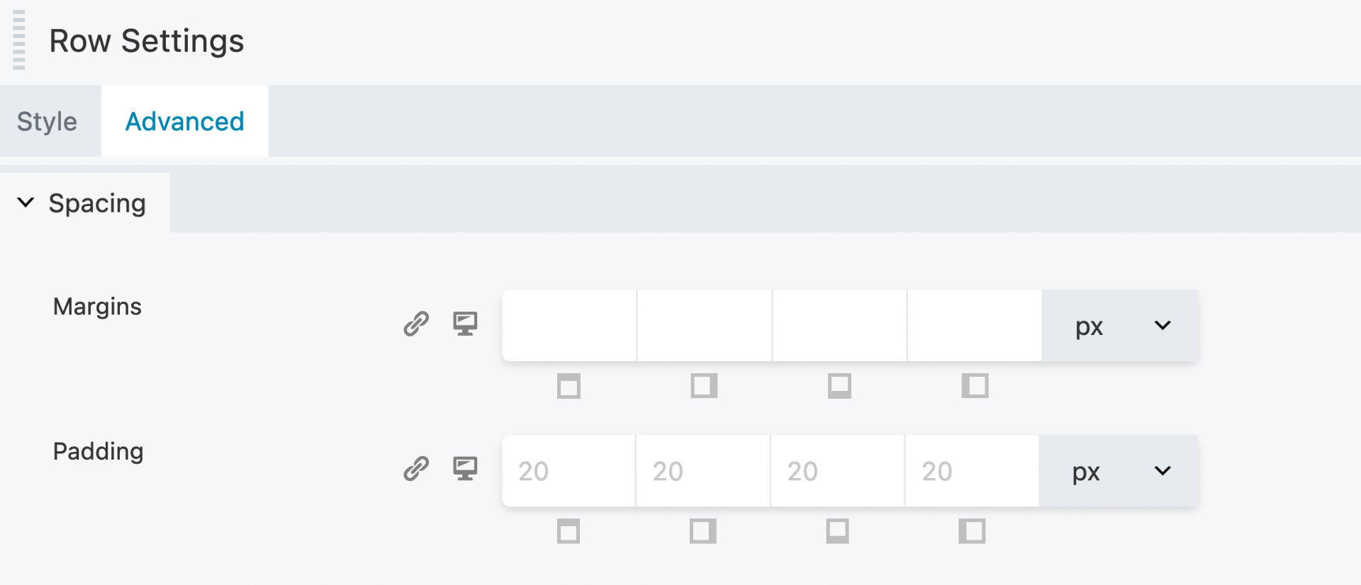
In the “Background” section, you can set a background image for the row. Make sure to choose an image suitable for the parallax effect.
Under the background settings, choose “Parallax”.
Step 5: Enable Parallax
After enabling parallax, you can adjust the parallax settings to make it work well on mobile devices.
Adjust the “Parallax Speed” setting to control the speed at which the background image scrolls. A value between 1 and 2 often works well for mobile.
Test the parallax effect by scrolling within the Beaver Builder editor to ensure it looks good on both desktop and mobile.
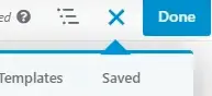
Step 6: Save and Publish
Once you are satisfied with the parallax effect, click the “Done” button in the top-right corner of the Beaver Builder editor.
Click the “Publish” button to make your changes live on your website.
Step 7: Test on Mobile Devices
Open your website on various mobile devices to ensure that the parallax effect works smoothly and looks appealing on smaller screens.
Make any necessary adjustments to the parallax speed or background image if it doesn’t display as expected on mobile.
By following these steps, you can successfully implement a responsive parallax effect on your website using Beaver Builder, making sure it looks great and functions well on both desktop and mobile devices.
Conclusion
Enhancing user experience with Beaver Builder is a comprehensive process that requires attention to detail, creativity, and user-centric design. By following the steps and best practices outlined in this guide, you’ll be well on your way to creating an exceptional website that leaves a lasting impression on your visitors.


