

Introduction
In the fast-paced world of website development, Beaver Builder stands out as a powerful and user-friendly page builder. As we navigate the vast landscape of web design, one crucial element takes center stage – contact forms. In this tutorial, we’ll delve into the workings of contact forms in Beaver Builder, exploring their features, customization options, and the seamless integration process.
Understanding the Basics of Contact Forms
Creating a contact form involves several key components, including form fields, buttons, and the underlying HTML and CSS. These elements work together to capture and process user input.
Step 1: Adding the Contact Form Module
Open the Beaver Builder editor for the page where you want to add the contact form.
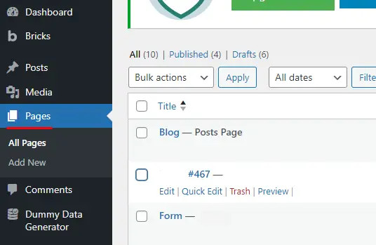
Locate and add the “Contact Form” module to your page.
Step 2: Customizing the Contact Form
After adding the Contact Form module, focus on customizing it using the options in the left sidebar.
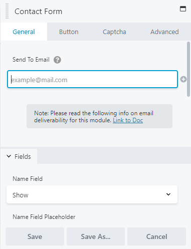
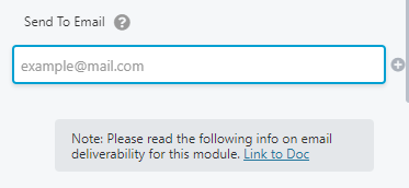
Setting the Recipient Email
In the “Send to Email Field” section, specify the email address where notifications will be sent when someone submits the form.
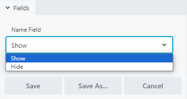
Displaying the Name Field
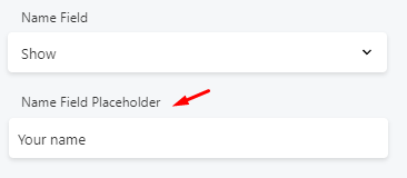
Decide whether you want to display the Name field on the form. Choose between “Show” or “Hide.”
If you choose to display the Name field, add the text you want to appear as a placeholder in the “Name Field Placeholder.”
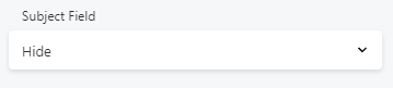
Displaying the Subject Field
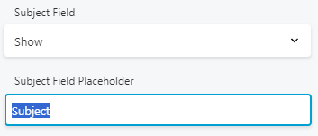
Choose whether to display the Subject field on the form by selecting “Show” or “Hide.”
If you choose to display the Subject field, provide the subject for the email in the appropriate field.
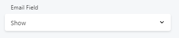
Displaying the Email Field
Decide whether to display the Email field on the form. Choose between “Show” or “Hide.”
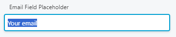
If you choose to display the Email field, add the text you want to appear as a placeholder in the “Email Field Placeholder.”
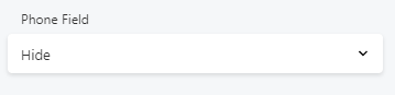
Managing the Phone Field
Choose between “Hide” or “Show” for the phone field.
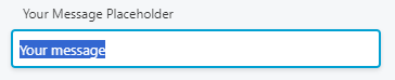
Customizing the Message Field
Add the message text in the “Your Message Placeholder” field.
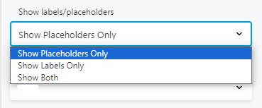
Placeholder vs. Labels
In the “Show labels/Placeholders” section, determine whether you want to use placeholders instead of labels, show labels instead of placeholders, or display both placeholders and labels.
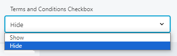
Terms and Conditions Checkbox
In the “Terms and Conditions checkbox” section, enable this option if users must accept the terms and conditions for successful form submission.
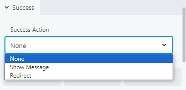
Configuring the Success Section
Choose the desired outcome for the “Success” section by selecting between “None,” “Show Message,” or “Redirect.”
Step 3: Button Customization
Switch to the “Button” tab within the Contact Form module.
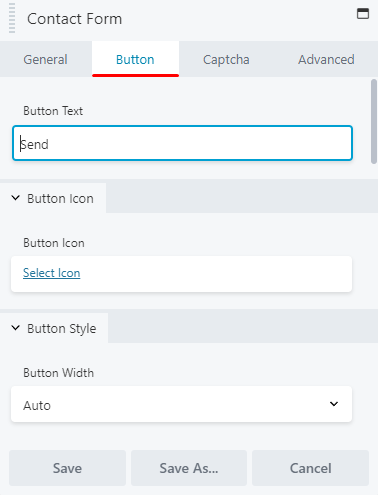
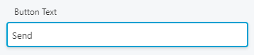
Specify the text you want to appear on the button in the “Button Text” field.
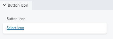
Select an icon that suits your page from the available options.
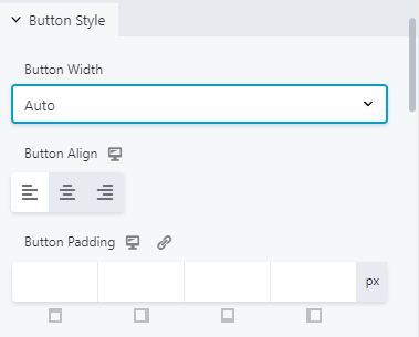
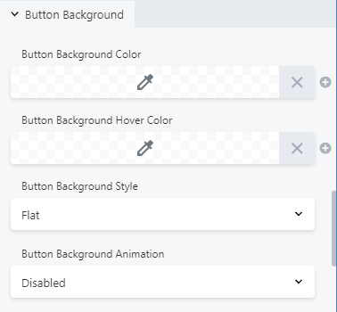
Customize the button’s style by setting its width, alignment, and padding.
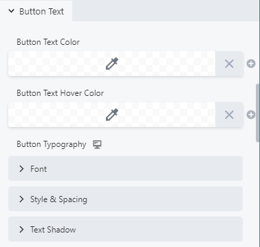
Adjust the text color, typography, spacing, and shadow as needed.
Modify the background and border settings to match your design preferences.
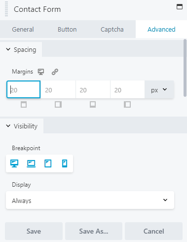
Step 4: Advanced Customization (Optional)
For further customization options, navigate to the “Advanced” tab within the Contact Form module. Explore the additional settings to fine-tune the form’s appearance and behavior to your liking.
By following these step-by-step instructions, you can easily set up and customize a Contact Form using Beaver Builder for your website.
Tips for Designing Effective Contact Forms in Beaver Builder
Designing effective contact forms in Beaver Builder is crucial for ensuring a seamless user experience and maximizing conversions. Follow these step-by-step instructions to create a contact form that captures user information efficiently.
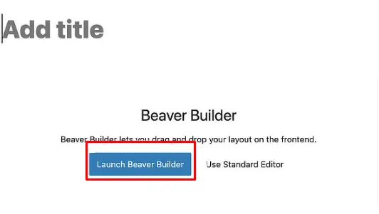
Step 1: Access Beaver Builder
Open your WordPress dashboard.
Navigate to the page where you want to add the contact form.
Click on “Launch Beaver Builder” for that specific page.
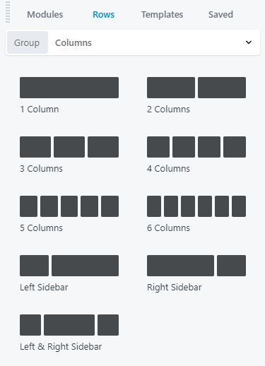
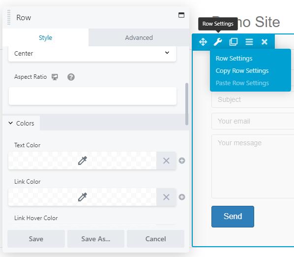
Step 2: Add a New Row
Once inside Beaver Builder, click the (+) icon to add a new row.
Select the appropriate column structure for your contact form.
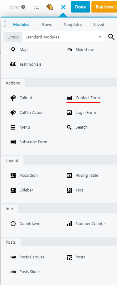
Step 3: Add the Contact Form Module
In the row you just created, click the (+) icon again.
Search for and select the “Contact Form” module.
Step 4: Configure the Contact Form Module
Click on the contact form module to bring up its settings.
In the General tab, configure the following settings:
Form Name: Give your form a descriptive name.
Email Subject: Specify a clear subject line for form submissions.
Success Message: Customize the message users will see after submitting the form.
Button Text: Define the text for the submission button (e.g., “Submit,” “Send Message,” etc.).
Navigate to the Fields tab and add or edit the form fields as needed (e.g., Name, Email, Message).
Adjust field settings, such as required fields or placeholder text, as per your preferences.
Step 5: Style and Customize the Contact Form
Navigate to the Style tab to customize the appearance of the form, including colors, fonts, and spacing.
Step 6: Test the Contact Form
Save your changes in Beaver Builder.
Preview or publish the page with the contact form.
Fill out the form and submit a test entry to ensure it functions correctly.
Verify that you receive the submission notification in the designated email address.
Step 7: Monitor and Optimize
Regularly check form submissions to ensure they’re reaching the intended recipient.
Analyze user behavior and consider A/B testing to optimize the form for better conversions.
Make adjustments as necessary based on user feedback and performance metrics.
By following these step-by-step instructions, you’ll be able to create an effective contact form using Beaver Builder that enhances user interaction and helps you collect valuable information.


