

Introduction
Today, we’re going to show you how to create a stunning mobile mega menu using Thrive Themes. Mobile mega menus are essential for providing a seamless and intuitive navigation experience for mobile users. Before we get started, we’ll share some best practices to ensure your mega menu is optimized for mobile users. Thrive Themes is a powerful tool for building and customizing websites, and its page builder makes the process straightforward and user-friendly.
Understanding Mega Menus
What is a Mega Menu?
A mega menu is an advanced type of drop-down menu that offers users a comprehensive view of available options in a single, large panel. Unlike traditional drop-down menus, mega menus can include images, icons, and multiple columns, making navigation more intuitive and visually appealing.
Benefits of Mega Menus on Mobile
Mega menus provide several advantages for mobile users:
- Enhanced Navigation: Simplifies browsing by grouping related links and displaying them in a structured layout.
- Improved User Experience: Reduces the number of clicks needed to find information, leading to quicker access and higher satisfaction.
- Visual Appeal: Allows for the inclusion of images and icons, making the menu more engaging and easier to use.
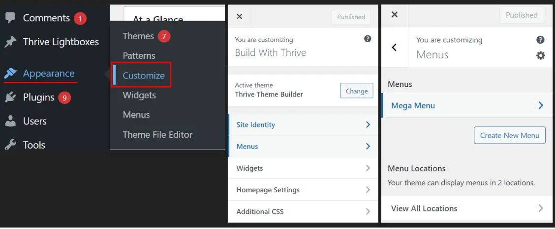
Setting Up the Mega Menu Structure:
First, set up the structure for your mega menu. Go to ‘Appearance,’ then click on ‘Customize,’ and then click ‘Menus.’ Here, you can create a new menu or edit an existing one.
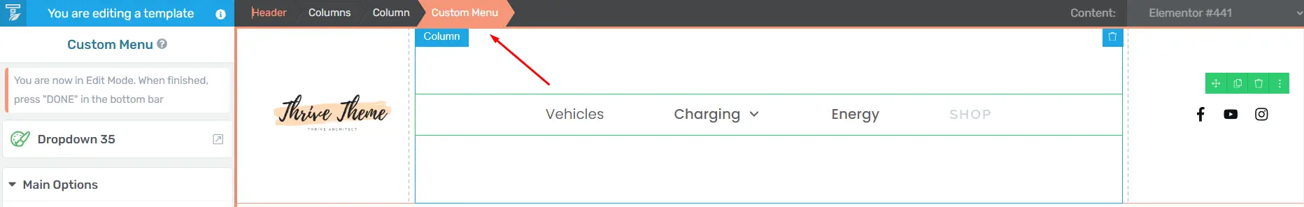
Step 1: Designing the Mega Menu with Thrive Architect
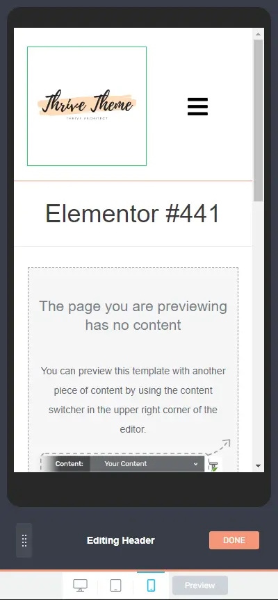
To design your mega menu, go to any page and launch Thrive Architect.
Once inside, add a new ‘Custom Menu’ element to the page.
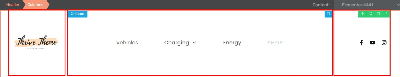
Step 2: Editing the Header Section
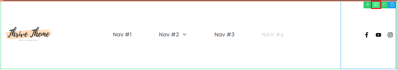
In the header section, add a column and select a 3-column structure.
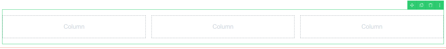
In each column, add a logo, menu, and icon. This setup helps create a balanced and visually appealing layout.
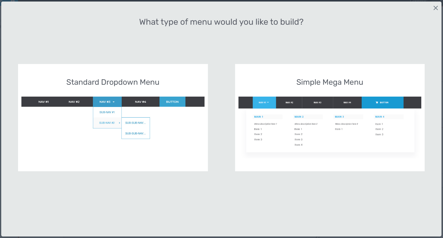
Step 3: Creating the Mega Menu
Choose the type of menu you want, either a standard dropdown menu or a simple mega menu.
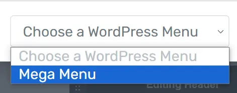
Select a simple mega menu and choose the WordPress Menu.
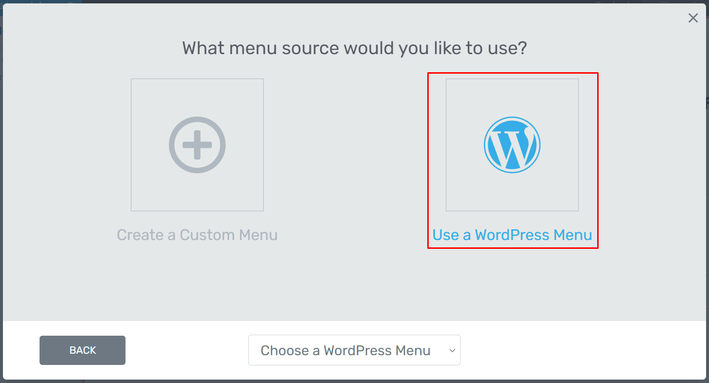
Select a Mega Menu that you’ve created earlier.
After that, click ‘Select Template’ to choose the type of mega menu.

Step 4: Duplicating the Header Section
Next, duplicate the header section.
The first one will be visible on Desktop, and the second one will be visible on Tablet and Mobile. This ensures that your menu looks great on all devices.
Step 5: Configuring the Mobile Menu
For the mobile menu, choose a hamburger menu type. Set the responsive option to be visible, ensuring the menu adapts well to different screen sizes.
Step 6: Final Adjustments
Go to mobile responsive settings and adjust the column breakpoint to align each element properly.
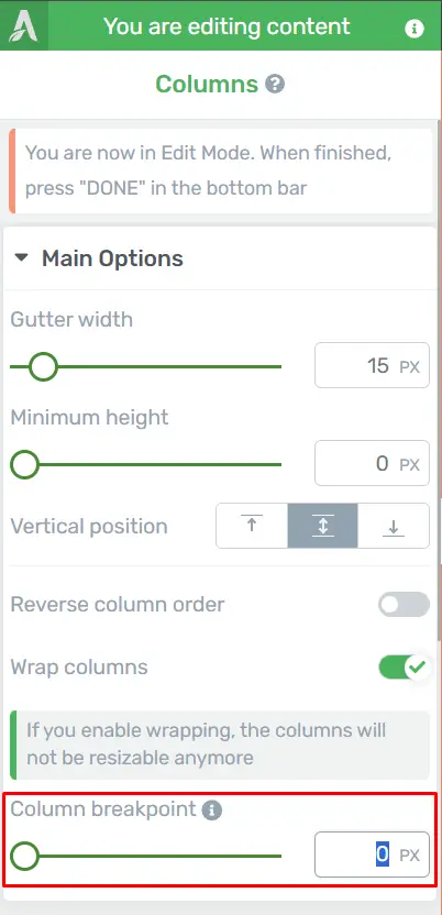
This step ensures that all parts of your menu look and function well on mobile devices.
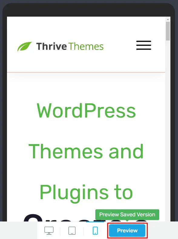
Step 7: Preview and Testing
Click on ‘Preview’ to see how your menu looks and functions. Thoroughly check to ensure everything works correctly, making any necessary adjustments.
Best Practices for Mobile Mega Menus
Simplify Navigation: Start by limiting the number of top-level items and sub-menus to avoid overwhelming users. Use clear, concise labeling to ensure easy understanding and quick navigation.
Ensure Responsive Design: Your menu should adapt seamlessly to different screen sizes. Use media queries to make sure the menu looks great on any device, from desktops to smartphones.
Implement Touch-friendly UI: Make sure all elements are easy to tap with sufficiently large touch targets and proper spacing between items. This reduces the chance of accidental clicks and improves user satisfaction.
Use Clear Indicators for Submenus: Visual indicators like arrows or plus signs help users understand which items are expandable. This adds clarity and improves the overall navigation experience.
Provide Easy Open and Close Options: Include a clear and accessible button, like a hamburger icon, for opening and closing the menu. Additionally, offer intuitive ways to close the menu, such as swiping or tapping a close icon.
Utilize Accordion or Full-Screen Overlay: For mobile devices, an accordion style or a full-screen overlay can be effective in utilizing limited space while maintaining an organized layout.
Prioritize Speed and Performance: Optimize images and other assets to reduce load times and ensure smooth performance. A fast-loading menu keeps users engaged and prevents frustration.
Ensure Accessibility: Make your menu accessible to all users, including those with disabilities. Use ARIA attributes and roles for navigation elements, and ensure functionality is available via keyboard navigation.
Optimizing for Performance
Speed Optimization Tips
Optimize images, use lazy loading, and minimize JavaScript to improve load times. A fast-loading menu can significantly enhance the user experience.
Reducing Load Times
Consider using a Content Delivery Network (CDN) and caching plugins to reduce server load and improve page speed.
Common Mistakes to Avoid
Overloading the Menu with Too Much Content: While it’s tempting to include everything, too much content can overwhelm users. Stick to essential items to keep the menu clean and user-friendly.
Ignoring User Experience
Always prioritize user experience. Make sure your menu is intuitive, easy to navigate, and doesn’t obstruct the main content.
Maintaining Your Mobile Mega Menu
Regular Updates and Maintenance: Keep your mega menu updated with the latest content and remove outdated links. Regular maintenance ensures your menu remains relevant and functional.
Monitoring User Feedback
Pay attention to user feedback and analytics. If users report issues or if you notice high bounce rates from specific menu items, make necessary adjustments.
Conclusion
Creating a mobile mega menu with Thrive Themes involves a series of steps, from setting up the structure to fine-tuning the responsive settings. By following best practices and using Thrive Architect, you can build a functional and visually appealing mega menu that enhances the user experience on mobile devices.


