
Introduction
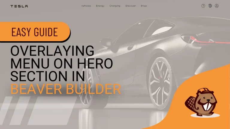
Tesla’s website is renowned for its sleek header design, characterized by an overlay of the menu on top of the hero section. Achieving a similar aesthetic on your own WordPress site is made possible with the help of Beaver Builder, a popular page builder plugin known for its user-friendly interface and robust customization options. In this guide, we’ll walk you through the step-by-step process of overlaying your menu atop the hero section using Beaver Builder, allowing you to create a modern and visually appealing header design.
Understanding Beaver Builder
What is Beaver Builder?
Beaver Builder is a flexible drag-and-drop page builder for WordPress. It allows you to create beautiful, responsive pages with ease, without needing to write any code.
Key Features of Beaver Builder
Drag-and-Drop Interface: Simplifies the design process.
Responsive Design: Ensures your site looks great on all devices.
Pre-built Templates: Offers a variety of templates to kickstart your design.
Step-by-Step Guide to Overlay Menu:
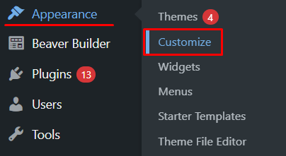
Step 1: Accessing WordPress Dashboard
To begin, navigate to the “Appearance” section. From the dropdown menu, select “Customize”.
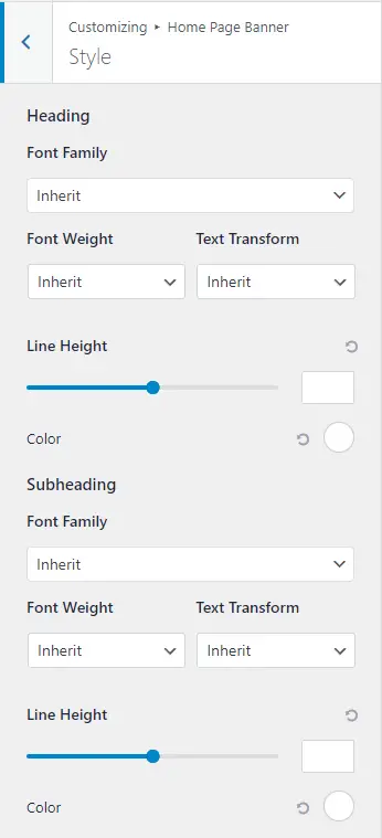
Step 2: Customizing the Header
Once in the customization panel, locate the option to overlay the header text. This can typically be found by clicking on the pen icon of the header.
Step 3: Modifying Header Design
In the customization panel, you can adjust various design elements of the header, including its height and overall appearance.
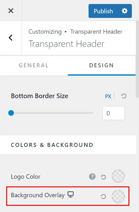
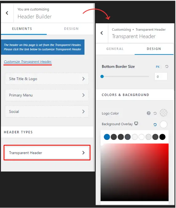
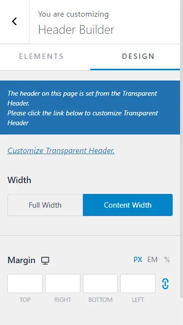
Step 4: Removing Background and Implementing Overlay
To remove the white background and create an overlay effect, navigate to the Header Builder and select the transparent header option.
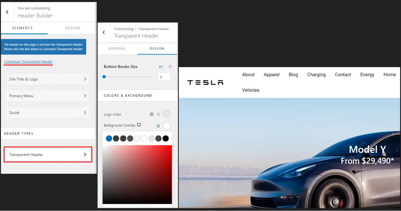
Step 5: Customizing Header Appearance
In the design section, you’ll find options to customize the header’s color, background, and opacity to achieve the desired overlay effect.
Step 6: Overlaying Header on Hero Section
Position the header text on top of the hero section to create a seamless overlay effect.

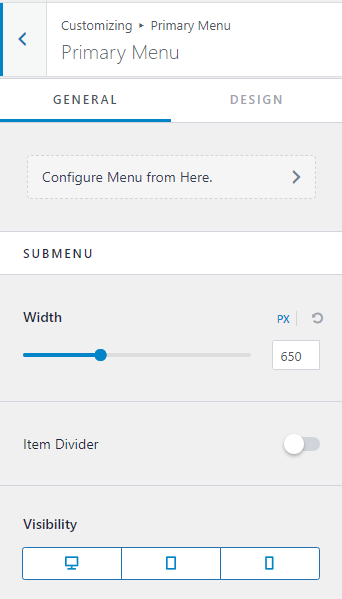
Step 7: Customizing Menu Appearance
You can further customize the appearance of your menu, including menu items, sub-menu, and social icons.
Step 8: Making the Header Full Width
To make the header full width, adjust the design settings accordingly, opting for ‘full width’ instead of ‘content width’.
Step 9: Saving Changes and Exiting
Once you’re satisfied with the design, save your changes and exit the customization panel. Your sleek, modern header overlay is now ready to impress your website visitors.

Testing Your Design
Cross-Browser Testing
Ensure your design looks good on all major browsers (Chrome, Firefox, Safari, Edge). Use tools like BrowserStack to test your site across different browsers and devices.
User Experience Testing
Conduct user testing to gather feedback on the overlay menu’s functionality and ease of use. Adjust your design based on this feedback to improve user experience.
Best Practices for Overlay Menus
Keeping It Simple
Avoid overcomplicating the menu with too many links or excessive styling. Keep it clean and straightforward to ensure users can navigate easily.
Ensuring Readability and Accessibility
Use high-contrast colors and readable fonts. Make sure the menu is accessible to all users, including those using screen readers.
Examples of Great Overlay Menus
Case Studies: Look at successful websites that use overlay menus effectively. Analyze what works well and consider how you can apply similar strategies to your design.
Inspirational Designs: Explore design inspiration sites like Dribbble or Behance for creative overlay menu ideas. Draw inspiration to create a unique and visually appealing menu.
Conclusion
By following these simple steps, you can elevate the design of your WordPress website with a sleek, modern header reminiscent of Tesla’s website. Customizing your menu items and structure according to your preferences allows for a personalized touch that enhances user experience and aesthetics.


