
Introduction
In this tutorial, we’ll walk through the process of creating attractive product feature boxes for your WordPress site using Brizy. Product feature boxes are perfect for review sites, offering a visual summary of reviewed products. Brizy is known for its user-friendly interface and powerful drag-and-drop capabilities, making it an excellent choice for designing engaging content like product feature boxes in WordPress. Whether you’re highlighting key features or showcasing product comparisons, Brizy Page Builder simplifies the design process, ensuring your content looks professional and captures your audience’s attention effectively.
Understanding Brizy: A Brief Overview
What is Brizy?
Brizy is a user-friendly drag-and-drop website builder known for its intuitive interface and powerful design capabilities.
Benefits of Using Brizy for Feature Boxes
- Ease of Use: Simplifies the design process with its drag-and-drop functionality.
- Customization: Offers a wide range of customization options to tailor feature boxes to your brand.
- Responsive Design: Ensures feature boxes look great on all devices without additional effort.
- Integration: Seamlessly integrates with WordPress and other platforms.
Step-by-Step Guide to Design Feature Boxes Using Brizy
Step 1: Accessing Beaver Builder
Navigate to Your WordPress Dashboard
First, go to your WordPress dashboard and navigate to the Pages tab.
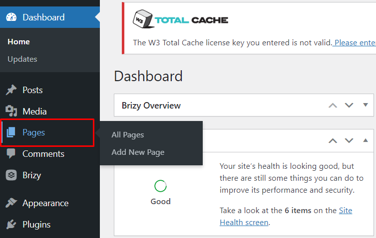
Creating or Editing a Page
Choose to create a new page or edit an existing one where you want to add the product feature boxes.

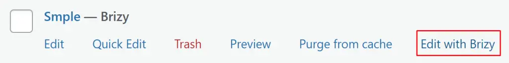
Launch Beaver Builder
Click on the ‘Edit with Brizy’ option to launch the Beaver Builder interface for the chosen page.
Step 2: Setting Up the Layout
Adding a Row
Click on the plus icon to add a new block, then select ‘Add one row’ to begin setting up your layout.
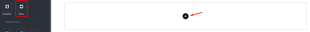
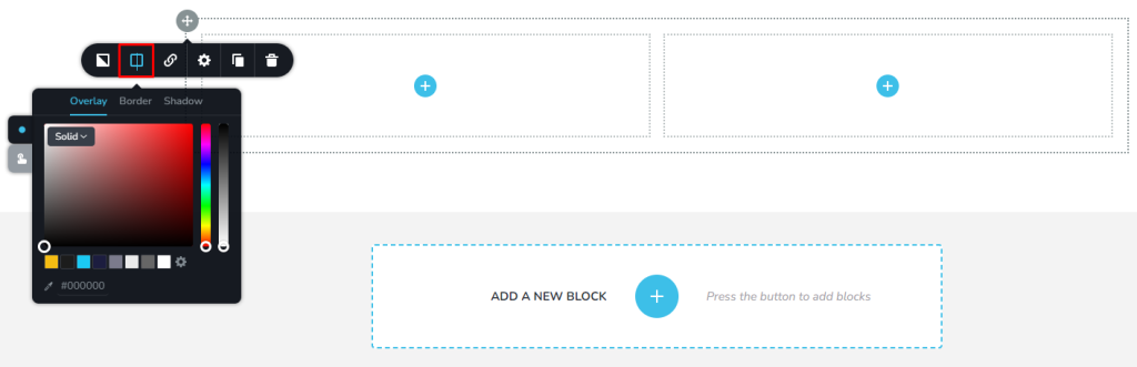
Choosing Background Color
Select a suitable background color for the row container to complement your site’s design theme.
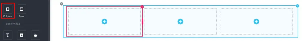
Creating Columns
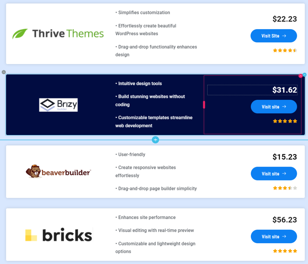
Add a 3-column layout inside the row container to accommodate the product feature boxes.
Step 3: Adding Content Elements
Inserting Elements
For each column, add essential elements:
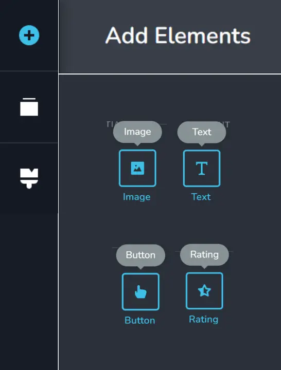
- Image: Upload an image representing the product.
- List: Customize the product list with key features or specifications.
- Button: Add a call-to-action button for users to learn more or purchase.
- Ratings: Include a visual representation of product ratings.
- Price: Display the product’s price for comparison.
Customizing Appearance
Adjust the appearance of each element:
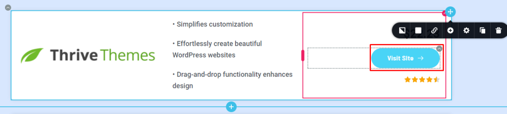
- Modify the product container’s styling.
- Customize the button design and color.
- Align and resize elements for consistency.
Step 4: Duplicating and Customizing
Duplicating Feature Boxes
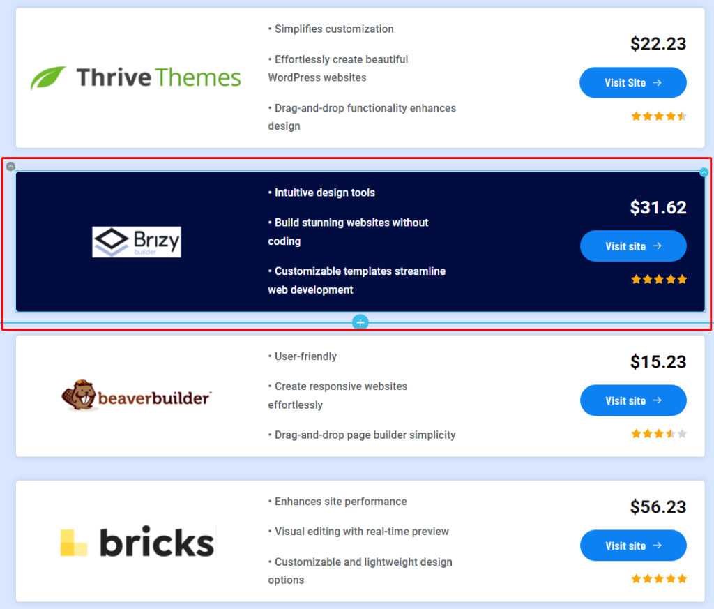
Once you’re satisfied with the first product feature box, duplicate it:
Adjust details such as price, list description, ratings, and image for each product.
Highlighting Products
Differentiate one product by changing the background color of its container:
Ensure text color contrasts well with the new background for readability.
Step 5: Adding Interaction
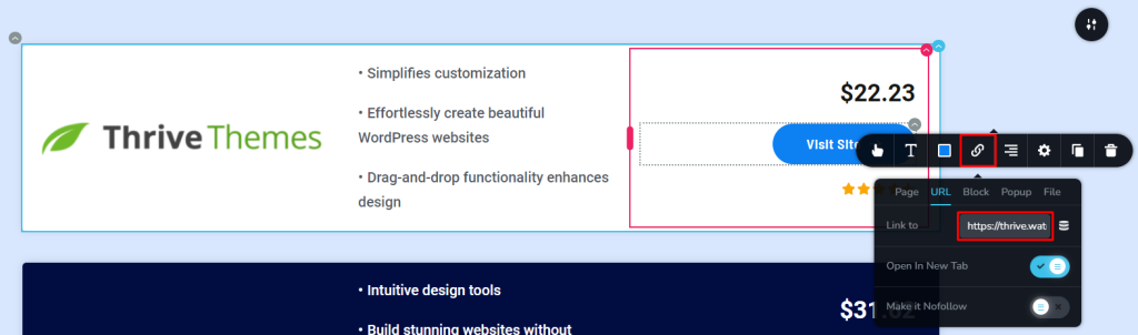
Adding Links
Enhance user interaction by adding links to each button:
Configure buttons to redirect to specific product pages or affiliate links.
Step 6: Final Adjustments and Updates
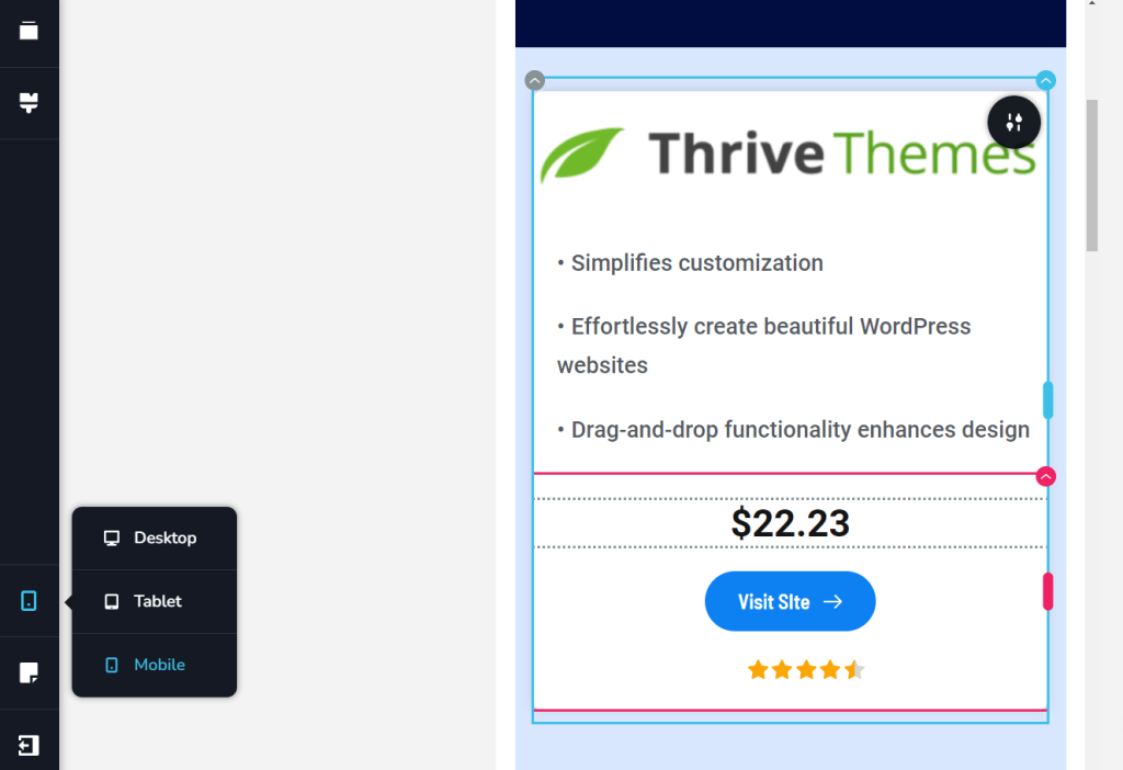
Checking Responsiveness
Ensure your design is responsive across devices:
Make any necessary adjustments to improve mobile and tablet display.
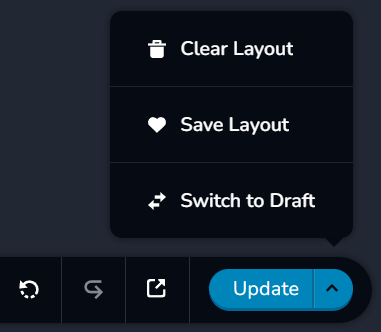
Saving Changes
Click ‘update’ to save your modifications and publish the updated page.
Best Practices for Designing Effective Feature Boxes
Keep It Concise and Relevant
Ensure that the content within your feature box is concise, engaging, and directly relevant to your audience’s needs or interests.
Use Compelling Calls-to-Action
Incorporate clear and compelling calls-to-action (CTAs) within your feature box to prompt users to take desired actions, such as signing up for a newsletter or exploring a product.
Mobile Responsiveness
Verify that your feature boxes are optimized for mobile devices to maintain a consistent user experience across all screen sizes.
Conclusion
By following these steps, you’ve successfully created appealing product feature boxes using Beaver Builder. This design enhances your site’s usability, making product comparisons clearer and more engaging for your visitors.


