
Introduction
The Beaver Builder page builder is a beacon of innovation in the ever-expanding realm of website design, providing both novice and seasoned developers with a seamless platform to bring their visions to life. Creating engaging content is essential, and interactive modules like the Slide Box have become increasingly popular. Slide Boxes allow you to display information to users when they click or hover over them, making your website more interactive and user-friendly. In this step-by-step tutorial, we’ll show you how to create a Slide Box module, so you can quickly add interactive sections to your website with ease.
Understanding the Beaver Builder Page Builder
Beaver Builder stands out as a premier page builder for WordPress, renowned for its intuitive drag-and-drop functionality. It’s a favorite among users with varying levels of technical expertise, allowing seamless customization without the need for complex coding.
Step 1: Adding the Slide Box Module
The first step is to find the Slide Box module in your module list and drag it onto the page you’re working on. This is the foundation for creating your interactive section.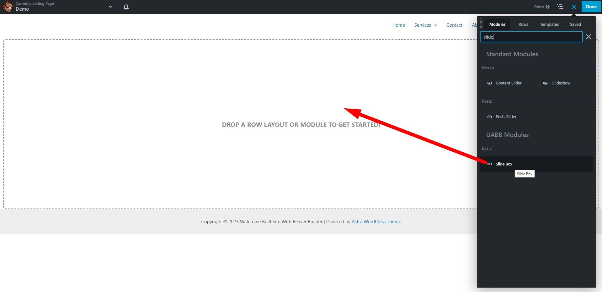
Step 2: Configuring the Slide Box
Once you’ve added the Slide Box module, it’s time to customize it to your liking. Here’s how you can do that:
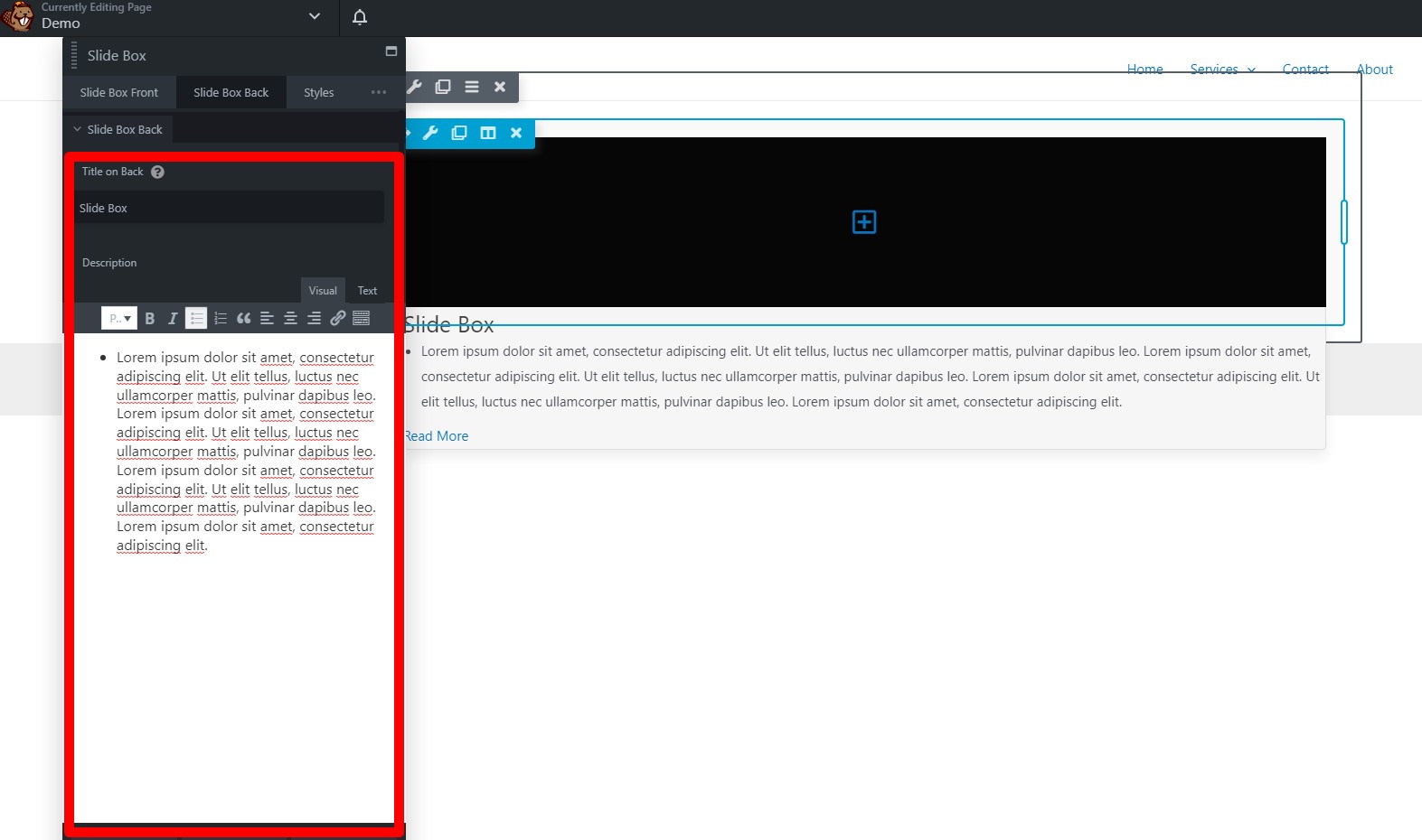
Adding a Relevant Title and Description
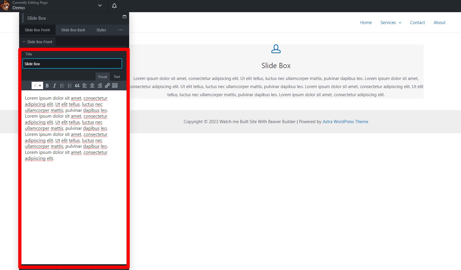
Start by giving your Slide Box a title and description that convey the purpose of the interactive element. This information will help users understand what to expect when they interact with the Slide Box.
Choosing an Image or Icon
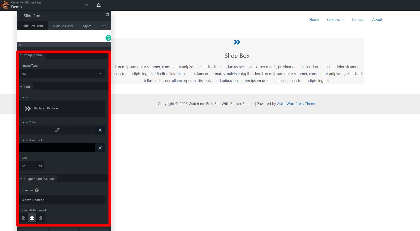
Next, you’ll need to decide whether you want to use an image or an icon for your Slide Box. If you opt for an image, upload the image you want to use. If you choose an icon, select one from the library that best suits your content.
Setting the Icon
In the icon library, select the icon you want to use for your Slide Box. You can also choose the icon’s color and icon hover color to match your website’s design.
Adjusting the Icon Size
Customize the size of the icon to ensure it fits perfectly within the Slide Box. You can set the size to match your design preferences.
Icon/Image Position
Specify the position of the icon or image in separate sections for the front and back of the Slide Box. Additionally, you can adjust the overall alignment to make sure everything looks just right.
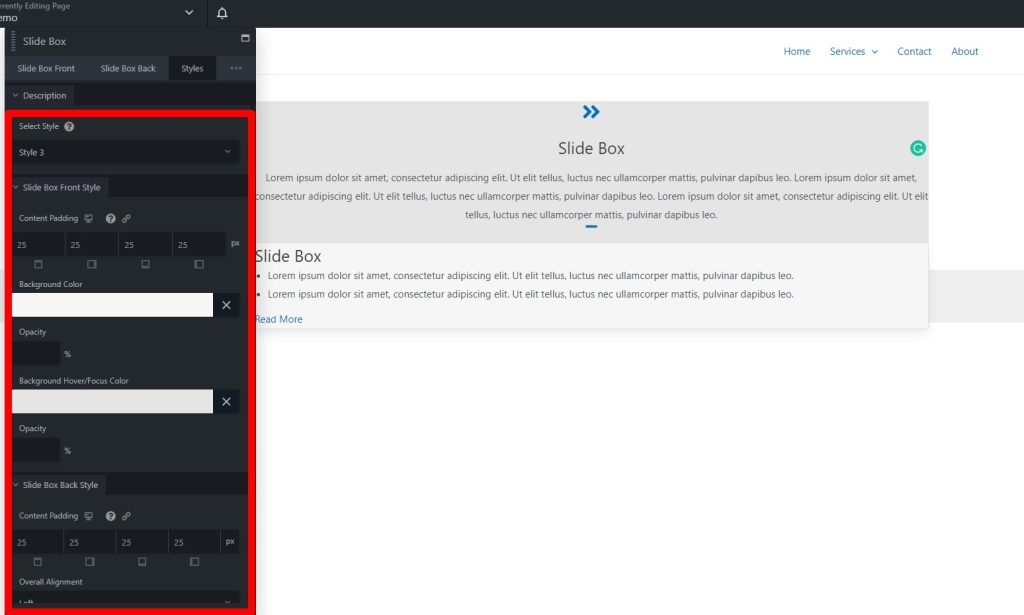
Step 3: Styling the Slide Box
The Styles Tab allows you to make the Slide Box visually appealing and in line with your website’s design. Customize the styles for the title, description, call to action, and text under the Slide Box Back.
Title and Description
Configure the appearance of the title and description on the Slide Box back. You can change fonts, colors, and other visual elements to match your website’s style.
Call to Action
Choose the type of your call to action, which is the action users can take within the Slide Box. Make sure it matches your content and has a pleasing visual appeal.
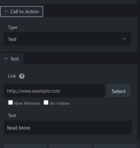
Adding a Link
If your Slide Box includes a call to action, be sure to add a link that directs users to the desired location. This could be a webpage, a form, or any other relevant destination.
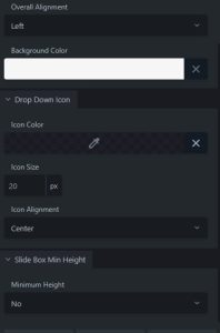
Step 4: Advanced Customization
For more advanced customization options, head to the Advanced Tab. Here, you can access additional settings to fine-tune the style and behavior of your Slide Box. Try out several configurations until you get the desired appearance and functionality.
Step 5: Save and Publish
Once you’ve finished designing your Slide Box and are satisfied with how it looks and functions, save the settings. Click “Done” in the upper right corner of your editor. Then, you can choose to publish your changes, save them as a draft, or discard them if you’re not satisfied. Don’t forget to hit “Cancel” if you want to exit without making any changes.
In conclusion, creating an interactive Slide Box module is a fantastic way to engage your website visitors and enhance their user experience. By following these step-by-step instructions, you can easily add this feature to your website and make your content more interactive and appealing.
Best Practices for Integrating Beaver Builder’s Slide Box Module
In the realm of web design, user engagement and interaction are pivotal. Building websites that capture the audience’s attention and retain it is no easy feat. Beaver Builder’s Slide Box Module is a versatile tool that can elevate your web design game. In this article, we will delve into the best practices for integrating this dynamic module, step by step.
What Is the Beaver Builder’s Slide Box Module?
Before we jump into the integration process, let’s get acquainted with what the Slide Box Module is. This module is a powerful addition to the Beaver Builder plugin, offering a visually appealing way to display content and images within a slider. It’s perfect for showcasing products, services, or any other content you want to highlight on your website.
Why Use the Slide Box Module?
Enhanced User Experience: By utilizing the Slide Box Module, you can create interactive and engaging content, keeping visitors on your website for longer.
Visual Appeal: The module allows you to incorporate striking visuals, making your website more attractive and informative.
Versatility: It’s suitable for a variety of content types, from image galleries to informational slides.
Add a New Page or Change an Existing One
Once Beaver Builder is up and running, navigate to the page where you wish to integrate the Slide Box Module. You have the option of creating a new page or editing an existing one.
Launch Beaver Builder
After choosing your page, click on the “Launch Beaver Builder” button. This action will take you to the Beaver Builder editor.
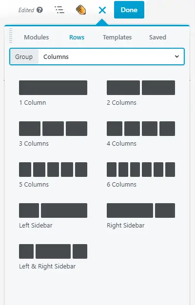
Add a Row
In the editor, you can start by adding a new row to your page layout. This row will serve as the container for your Slide Box Module.
Insert the Slide Box Module
Within the row, click on the “+” button to add a module. Search for “Slide Box” and select the Slide Box Module.
Customize the Module
Now that you’ve added the Slide Box Module, it’s time to customize it according to your needs. You can adjust settings, add content, and choose how the slider will function.
Design the Slides
Create visually captivating slides with your preferred content. You can add text, images, and even links to other pages or resources.
Save and Publish
After you’re satisfied with your Slide Box Module’s design and content, save your changes and hit the “Publish” button. This will make your integration live on your website.
Conclusion
Integrating Beaver Builder’s Slide Box Module is a fantastic way to enhance user engagement and display captivating content on your website. By following the above step-by-step instructions, you can make the most of this versatile module.


