
Introduction
Thrive Architect, a feature-packed page builder for WordPress, empowers you to design and customize your website effortlessly. One of its standout features is the Tabs Element, which allows you to create organized and visually appealing content on your web pages. In this article, we’ll delve into the world of Thrive Architect’s Tabs Element, guiding you through its setup, customization, and the benefits it can bring to your website. So, let’s get started!
What is the Tabs Element in Thrive Architect?
The Tabs Element is a versatile feature in Thrive Architect that enables you to display content in a tabbed format. This means you can present different types of information, such as product features, services, or FAQ sections, in a neat and organized manner. Visitors can simply click on the tabs to access the content they are interested in, providing a seamless and engaging user experience.
Adding the Element to Your Post/Page
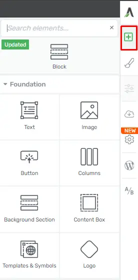
The first step in harnessing the power of the “Tabs” element is to add it to your post or page. Here’s how you can do it:
Access the Editor
To begin, click on the plus sign located in the right sidebar. This will open a list of all the available Thrive Architect elements.
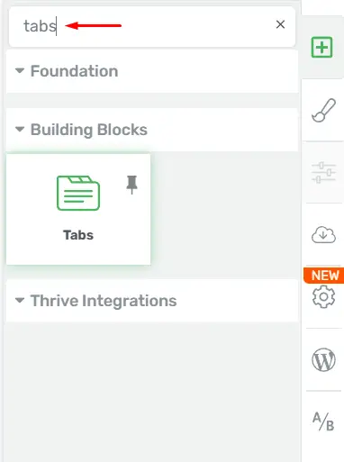
Locate the “Tabs” Element
Look for the “Tabs” element in the list or use the search bar to find it quickly.
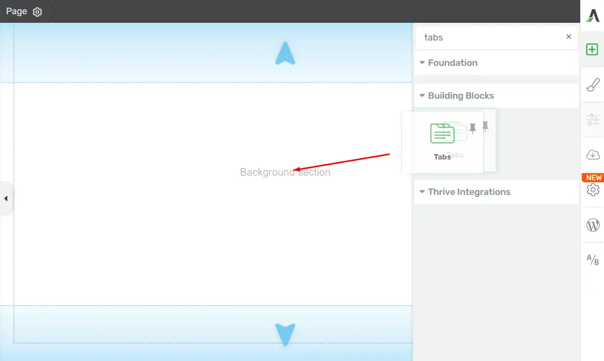
Drag and Drop
Once you’ve found the “Tabs” element, simply drag and drop it into your editor wherever you want it to appear on your page.
After adding the “Tabs” element, a pop-up will appear, allowing you to select a template.
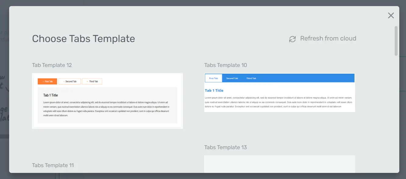
Choosing the Template
Now that you’ve added the “Tabs” element, it’s time to select the template that best suits your needs. Follow these steps:
Templates Library: In the left sidebar, you’ll find the “Templates Library” section.
Change the Template
If you wish to replace the initial template, you can do so here. Be aware that any previous content or modifications will be lost when changing the template.
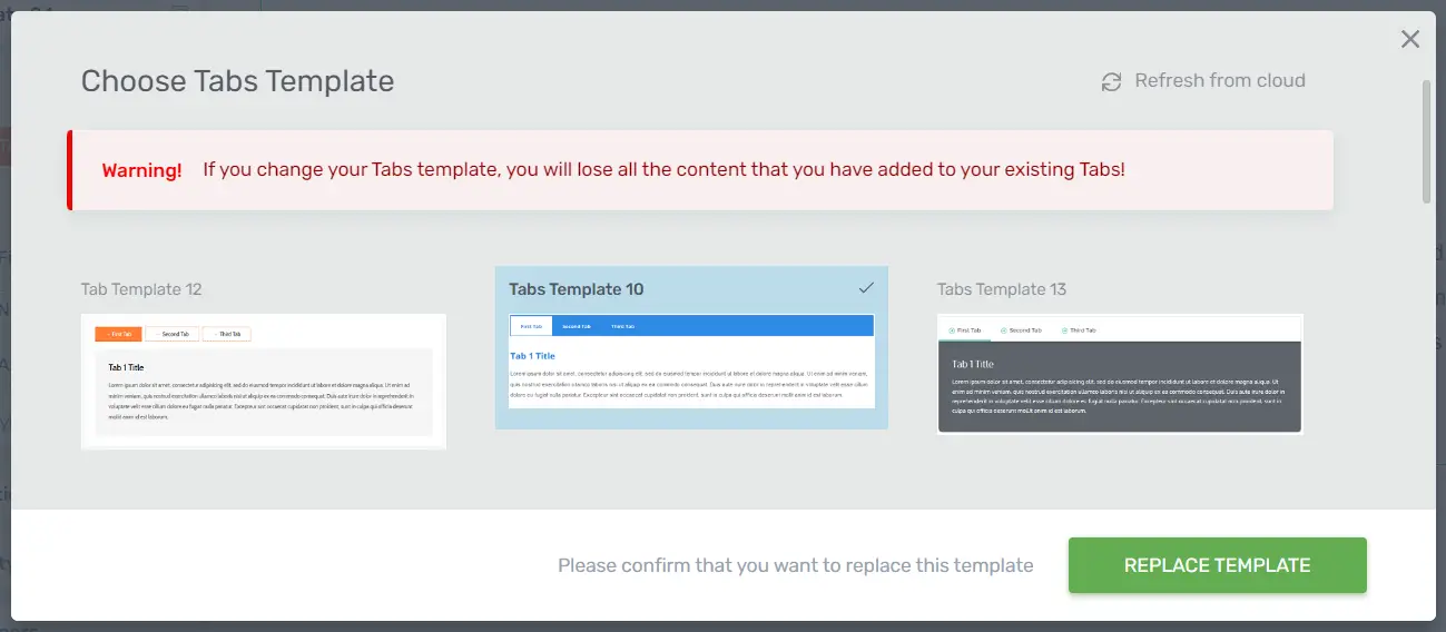
Select Your Template
Choose the template that aligns with your design and content preferences, then click on it. The template will be automatically applied to the “Tabs” element.
With the template in place, you can proceed to customize the element further.
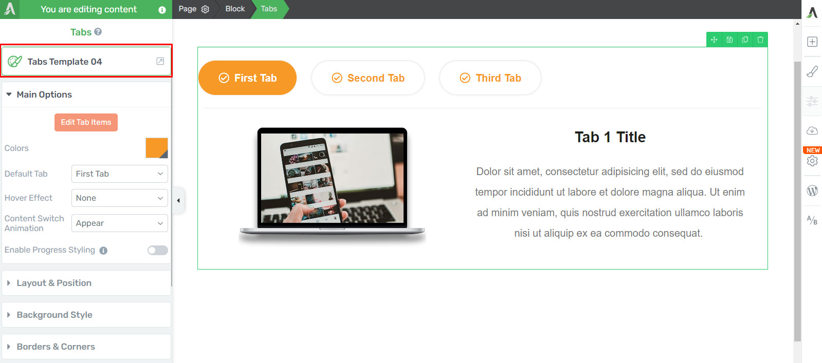
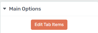
Using the “Edit Tab Items” Option
The “Edit Tab Items” feature allows you to customize each “Tabs” item individually, rather than making changes to the entire element. Here’s how to use it:
Edit Mode
Click on the “Edit Tab Items” button in the “Main Options” section.
Individual Editing
Once in “Edit Mode,” you can edit the items of the “Tabs” element one by one. This means you can customize each tab’s content to fit your specific needs.
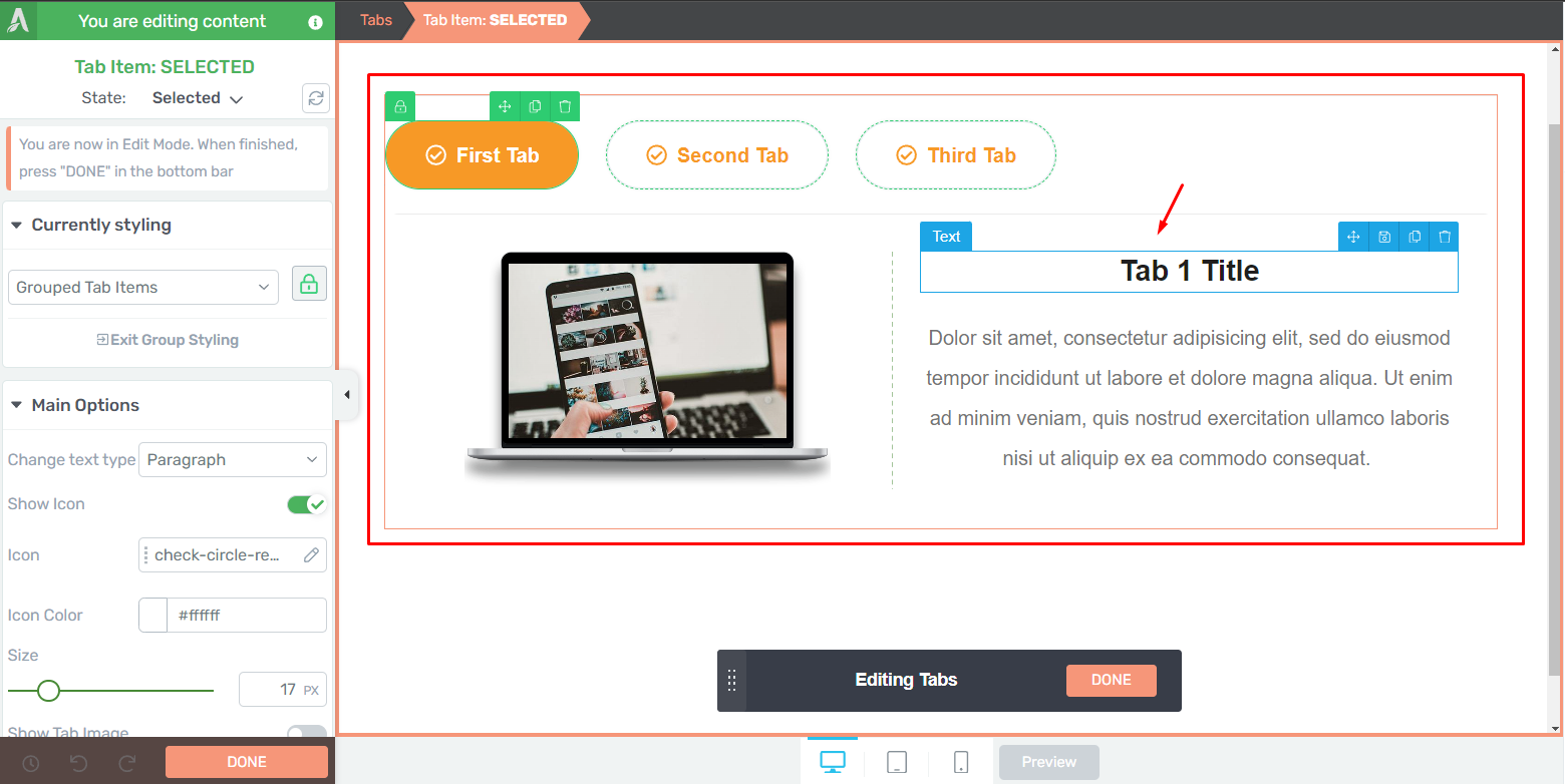
While in “Edit Mode,” you can also add various elements to the “Tabs” content, providing you with flexibility in content creation.
Adding Custom Content to the Element
The default “Tabs” element typically consists of a title and a paragraph. To add different elements to the “Tabs” content, follow these steps:
Plus Sign: Click on the plus sign in the right toolbar while editing the “Tabs” element.
Drag and Drop: Select the element you wish to add and drag it into the tab’s content area.
Customization: The options for the added element will appear in the left sidebar. You can customize the element’s settings and appearance from there.
To return to editing the tab items, simply click on “Tab Content” in the breadcrumbs.
Customizing the Normal/Hover/Selected States
The “Edit Mode” also allows you to modify how the “Tabs” element looks in different states: Normal, Hover, and Selected. Here’s how to do it:
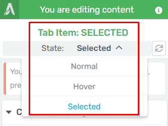
State Selection
Click on the down arrow next to the “State: Normal” section in the top part of the sidebar.
Choose a State: Select one of the three options to customize the respective state: Normal, Hover, or Selected.
Customization is done using the options in the left sidebar. After modifying the Hover and Selected states, return to the Normal state to continue customizing the “Tabs” element.
Using the Group Styling Option
The “Group Styling” option allows you to quickly modify different parts of the “Tabs” element. Here’s how to use it:
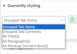
Selection: Click on a tab item or a content box of the “Tabs” element. The “Currently Styling” section on the left sidebar will appear.
Select the Items: You can choose which items you want to style either from the drop-down menu or by directly clicking on them in the editor.
Customization: The “Group Styling” feature allows you to make changes to all the selected items simultaneously.
The options available for “Grouped Tab Items” include changing text types, showing icons, selecting icon images, adjusting icon colors, modifying icon sizes, and positioning icons or images.
Exiting Group Styling
Once you’ve finished customizing different parts of the “Tabs” element using “Group Styling,” you can exit this mode:
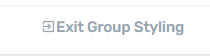
Exit Option: Click on the “Exit Group Styling” option in the “Currently Styling” section on the left sidebar.
This will take you back to the “Main Options” of the “Tabs” element.
Main Options for Further Customization
The “Main Options” section in the left sidebar provides various ways to customize the design of the “Tabs” element. Here’s what you can do:
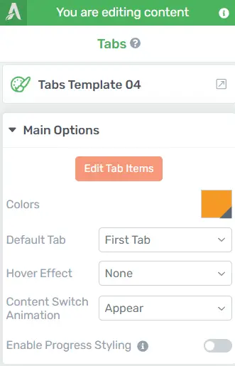
Color: You can change the main accent color of the “Tabs” element by clicking on it and selecting a new color from the pop-up.
Default Tab: Choose which tab opens by default when someone accesses the “Tabs” element.
Hover Effect: Select an animation for when someone hovers over one of the tabs.
Content Switch Animation: Choose an animation for the content when tabs are switched.
Enable Progress Styling: This option styles the selected tab and any preceding tabs as “active.” Activate this to enable progress styling.
With these options, you can further customize your “Tabs” element to match your design and content needs.
Adding More Tabs
You can add as many tabs to the “Tabs” element as you need. To do so:
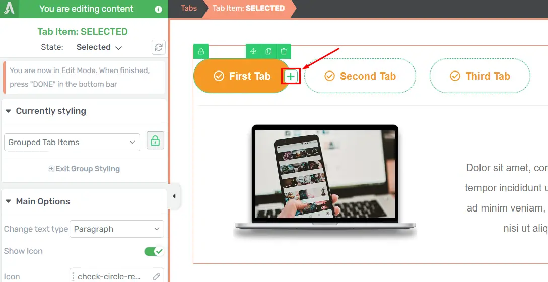
Edit Tab Items: Click on the “Edit Tab Items” option, and you’ll enter “Edit Mode.”
Add a New Tab: Hover over the tab items in the editor, and a plus sign will appear. Click on it to add a new tab.
The new tab will be placed to the right of the one you’ve selected. You can then customize it using the same options described earlier.
Exploring Additional Options
Apart from the “Main Options,” you have several other sections in the left sidebar that allow you to customize the “Tabs” element even further. These sections include layout and position, borders and corners, shadows, and more.
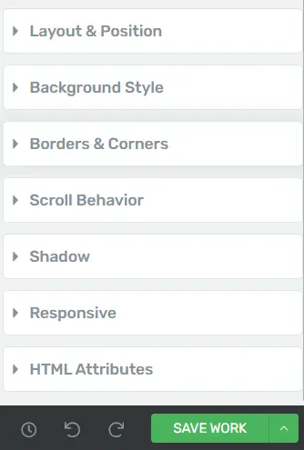
One commonly used option is “Typography.” This section lets you change the default font, color, alignment, font size, line height, and letter spacing, among other text-related settings.
Conclusion
In conclusion, using the “Tabs” element in Thrive Architect provides you with a powerful tool for organizing and presenting your content in an engaging and user-friendly way. Whether you’re creating a blog post, landing page, or any other content, the “Tabs” element can help you deliver information more effectively and make your content stand out.


