
Introduction
Elementor makes creating a responsive header mobile menu easy, which is essential for a seamless user experience on mobile devices. This guide will walk you through the process, incorporating best practices to ensure your menu is user-friendly, accessible, and effective. By the end, you’ll have a visually appealing and highly functional mobile menu using the page builder.
Understanding Responsive Design
What is Responsive Design?
Responsive design is an approach to web design that ensures a website looks and functions well on all devices, from desktops to tablets to smartphones. It adapts the layout and content to the screen size and orientation, providing an optimal user experience.
Benefits of a Responsive Header Menu
A responsive header menu enhances usability, ensures easy navigation, and improves overall site performance on mobile devices. This leads to higher engagement and better retention rates.
Three Basics of Mobile Menu Best Practices
Limit Menu Items
To keep your menu user-friendly:
Keep primary menu items to 5-7: Too many items can overwhelm users. Focus on the essentials.
Use submenus if needed: Additional items can be nested in submenus to keep the main menu clean.
Expandable Menus
Ensure your menu is easy to navigate:
Use intuitive icons: Icons like the hamburger icon are widely recognized and indicate where users can access the menu.
Accordion or drop-down style: These styles are great for mobile menus, allowing for compact yet expandable lists.
Easily Clickable Elements
Make sure your menu is easy to use:
Large text and clickable areas: The text should be large enough to read easily, and the menu items should be clickable.
Adequate padding: Tap targets should be at least 44 x 44 pixels with enough padding between links to prevent accidental clicks.
Getting Started with Elementor
Accessing Elementor Theme Builder
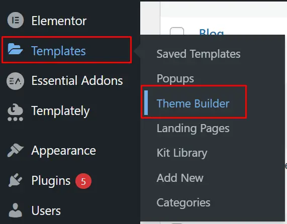
First, you’ll need to access the Elementor Theme Builder:
Navigate to Templates: From your WordPress dashboard, go to Templates and then click on Theme Builder.
Open the Header Section: Find the header section where you want to create your mobile menu and click on it.
Step-by-Step Guide to Creating a Responsive Header Mobile Menu
Step 1: Navigating to the Templates
Click on Theme Builder: Access the header section.
Add a New Section: Click on the plus icon to add a new section.

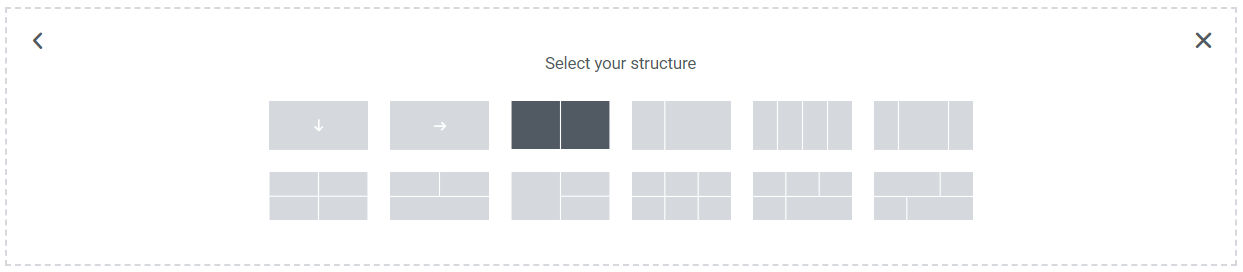
Step 2: Adding a New Section
Choose a Two-Column Structure: This structure is flexible and works well on any screen type.
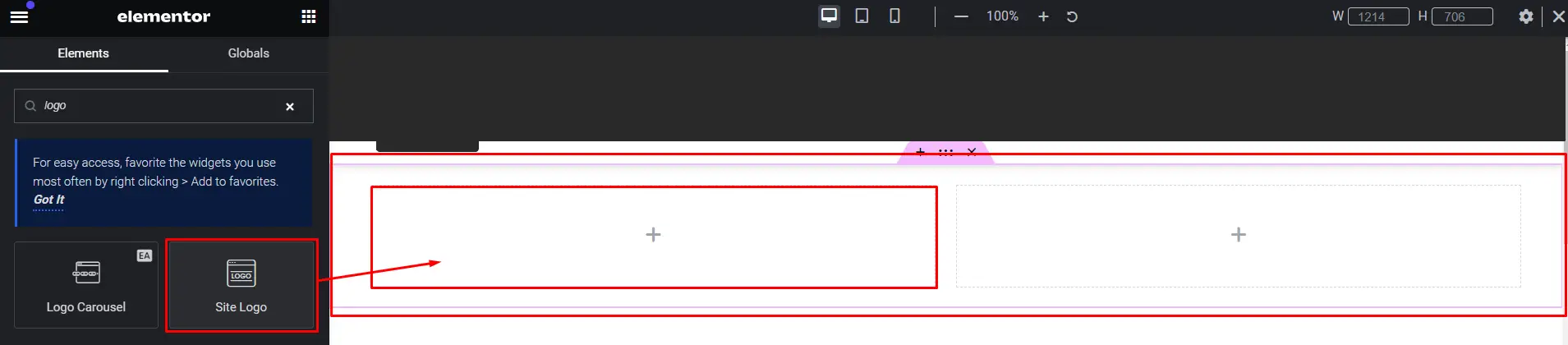
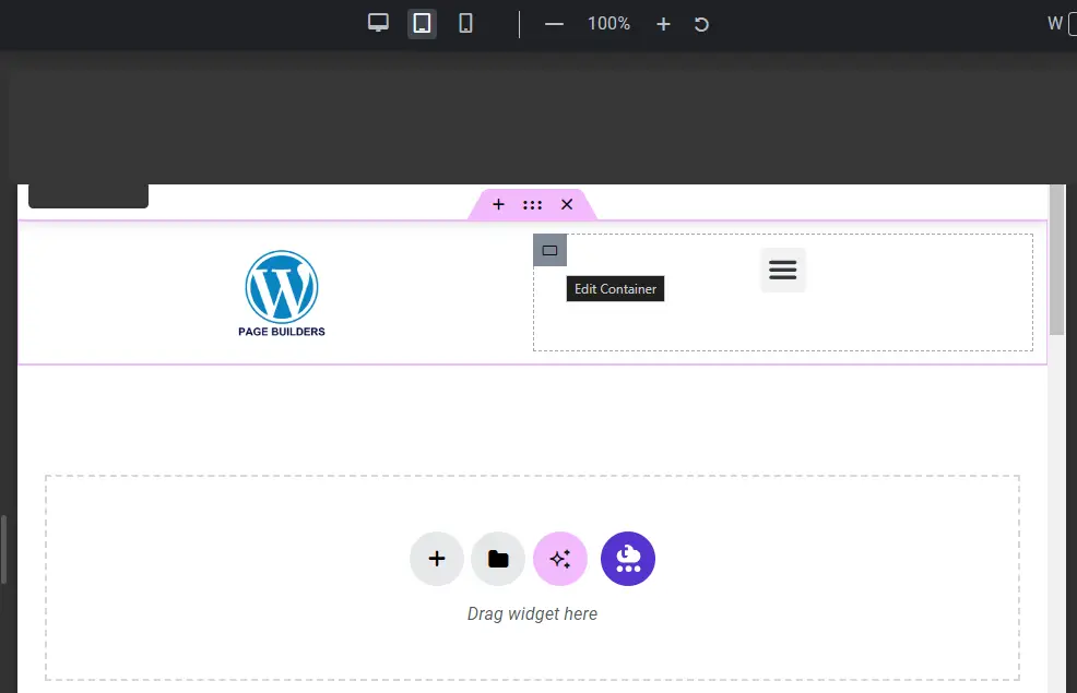
Step 3: Adding Essential Elements
Adding a Logo
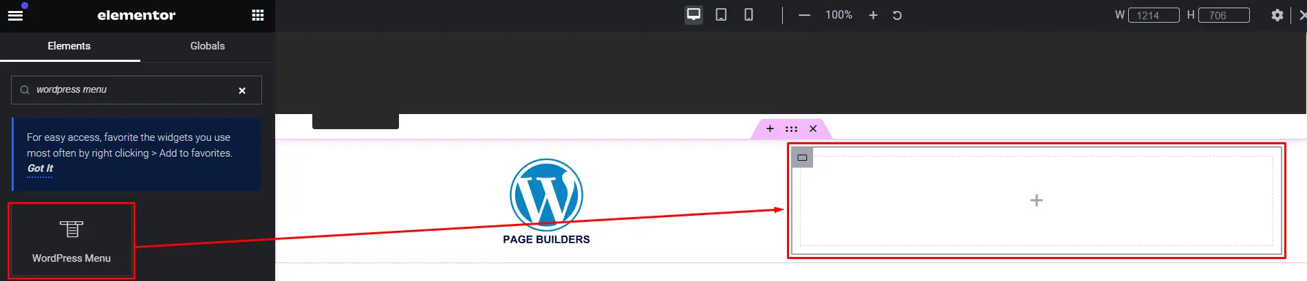
Drag the Logo Widget: From the Elementor panel, drag the logo widget into the new section.
Adding a Navigation Menu
Drag the Navigation Menu Widget: Place it in the same section as the logo.
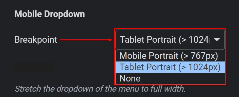
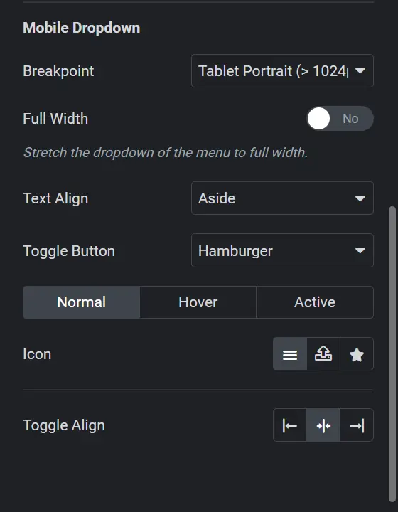
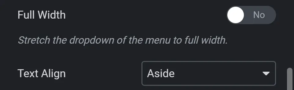
Step 4: Customizing the Mobile Dropdown Settings
Setting the Breakpoint
Adjust the Breakpoint: Set the breakpoint at which the toggle button or hamburger menu appears.
Customizing the Toggle Button or Hamburger Menu.
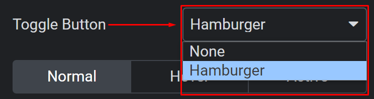
Upload an SVG Menu: You can upload an SVG menu for a customized look.
Step 5: Styling the Navigation Menu
Customize the Menu Style: Choose your menu from the dropdown in the content settings.
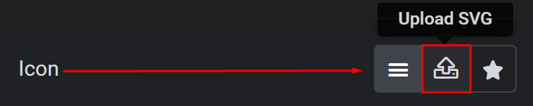
Step 6: Setting the Active Section Icon
Choose an Icon: Replace the default icon in the active section with one of your choice.
Step 7: Adjusting for Different Views
Desktop View Adjustments
Set Width and Alignment: Adjust the width and alignment of each element for desktop view.
Tablet View Adjustments
Repeat for Tablet View: Ensure the elements are appropriately sized and aligned for tablets.
Step 8: Advanced Customizations
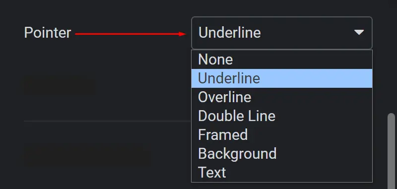
Pointer Settings
Customize the Pointer: Under Pointer, choose how you want each item to be recognized when the cursor is pointed at it.
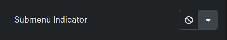
Sub Menu Indicator
Add or Remove Arrows: In the Sub Menu Indicator, add an arrow to indicate submenus or choose none for a sleek look.
Step 9: Final Adjustments and Preview
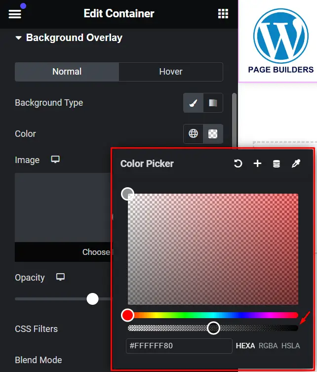
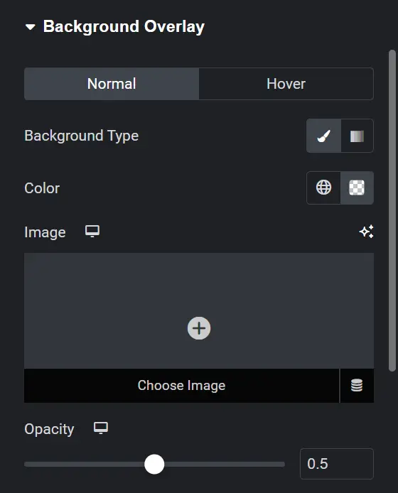
Making the Menu Transparent
Set Transparency: Make the menu transparent for a minimalist design.
Overlaying the Menu for a Minimalist Look
Overlay the Menu: Ensure the menu overlays content appropriately.
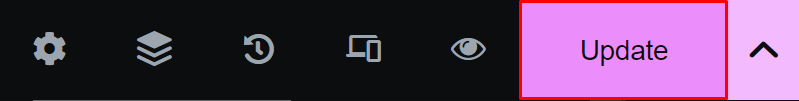
Step 10: Updating and Previewing Changes
Click Update: Save your changes and preview the header to ensure it looks and functions as expected.
Best Practices for Mobile Navigation
Simplifying Navigation
Strategies to streamline your menu items for mobile users without compromising on content.
Using Icons and Labels
Enhancing user experience by incorporating intuitive icons and clear labels in your mobile header.
Testing and Optimization
Conducting Mobile-Friendly Tests
Tools and methods to ensure your header menu looks great and functions well on various mobile devices.
Optimizing Load Speed
Tips for optimizing your mobile header menu to improve page load times and overall performance.
Conclusion
Designing a mobile-friendly header menu in Elementor is not just about aesthetics; it’s about enhancing user experience and improving SEO. By following these guidelines and leveraging Elementor’s powerful features, you can create a header menu that is both functional and visually appealing across all devices.


